Photo Collage: David Hockney-esque

For our latest project in Process and Skills, we were asked to study David Hockney’s “joiners” or his cubist photography. I really appreciated reading about his views on photography and how his new technique came to be. In an interview he says the following about photography- “So, the moment you’ve looked at [the photograph] for even four seconds, you’re looking at it far more than the camera did. It dawned on me this was visible, actually, it is visible, and the more you become aware of it, the more this is a terrible weakness; drawings and paintings do not have this.” From this, he decided to break down this weakness and try to use photography to show space and time by layering multiple images as though he was approaching it as a drawing or painting.

IMG_0156

Above is my first attempt with his technique! I decided to use a manageable object, so that I wouldn’t get overwhelmed and I could really focus on understanding his process. After taking a million pictures of this fire hydrant and probably worrying a number of people around me, I knew I wanted to show it from the perspective of standing above. With a few tweaks in class especially on the background, I think it is starting to give off that impression!

Photo Collage

For our process and skill class we were asked to take as many pictures as possible sequently  of an event or objet to expand the sensation of depth,moment in time, and interesting point of view. Here is some inspiration that I found from David Hockneys´s work. 

paint_trolley1985 telephone pole

It´s amazing how you can still see a complete piece of something modifying the perspective direction and order of the objects.

Here it´s my work!! I chose Coca -cola because it is a product with a lot of history  but mainly because it is distinguished all around the world.Changing the direction of the pictures and playing with shapes created a much more exciting and creative work.

coca-cola

FIT | DESIGNERS & BOOKS FAIR

Earlier this month, I attended the FIT School of Art and Design Designers & Books Fair, which featured over 70 book publishers, book signings, and programs related to a variety of design disciplines: architecture, experience design, fashion, graphic design, interior design, landscape architecture, product and industrial design, and urban design.

In addition to tables set up with publishers, there was programming that spanned the weekend, including speakers such as Milton Glaser, Steven Heller, Irma Boom, Peter Bohlin, Juliet Kinchin, Philip Pearlman, and Gary Hustwit.

One of my favorite pieces was a book about Paul Bunyan which was created using wood block prints.

20151003_175545

Another cool piece was a book about air streams—which had a metal cover mimicking the iconic trailer material. The airstream sleeve was, in part, inspiration for my photo essay book project; I plan to create a small LP cover sleeve for my book.

20151003_173904

A highlight was checking out a book about the style of David Bowie — signed by Ziggy Stardust himself! Unfortunately, the book was going for $3,500, so it has not been added to my library.

20151003_174134

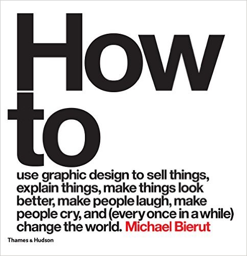
I did splurge on one purchase, Michael Beirut’s How to: Use graphic design to sell things, explain things, make things look better, and (every once in a while) change the world.  In addition to being a gorgeous design book the captions and text copy is so clever that I could not turn it down.

5138hpdgqWL._SX481_BO1,204,203,200_

Unlike the PS1 art book fair, the FIT fair was quiet due to the weather and it was easy to get a good look at everything and manhandle publishers’ products. I would definitely recommend it for any future Process and Skills students!

Self Poster Project

For our first Project in Process and Skills class we were asked to create black and white self poster based in the Punk Rock era posters and Japanese, Polish and Russian posters starting from a photo taken in a photo booth. The poster should have only our initials or name and just one photo.

The project had so many restrictions that at the beginning I thought it was going to be horrible but working on progress and researching helped me to develop a lot of good ideas with just a photo and my initials.

Its was amazing to see the final posters of all and  how everyone turned 2 things into different  great ideas.

Here is my process and my final poster.

Featured image3rd poster

2nd posterselfportrait4

Everything is Design: The Work of Paul Rand

If you go see only one exhibition this year, it should be “Everything is Design: The Work of Paul Rand” at the Museum of the City of New York. Even if you had never heard his name before, you have seen his work. Paul Rand is a Brooklyn-born graphic designer who designed the logos for ABC, UPS, Westinghouse, among others. He is most famously known for his branding and identity work for IBM. Rand has been called “the Picasso of graphic design.”

exbphoto2

The exhibition focuses on Rand’s life and work, divided into “Early Life and Career,” “Transforming Madison Avenue,” “Books and Publications,” “Creating Corporate America,” and “Writing and Teaching.”

exbphoto1

One of my favorite parts of the exhibition is a small TV screen outside of the main exhibition room, which shows a four-minute video of Rand talking about his design philosophies interposed with images. The other thing I loved is how Rand’s quotes are integrated into the exhibition, displayed on the sides of the vitrines. Some of my favorite quotes are:

“Don’t try to be original, just try to be good.”

“Design is so simple, that’s why it’s so complicated.”

“Without play, there would be no Picasso.”

exbphoto3

exbphoto4

exbphoto5

exbphoto6

If you are in the world of graphic design, you cannot miss this exhibition. Paul Rand transformed the world of advertising and changed the graphic design culture of New York City. And as Rand would say:

“Everything is design. Everything!”

The exhibition is up until September 7, 2015. For more information on the exhibition, visit: http://www.mcny.org/exhibition/everything-design

Illustration Inspo — From the Beggarstaff Brothers to Ben Wiseman

By Morgan Taylor

It seems that the flat, figurative illustrations of the Beggarstaff Brothers are back in vogue. Initially, when British painters William Nicholson and James Pryde began working together in 1894 under the pseudonym “Beggarstaff Brothers” (actually brothers-in-law), they were working against the decoration of Art Nouveau, which by that time had made it’s way from France to Glasgow, where many British artists, such as the “Glasgow Four” were emulating the style.

Beggarstagg Brothers, Hamlet 1894
Beggarstaff Brothers, Hamlet 1894
1896, Charles Rennie Mackintosh, The Glasgow Four

One of the most famous illustrators of all time, Aubrey Beardsey, represents the transition between the style of the Beggarstaffs and Art Nouveau, with his figuration, decorative typography and flourishes.

Aubrey Beardsley, The Peacock Skirt, 1893
Aubrey Beardsley, Salome, 1894

According to Colin Campbell, the Beggarstaff Brothers’ process of making the “Hamlet” poster was initially collage cut from paper, then stencil on brown wrapping paper with some hand drawn details. The end result was life size. The Beggarstaff Brothers also employed the commonly-used techniques of woodcut and lithography in their designs.

Beggarstaff Brothers, Girl on Sofa, 1895
Henri Matisse, Blue Nude (paper cut out), 1952

The idea of the Beggarstaffs’ style was simplification over decoration, which produced striking images which are at once naive and sophisticated. The “brothers” only worked together for a few years but the style was picked up by German artists, including Ludwig Hohlwein.

Ludwig Hohlwein, Hermann Scherrer. Breechesmaker Sporting-Tailor, 1911
Beggarstaff Brothers, 1894

Today, the Beggarstaff Brothers Illustrative style is still alive in the work of Ben Wiseman, whose clients include Time, Newsweek, The New York Times, etc. I’m curious as to why this style has come back in style — could it be that Adobe Illustrator, which is built on simplified graphic shapes and forms, has powered this kind of graphic art?

time_benwisemanactor2

LECTURE: SHADOW ATLAS with Nora Krug & Enrico Fiammelli

Illustrator and graphic novelist Nora Krug created a lavishly made silk-screen book done in a limited edition of 400 copies. Shadow Atlas: An Illustrated Encyclopedia of Ghosts and Spirits was printed in three colors (yellow, blue and red) and one special color (silver).

Read more about Shadow Atlas from Steve Heller’s interview with Nora Krug (4/13) – Ghosts on A Grand Scale in Print Magazine

LECTURE INFO: Behind The Bling Lecture Series with Nora Krug & Fiammelli at FIT on March 18th – Free and Open to to the public (see poster below for details)

Behind The Bling Lecture Series with Nora Krug & Fiammelli at FIT (see poster for details)
Behind The Bling Lecture Series with Nora Krug & Fiammelli at FIT

Illuminations: Process for Old Traditions from a Contemporary Artist

February 6 through May 3, 2015  | Hebrew Illumination for Our Time

The Art of Barbara Wolff offers startling illuminations—recent gifts to the Morgan—created by this contemporary artist. The ten folios of “You Renew the Face of the Earth” illustrate passages from Hebrew Psalm 104, a celebration of all creation, with images illuminated in silver, gold, and platinum foils.

In the seventeen bi-folios comprising the Rose Haggadah, Wolff, while rooted in the tradition of illustrated Haggadot, presents a modern interpretation of the texts used at the Passover Seder.

THE VIDEO OF THE EXHIBITION: In a 22-minute video Wolff discusses her process from her love of doing research, to choosing paper and paint, to a painting demonstration of her illustrations.

LINK: http://www.themorgan.org/exhibitions/Hebrew-Illumination

BarbaraWolff_PageArt

INFORMATION: The Morgan Library & Museum | 225 Madison Avenue at 36th Street | NYC

Hours: The Morgan Library & Museum and the Morgan Shop are open

Tuesday through Thursday: 10:30 a.m. to 5 p.m.

Friday: 10:30 a.m. to 9 p.m.

Saturday: 10 a.m. to 6 p.m.

Sunday: 11 a.m. to 6 p.m.

Admission is free on Fridays from 7 p.m. to 9 p.m. | Other: $12 Students (with current ID)

BREATHE

For my photo essay and book I decided to address the idea that in the city we barely look up. How often do we take our eyes off the ground? We rush through life barely looking at the city around us, let alone the sky. If we take just a moment, a break, and look above the streets, buildings, and concrete we will find that the first thing we do is…BREATHE. 1Breath Cover2Breathe Back

In order to convey this message I made the cover of my book cutouts of the New York City skyline. To bind the book I used fabric and metal fasteners to stick with the theme of buildings and the city.

3Breathe Side 3Breathe side1

In the center I made an accordion fold with photos (on each side) starting with the street, then items you would find on the street, then fronts of buildings, then tops of structures, then bridges and finally an ambigram in the middle saying “breathe” both ways. I added color into the photos in areas where the sky was visible. I wanted to give my viewer the experience of starting with looking down at the ground and slowly moving towards the moment where the sky takes their breath away.

4Breathe Inside 5Breathe inside 6Breathe Inside

I hope the next time you are walking through the streets of New York you take a moment, look up, and “Breathe.”

-Teige Alexandra

“Artist of the Day” learning opportunities

Screen Shot 2014-11-13 at 11.16.01 AM

Many are familiar with Reddit, a site of user-generated news links that refers to itself as “the front page of the internet.” Reddit entries are organized into areas of interest called “subreddits;” there’s essentially a subreddit for anything you might be interested in, from male fashion to world news to DIY.

While browsing Reddit recently, I was excited to find an Artist of the Day subreddit. As the title suggests, moderators select an artist each day and showcase his/her work and biography. The artists range from well-known to rising stars, and some are controversial (ie Adolf Hitler’s profile).

Keeping up with an “Artist of the Day” program would be a fun way to learn about artists beyond those suggested to us in Process & Skills. If you’re not a fan of the Artist of the Day subreddit, here are a few alternatives: