The Center for Book Arts: Then & Now

” Book Arts. Art of the Book. Artist’s Books. Printmaking. Book Binding. Paper Arts. These are just a few of the terms that come into play in the subject at hand, and one of the reasons that [I’ll stick with] Book Arts is, perhaps the ultimate interdisciplinary art of our time.” – Peggy Roalf

The Center for Book Arts, located in New York City’s Flatiron District, is a leader in the field, and the first not-for-profit center of its kind in the country. Founded in 1974, it has become a model for other such organizations that have since proliferated from coast to coast.  In celebrating its 40th anniversary, CBA has produced a series of exhibitions that reveal the many faces of Book Arts, from printing and binding; writing; collecting; and conservation. The current show, Then & Now: Ten Years of Residencies at the Center for Book Arts, organized by Executive Director and Curator Alexander Campos, offers a microcosmic view of the possibilities that artists explore using paper [but not always]; printing [but not always]; binding [but not always]; stitching [often]; architecture [sometimes]; performance, music and video [more often than you might think]; and imagination [always]. – from DART | Design Arts Daily

CBA_ThenAndNow1

Exhibition area displaying many different creative approaches to the art of the book.
Exhibition areas displaying many different creative approaches to the art of the book.
Jessica Lagunas | Wave Hilll’s Books of Leaves
Sara Parkel | Baggage
Elysa Voshell | Space Between You & Me

More information for the exhibition Then & Now and two companion exhibitions:

Then & Now: Ten Years of Residencies at the Center for Book Arts, and

Featured Artist Projects: 2014 Workspace Artist-in-Residence and Linda Carreiro: Inside Out of Words, continue through June 27 at The Center for Book Arts, 28 West 27th Street, Third Floor, NY, NY.

The exhibition Then & Now will travel, opening at the Castle Gallery at The College of New Rochelle, on September 8. An exhibition catalogue is in production. Workshops and Certificate Program classes continue. 

http://centerforbookarts.org/visit/location-hours/

How to spot America’s most loved beer? Look for Betsy the purple cow

cnbc 200

After two weeks and thousands of votes, Newburgh Brewing Co.’s Cream Ale beer label was crowned the 2015 winner of CNBC‘s Most Loved Label competition.

Newburgh-Cream-Ale_sm_Modern-Good_web
Since we never tried the beer – our belief is that the man behind the design is responsible for the win. After all it was competition for the most loved label and not the best beer. The label was designed by Philadelphia-based design firm Modern Good run by Matthew Bouloutian, a former adjunct faculty at AAS Graphic Design.
It features Betsy the cow which was created for a poster for the Cream Ale a few years before.

Modern Good_NBC_4BeerPosters
Four Beer Posters for Newburgh Brewing Company
Here is what Matthew Bouloutian told us about process of the design:


Our can design first began in 2012 when we created Betsy the Cow (with her two little side kicks) as the main subject for a promotional poster for Newburgh Brewing Company’s first beer, their cream ale. This poster along with 5 others, one for
each of their beers, was produced with the intention that when Newburgh Brewing decided to package their beer they would already have an iconic solution to represent each one. Each poster revolved around a unique illustration for the beer based on its name or character. Two years passed before the can design project became a reality. When it came time to start distributing the beer in cans,
I used our icon of Betsy, the established typography and colors from the poster to design a label, which basically looked like the poster with some adjustments. Chris Basso, the head brewmaster at Newburgh Brewing ultimately felt it wasn’t exciting enough and pushed for something more. I was surprised but Chris felt strongly about making something adventurous. He mentioned that other breweries had done some trailblazing in packaging their beer. At this point I had to do something very different. Our cow icon was already in use and wasn’t going to change so the design had to. 
After exploring design ideas we arrived at this patchwork, wraparound design which was engaging to pick up and explore. It allowed us to feature our beer icons as well as the town of Newburgh and other bits of information about the beer and spirit of the brewery. It also didn’t look like any other label we’d seen. There was lots to look at, read and discover. It has a pop/craft impression that is lighthearted but conveys a respect for heritage. The shelf presence is strong and I’ve heard that it’s been very successful in terms of sales… but who knows if that’s our can design or the beer! I’d like to think it’s both. Cheers.

Newburgh Brewing Website

Screen Shot 2015-04-10 at 3.25.41 PM

Paul Halayko, Newburgh Brewing Company, discusses the inspiration behind his cream ale beer, and the craft brewing craze.

Editor: Katarzyna Gruda

Spotlight | Jason Booher | Book Cover Designer | AAS Graphic Design Faculty & Alumnus

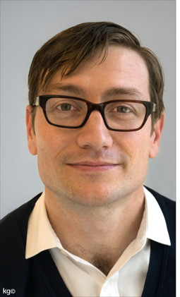
Parsons AAS Graphic Design Alumnus (’05) and Faculty Jason Booher talked with current student Kiel Guba about how he came to Parsons, how he got his first
job, and his experience as a book cover designer and teacher

2015_03_Jason-Booher_01_copyright

After obtaining a degree in English Literature
at Princeton University, Jason pursued his childhood dream of becoming a high school English teacher. His career started by teaching
at Eton College in England (he had to wear
a tuxedo to class!) and then Trenton High School (NJ). While he enjoyed teaching, he felt that something was missing from his life. He
quit and bounced around for a few years living in England and Australia where a friend hired him as a personal chef. Despite Bondi Beach beckoning him each day, Jason continued to paint and draw (something he has desperately tried to fit into his schedule as an undergrad) and attempted to make a graphic novel.

When he returned to the US, he took a continuing education course at Parsons on a whim, and through it found out that graphic design existed everywhere and about the Parsons AAS GD program, which he chose as his path into the design world.
“I never really knew about graphic design, let alone considered it as a career,” he says, “but when I started attending classes, I knew immediately it was what I should have been doing all along. Parsons’ AAS Graphic Design was perfect and intense; it really felt more like an MFA program”.

After graduating, Jason started designing book interiors part-time at Dubé Juggling. This freed him up to shop his portfolio to designers he would want to work for, specifically looking for book cover design work. “By the end of school, I figured out graphic design is about selling something”, Jason says “and I knew I would only be able to design well if I was selling something I believed in—I believe in books”.

01_8_36-arguments_history-of-histories

02.-Gone-away_angelmakerUltimately he landed a job in the art department at Penguin, and soon after found himself in his dream job designing book covers at Alfred A. Knopf. His wife, Helen Yentus, is also a designer and they collaborate often on projects, although he admits with their current jobs they have less times to work together. Jason is currently the Art Director at Blue Rider Press as well as a part-time History of Graphic Design professor at Parsons.

03.-Lanier_you-are-not_who-owns

Jason’s work is evocative without being heavy-handed – his covers have just enough information to draw the reader in without revealing too much. They are beautifully and thoughtfully designed and speak both to his great understanding of literature as well as his talent for design.

04.-news_six-months

Q: How do you come up with a cover design for a book?
A: It’s different every time. Reading the book is important. Sometimes I sketch starting with the title and author. Sometimes I am making thumbnails from the very beginning. Sometimes I have a clear idea immediately of what I want to do and start there. Sometimes I read the book and then wait for months until I start really coming up with something. Most of the time I have some idea that I then work through and throw away and move on from there. But I love the process. I get to fall in love with each book and work to find something visually interesting that connects to it’s soul.

05.-5-cents

Q: What is your favorite typeface?
A: I don’t have one. Type is contextual. But maybe Futura.
Q: What is some of the best advice you received from a Parsons professor?
A: Something I learned very early in my first graphic design class with Julia Gorton has always stayed with me. In the critique of our first projects she burned into us that your design should not be like everyone else’s; it should be unique within its context. That’s something I try to keep in mind each time I start a new project.
Q: Who is your favorite graphic designer?
A: That’s an easy one—Helen Yentus.

06.-road-trip_god-without-men

Q: You have been teaching design in the AAS program now almost as long as you have been designing, has that affected how you design?
A: There has been no experience or thing that has effected my design or how I think about design as deeply as teaching the History of Graphic Design. Beyond the exposure to great historical designs and soaking in the relationships that I find within them, I was forced to develop a language of design that moved beyond critiquing contemporary designs (either my students’ work or my work in progress). I had to find a way to speak about or discuss design outside the glossy historical narrative with students, a way to move into designs that weren’t their own. Most examples of this kind of dialogue I have found in books have not been helpful to me, because the language used doesn’t relate to how I think about design. However, Paul Rand’s words from his Conversation with Students have. “Design is relationships.” That’s were I start, and it opens up designs in almost any direction I want to push myself and the students.

07.-Forensing-Songs_nothing-by-design

Through teaching, as much as designing, I quickly came to believe innovation in formal execution to be as important (or perhaps more important) as conceptual expression in most design. Certainly in book packaging. Looking at formal relationships in historical designs as a way to find a unique visual moments in contemporary designs is what my class is about. And it is what I passively and sometimes actively do in my own work. At the very least, I certainly benefit from an accumulation of discussions of various effective relationships. And because I have had to verbally express why I think things work, I can look at something I am designing and not rely on intuitive instinct as to why any given relationship is or isn’t working. Surely I use intuition when I design. But for some reason being able to talk about the decisions I am making intelligently (as in it is intelligible) with another human designer has given me a way to push things further.

09_shady_silversUntitled-1

Editing and photography: Katarzyna Gruda


Jason Booher | AAS GD Faculty & Alumni is featured in AIGA article

A Graphic Designer on Why You Should Always Judge Books by Their Covers

 By
Margaret Rhodes
March 2, 2015

These days, the screen is king. So it’s a (delightful) surprise when designer Jason Booher says, with zero hesitation, that “being a book cover designer is possibly the best job in the world.” Booher is the art director of Blue Rider Press, one of Penguin Book’s imprints, and the mind behind many of its most inventive book covers.

Booher_Lord of the flies

It’s easy to see why Booher is so enamored of his profession. Novels naturally lend themselves to illustration, so coming up with the best solution for a few square inches of real estate must be an especially savory visual challenge for a designer. Booher is especially suited to the job. As a kid, he wanted to have a career as a high school English teacher, but when that didn’t pan out, he found his way to design by way of graphic novels. Then a lucky break landed him a stint at the art department at Penguin, and things came full circle. It became his job to read manuscripts and analyze them—for cover designs, not a captive lit class.The key to creating stellar covers, according to Booher, is to first throw out the tired adage about not judging books by them. “Graphic design is really about selling things,” he says. Lest that sound soulless, the good news here is that Booher is selling other people’s creative ideas. And while every book is unique, Booher says he starts by reading the six or so manuscripts he gets per season, and then mentally digests them all. “You read it, you try and find the soul of the book, something that makes it special, and make it come alive,” he says.

booher-nothing-by-design-cover

 Read the rest…


LECTURE: SHADOW ATLAS with Nora Krug & Enrico Fiammelli

Illustrator and graphic novelist Nora Krug created a lavishly made silk-screen book done in a limited edition of 400 copies. Shadow Atlas: An Illustrated Encyclopedia of Ghosts and Spirits was printed in three colors (yellow, blue and red) and one special color (silver).

Read more about Shadow Atlas from Steve Heller’s interview with Nora Krug (4/13) – Ghosts on A Grand Scale in Print Magazine

LECTURE INFO: Behind The Bling Lecture Series with Nora Krug & Fiammelli at FIT on March 18th – Free and Open to to the public (see poster below for details)

Behind The Bling Lecture Series with Nora Krug & Fiammelli at FIT (see poster for details)
Behind The Bling Lecture Series with Nora Krug & Fiammelli at FIT

Published | Tory Burch In Color | Designed by our Faculty & Alumna | Emily Wardwell

Emily_2014_11_34_2
We are pleased to present a new book designed by our faculty member,
Emily Wardwell. After graduating from Parsons Emily started her design career as an editorial designer with the redesign of TeenVogue, In 2005 she became  the Art Director responsible for the full redesign of the Almay brand staged by Revlon. Once the launch was set in motion, Emily moved on to become the art director of Delia*s tween fashion catalog. She returned to Condé Nast in 2006 to design for Vogue in the editorial art department focusing on special projects such as Vogue Living, Fashion Rocks and a series of coffee table books published between 2007 and 2009 including; Vogue Living: Houses, Gardens, People [Knopf, 2007], The World in Vogue: People, Places Parties [Knopf, 2009] and Extreme Beauty in Vogue [Skira, 2009]. In 2008, when Glamour magazine came under new design direction she was responsible for the redesign of the beauty section among other elements.

Emily_books_2

Over the past four years Emily has been running the 40/4 Design Studio, which she founded. The boutique design studio specializes in fashion, lifestyle and beauty branding along with the design of publications for both large and small publishing houses. Projects have included Herb Ritts: The Golden Hour [Rizzoli, 2010], It’s Modern: The Eye and Visual Influence of Alexander Liberman [Rizzoli, 2013] for Charles Churchward and most recently, Tory Burch In Color [Abrams, 2014] for Tory Burch.

2014_IN-COLOR._sq

TOC_LowRes_700

blu_LowRes_700

purp_LowRes_700

red01_LowRes_700

blk02_LowRes_700

blk_LowRes_700

Editor & Photographer: Katarzyna Gruda