We are proudly announcing the launch of Ingrid Carozzi’s new book “Brooklyn Flowers”. It was released on May 5th and was produced by one of largest publishers in Sweden, Massolit Förlag. It is a beautiful and highly informative instructional book containing simple flower arrangements made with methods used at Tin Can Studios. There are also lots of images from the Tin Can Studios as well as street scenes from the Brooklyn neighborhoods around the Studio such as Red Hook and Williamsburg. The gorgeous photographs were all shot by the critically acclaimed photographer Paul Brissman who used a Hasselblad, the professional photographers’ favorite tool. Eva Nyqvist was the co-author, who writes for a wide variety of publications such as Elle Decor and Gourmet. Sadly for us New Yorkers it is only available in Sweden for now but is being currently translated into German. There is already talk about books two and three…
Conversation with Ingrid Carozzi
Ingrid Carozzi has been gaining momentum since she graduated from Parsonsand shows no signs of slowing down. Her successful flower design studio based in Brooklyn, with a second location coming on line in her native Stockholm, has orders through next year. She is currently booked through 2016 with TV appearances, an executive women’s conference, and an event for the largest auction house in Sweden. Some of the country’s highest profile companies are among her clients.
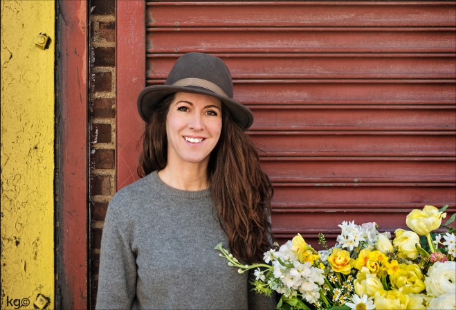
Ingrid Carozzi in front of her studio in Red Hook in Brooklyn
Ingrid credits Parsons for a great deal of her success. “Without Parsons, I would be nowhere,” she says. “I learned how to communicate well and how to critique work without offending others. This helps me with business because talented freelancers are very happy to work for me.”Her Parsons training also fortified her color strength, an essential talent in working with flowers. “I understand the properties of color — hue, value and intensity — after taking a great color theory course with Kelli Glancey.”
Color Theory Applied
She also was able to improve her sales and marketing efforts as a result of becoming a solid photographer at Parsons in my Process and Skills class. “You can create the most beautiful floral arrangement in the world, but if you cannot capture it, it won’t matter how good you are.”
“You need to know how to brand yourself,” explains Ingrid. “My experience in graphic design was essential for my success. I am able to design, build and update my website as my business blossoms. As a former PR person I know how to market myself, too. These are all things that Parsons helped me to understand. It really is one of the best design schools in the world”.
After graduating from Parsons, Ingrid was presented with a slew of freelancing opportunities. It was a request from a former colleague from the Swedish Chamber of Commerce (SACC) that led to her watershed moment. “SACC asked me to come up with some ideas for floral arrangements for the Royal Green Award Gala Dinner at the Mandarin Hotel which was attended by the King and Queen of Sweden.” At the time, she had been designing business cards and branding for a salvage wood company called Recycled Brooklyn. Since she had access to a plethora of farm crates she had the idea to use them as the vessels for her flowers. When Ingrid brought in her arrangements, fate intervened: the executive chef had, unbeknownst to Ingrid, created a menu that matched her arrangement, even using some of the same ingredients such as crown dill and rosemary.
“I was hesitant, because at the time I wasn’t a florist. I was a designer, but I never say no to a challenge. After that I realized this was something I really love 100%,” says Ingrid. “Once I got started, I knew this was something I should have been doing all along. I launched Tin Can Studios a year later.”
Press
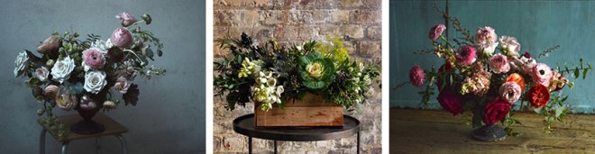
Ingrid Carozzi, who sources her dahlias and anemones from tristate farms, leans wild and loose, using “blender” flowers like ranunculus to unify her high-contrast bouquets. To contain them, she forages vintage measuring cups, test tubes, and wine bottles—often from Dead Horse Bay. While Carozzi focuses primarily on weddings and corporate events (Cointreau and the Pierre Hotel are clients), she’s more than happy to accent your desk or dinner table. All South Brooklyn orders are delivered by bicycle.
Upcycling is the M.O. of Tin Can Studio’s Ingrid Carozzi, based in Red Hook, who recently published Brooklyn Flowers in her native Sweden. Some of her most collaborative wedding projects have been with clients who have provided vessels from their personal collections for her to work with. “There’s more character, and history [that way],” says the florist who regularly transforms everyday objects like wine bottle or tin cans into vases, and who’s been known to handcraft wooden crates from repurposed wood and dig up old bottles from landfills. These choices are responsible as well as aesthetic. “I love the contrast of the patina of something old with new, fresh flowers that are so alive,” says Carozzi whose services include arriving at the end of a wedding to disassemble arrangements and “turn them into mini bouquets to be passed out when guests leave. It is so lovely when people can bring a little piece of the wedding with them.” Here, from Tin Can Studios, wedding flower inspiration for brides-to-be with a feeling for history.
For Certainly Studio, it’s good business to work with businesses that do good works. The studio provides a wide range of design to many clients, but the heart
of the operation is in collaborating with organizations and corporations who are making the world better.
There are many people who follow a game plan for their careers — they know what they want and they go after it. Jim Wagner was not one of those people… immediately. He came late to design after working in television for 20 years. And it wasn’t until he graduated from Parsons in 2004 that he began to actually think about how he was going to earn a living in New York from the passion that came with his newly acquired skills.
“I really hadn’t even considered what I was going to do after graduation. I went on a few interviews and met with recruiters and decided that I just wasn’t going to be a good pool designer in a big studio,” confessed Wagner.
So he doubled-down and started his own company, Certainly Studio. He came to that decision while in Asia in 2004, and upon his return, met with a mentor, the ABC News anchor Charles Gibson, who asked him some pivotal questions. He wanted to know how Wagner’s design studio would be different from the thousands of others out there, and how he planned to build on his reputation as a responsible and creative manager.
“They were good questions. And frankly, they provided the framework for my business plan. Since my first degree was in journalism, I really cared about the message. And with my second degree in design, I felt like I was able to meet my clients’ needs wearing two hats — a powerful combination.”
His company’s philosophy is that content is made stronger with good design; and design is made stronger with good content. Taking a step at a time and going in the right direction is more his style.
“If you’re headed somewhere that you want to go, or like how today feels, then tomorrow is probably going to be just fine.”
It sounds passive, but for Wagner, being rigid when it comes to design is not a good process. One must to be open to opportunities and take advantage of circumstances as they present themselves. So what direction did Wagner’s studio path take? Working for clients who have agendas that mirror his own set of beliefs and causes. For firms that like to collaborate and do important work. And with people who are respectful and at the top of their industries.
“When you start out, you take every job because you have no choice. But, as you grow and develop, you are able to be more selective about who you work for and what you care about.”
These decisions have resulted in Certainly having a core of extremely smart clients who are passionate about their work. These companies and organizations are truly changing the world.
For instance, Certainly works with the American Committee for the Weizmann Institute of Science. They really ARE changing the world. The Weizmann Institute campus is in Rehovot, Israel. They employ around 3,800 scientists, graduate students, highly skilled research technicians, and the staff which supports them. They come to work every day with the goal of solving the most challenging problems facing humankind: global warming, world hunger and malnutrition, cancer and other diseases, safety and security, to name just a few. For more than 60 years, the Weizmann Institute’s curiosity-driven scientists have made thousands of landmark breakthroughs, and they continue to strive to make thousands more. Supporting this kind of work has really been not only gratifying for Wagner and Certainly Studio, but it also provides collaboration with extremely gifted people doing important work.
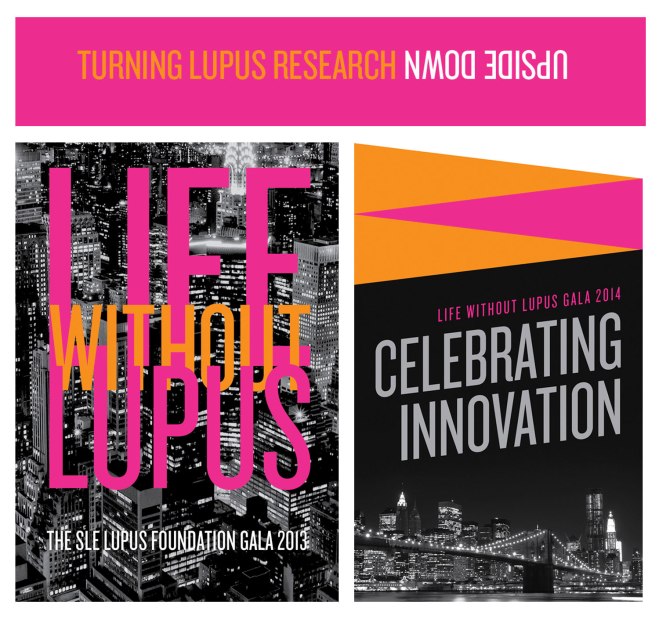
Certainly has also forged a very meaningful and long-term partnership with the SLE Lupus Foundation / Lupus Research Institute. These organizations are on the cutting edge of Lupus medical research and are known for their innovative approach to research and patient services.
“When you walk into their offices, you feel their passion; you sense their commitment. Every member of the staff is
laser-beam-focused on curing Lupus. So to help these passionate people position and package their important messages with great design is truly an honor.”
Certainly’s client list includes many other non-profit organizations who do amazing work including the Women’s Forum of New York and the YMCA of Greater New York. Certainly also works with many prominent businesses that are doing mind-blowing things in the private sector.
One stand-out relationship is with the Economic Cycle Research Institute (ECRI). Certainly has worked with the New York-based company for more than four years.
“You just can’t imagine the brain power in their offices. It was intimidating at first, since the principals of the company are truly geniuses.” Their mission is to forecast turning points in economic growth and inflation for their clients. Needless to say, I had to do a LOT of homework before our first meeting,” explained Wagner.
“Certainly has provided brand and design support to ECRI over the years and attempted to make their brand as strong as their intellectual product. Which is a very tall order. But I’m proud to say, that their phenomenal success and branding have been in lock-step and provides Certainly some of our most rewarding design pleasure,” admits Wagner.
Wagner and his team have won many awards. Yet he says the pleasure that comes from working with smart people on meaningful projects is a much bigger source of pride for Certainly Studio.
American Graphic Design Awards (12) Broadcast Designers Association (1) Promax International Awards (5) Daytime Emmy® Award (1)
After graduating from the University of Washington with a degree in Business Administration, Jennifer began working in corporate events. However, it was during her time as a flight attendant for Alaska Airlines, that her interest in design became re-invigorated. She started working on some of her own design projects and realized she wanted to formalize her education. After some research, she found and was accepted to the Parsons AAS program and headed to New York. “I was riding by in a taxi”, she said, “and as we passed Parsons I said to myself, I’m going to go there”. And sure enough she did!
Shortly after graduating from Parsons in 2005, Jen started her own design company in New York and quickly gained a following of clients such as Colette Malouf and the Chelsea Art Museum. With her increased notoriety, she was contacted by Target, who offered her a job as senior art director at their headquarters in Minneapolis. It was there that Jennifer found her stride. Working at Target gave Jennifer the opportunity to have a hand in many aspects of design, including creating catalogs, directing of photo shoots, collaborating with designers and leading castings in New York and Los Angeles. She also headed up some of the larger campaigns such as Club Wed, and was a part of the “Big Idea” committee.
Target catalogsTarget Valentine’s Day
With all the expansive knowledge she gained while working at Target, and after a brief tenure as VP of operations at an online invitation company in Los Angeles, she became Creative Director for the Canadian clothing company Joe Fresh. It was her team that was tasked with launching the brand in the US, and she oversaw the re-branding of the website, gave extensive photo direction, and made Joe Fresh a staple in the US, all in less than six months!
Joe Fresh webJoe Fresh home
In her next position as VP of Creative at West Elm, Jennifer led a team to develop monthly catalogs, digital design, packaging and signage.
Most recently Jennifer’s entrepreneurial spirit kicked in and she launched together with business partner Jen Worthington, bella j. , a lifestyle beauty / gift brand of over 25 beautifully packaged products that are sold online, at Nordstrom and various boutiques. The brand is playful and colorful and comes to life with Sujean Rim‘s illustrations (another Parsons alumni). Inside each product is a hidden charm with some of the candles even containing a $10,000 diamond necklace – its the Cracker Jack / Willy Wonka of beauty gifts! They even sell notebooks in some beautiful patterns which are great for sketching! Parsons students take note!
bella-j. advertising campaignbella j. advertising campaignbella-j. packaging
Here are bella-j. candles on the Today Show as Jill Martin’s featured choices for Mother’s Day perfect gifts!
For those people who are interested in taking a left turn in their career, Jennifer is a shining example of what can be done with a little bit of bravery and a lot of creativity. “I learned so much at Parsons AAS Graphic Design and was inspired by some so many of the professors”, she said. When asked if she had any regrets, she simply stated “No regrets!” !
Q: I wish I’d known before I started… A: That you didn’t need to know anything about graphic design before you start! The Parsons AAS GD program is so comprehensive.
Q: What is your favorite typeface? A: It’s a really hard decision, but right now I’ve been loving the clean lines of Brandon Grotesque Light.
Q: What advice do you have for students who are just starting out? A: Do as many internships as you can. You’ll learn so much in the classroom but it’s just as important to know how to apply your skills in real life.
Interview by Kiel Guba, AAS GD
Photography and edit: Katarzyna Gruda
Parsons AAS Graphic Design Alumnus (’05) and Faculty Jason Booher talked with current student Kiel Guba about how he came to Parsons, how he got his first job, and his experience as a book cover designer and teacher
After obtaining a degree in English Literature
at Princeton University, Jason pursued his childhood dream of becoming a high school English teacher. His career started by teaching
at Eton College in England (he had to wear
a tuxedo to class!) and then Trenton High School (NJ). While he enjoyed teaching, he felt that something was missing from his life. He
quit and bounced around for a few years living in England and Australia where a friend hired him as a personal chef. Despite Bondi Beach beckoning him each day, Jason continued to paint and draw (something he has desperately tried to fit into his schedule as an undergrad) and attempted to make a graphic novel.
When he returned to the US, he took a continuing education course at Parsons on a whim, and through it found out that graphic design existed everywhere and about the Parsons AAS GD program, which he chose as his path into the design world.
“I never really knew about graphic design, let alone considered it as a career,” he says, “but when I started attending classes, I knew immediately it was what I should have been doing all along. Parsons’ AAS Graphic Design was perfect and intense; it really felt more like an MFA program”.
After graduating, Jason started designing book interiors part-time at Dubé Juggling. This freed him up to shop his portfolio to designers he would want to work for, specifically looking for book cover design work. “By the end of school, I figured out graphic design is about selling something”, Jason says “and I knew I would only be able to design well if I was selling something I believed in—I believe in books”.
Ultimately he landed a job in the art department at Penguin, and soon after found himself in his dream job designing book covers at Alfred A. Knopf. His wife, Helen Yentus, is also a designer and they collaborate often on projects, although he admits with their current jobs they have less times to work together. Jason is currently the Art Director at Blue Rider Press as well as a part-time History of Graphic Design professor at Parsons.
Jason’s work is evocative without being heavy-handed – his covers have just enough information to draw the reader in without revealing too much. They are beautifully and thoughtfully designed and speak both to his great understanding of literature as well as his talent for design.
Q: How do you come up with a cover design for a book? A:It’s different every time. Reading the book is important. Sometimes I sketch starting with the title and author. Sometimes I am making thumbnails from the very beginning. Sometimes I have a clear idea immediately of what I want to do and start there. Sometimes I read the book and then wait for months until I start really coming up with something. Most of the time I have some idea that I then work through and throw away and move on from there. But I love the process. I get to fall in love with each book and work to find something visually interesting that connects to it’s soul.
Q: What is your favorite typeface? A:I don’t have one. Type is contextual. But maybe Futura. Q: What is some of the best advice you received from a Parsons professor? A:Something I learned very early in my first graphic design class with Julia Gorton has always stayed with me. In the critique of our first projects she burned into us that your design should not be like everyone else’s; it should be unique within its context. That’s something I try to keep in mind each time I start a new project. Q: Who is your favorite graphic designer? A: That’s an easy one—Helen Yentus.
Q: You have been teaching design in the AAS program now almost as long as you have been designing, has that affected how you design? A:There has been no experience or thing that has effected my design or how I think about design as deeply as teaching the History of Graphic Design. Beyond the exposure to great historical designs and soaking in the relationships that I find within them, I was forced to develop a language of design that moved beyond critiquing contemporary designs (either my students’ work or my work in progress). I had to find a way to speak about or discuss design outside the glossy historical narrative with students, a way to move into designs that weren’t their own. Most examples of this kind of dialogue I have found in books have not been helpful to me, because the language used doesn’t relate to how I think about design. However, Paul Rand’s words from his Conversation with Students have. “Design is relationships.” That’s were I start, and it opens up designs in almost any direction I want to push myself and the students.
Through teaching, as much as designing, I quickly came to believe innovation in formal execution to be as important (or perhaps more important) as conceptual expression in most design. Certainly in book packaging. Looking at formal relationships in historical designs as a way to find a unique visual moments in contemporary designs is what my class is about. And it is what I passively and sometimes actively do in my own work. At the very least, I certainly benefit from an accumulation of discussions of various effective relationships. And because I have had to verbally express why I think things work, I can look at something I am designing and not rely on intuitive instinct as to why any given relationship is or isn’t working. Surely I use intuition when I design. But for some reason being able to talk about the decisions I am making intelligently (as in it is intelligible) with another human designer has given me a way to push things further.
Žarko Dumicic and Vaishnavi Mahendran graduated of the Parsons AAS Graphic Design Program in 2012.
Vaishnavi completed her Bachelor’s degree in Economics from Mumbai and has a Masters degree in Marketing from the UK. After her Masters, and finishing a summer school course at Central Saint Martins, London, Vaishnavi was urged to apply to Parsons, by a former boss while training at design firm Red Lion, Publicis, in Mumbai. Her boss cited Parsons as one of the best schools for design, as well as mentioning that, being located in New York City, one of the most exciting cities to be a creative in, it would be an excellent choice for her future career aspirations — her boss was definitely right!
While completing his Bachelor’s Degree in Economics in Zagreb, Croatia, Žarko was introduced to the New School after a brief encounter with an inebriated Polish man in Sydney, Australia, who after a short discussion about their interests randomly urged him to continue his education there. Realizing that the New School has a strong design program and with the prudent advice of this friendly stranger to embolden him, Žarko applied and was accepted into the Parsons’ AAS Programand moved to New York. Despite the fact that his path to Parsons was less than traditional, it was clearly one of the best decisions he has ever made.
Vaishnavi and Žarko met at the second day of school waiting for a class to begin and the rest is, as they say, history… They both credit much of their design success to the comprehensive and challenging curriculum at Parsons.
After graduating and working in New York, they recognized the strong potential and opportunities for design in an emerging market such as India, Vaishnavi’s home country. They currently work together between Mumbai & New York through their new design studio,BLŌK, and are presently designing for a number of local & international clients. The Studio’s work spans a number of different mediums, from visual identities and package design to commissions by companies to curate the spatial design both in and outside of their offices.
Marco Argiro, vinyl coverGlobal, print design
In addition to their corporate work, Žarko and Vaishnavi have completed a variety of very exciting and creative self-initiated side projects over the course of their partnership. During the summer of 2013 they created an alphabet series constructed by projection mapping typography onto cardboard building blocks. Each of the 26 letters were made into a poster and subsequently hidden in bookstores, libraries and art galleries around the world. All of the posters contained a small description of the project, as well as their contact information. As these posters were located, they were able to make connections with fellow designers around the world, some of whom they are still in contact with.
BLOK Alphabet installation, letters A,B,C
While many of their projects have been highly conceptual, they also take as much care and use as much creative intuition to the more practical projects they have designed. When faced with the challenge of the limited availability of typefaces in Hindi, they simply created their own!
BLOK Business Cards, custom made ‘BLOK Hindi’ typography
The geometrical typeface that the studio uses for Roman letters was re-appropriated for Hindi use. It is this kind of attention to detail, recognition of gaps in the design market, and creative problem solving that has made Vaishnavi and Žarko a dynamic design team, and Parsons is undeniably the vehicle that has guided their passion.
Happy Home, package design
Hicare office space, spatial design
The interview was conducted and edited by Kiel Guba
Žarko & Vaishnavi were also gracious enough to answer some questions, below are the transcribed questions and answers:
Q: What was your inspiration to go into the design field…
V: Growing up I loved to draw and paint, but I think it was through music that I really discovered design and wanted to pursue it as a profession. I used to play drums in bands during school and college and it was during that time, that I fell in love with vintage vinyl cover art & poster design. From iconic works like Milton Glaser’s Dylan cover, Klaus Voormann’s Revolver album cover, to handmade typography of Fillmore posters from the 60s, the visual aspect of music inspired me to begin exploring graphic design.
Ž: I knew I wanted to go into the design field the moment I discovered the work of the French graphic designer Jean-Paul Goude – especially his collaboration with Grace Jones. Another endless source of inspiration is the brilliant Russian graphic designer Alexey Brodovitch.
Q: Share some of your experience from classes at Parsons…
V: Our Tamara Maletić’s class on Typography really opened our minds up to experimenting with form and function in type. My class with Juliette Cezzar (GD2) was an excellent experience and I remember her advising our class once, on growing as young designers, to challenge ourselves by taking up a variety of design projects that may sometimes require new skills that you may not be totally confident about at first, but will end up learning over the course of the project out of practical necessity, with the results often being pretty rewarding. This really resonated with me and has helped in times of doubt as a working designer.
Ž: Our Graphic Design + Silkscreen class with Katarzyna Gruda and William Morrisey was incredibly important and has solidified our typography appreciation and expanded our skills in composition and color. Katarzyna Gruda has also helped me a lot during school and post-graduation in finding internships and work in the city, which was essential for developing my overall skills as a designer. What is also great about Parsons is that we were also able to take classes in other creative fields that went beyond the core graphic design curriculum. We both took Photography as Expanded Media, Projected Environments and Experimental Video, and collaborated on art installations in these mediums.
Q: How has your perception of design changed as a student and after graduating?
V: I definitely see that the process of learning never ends, even after finishing design school — and more importantly that it should not end. As a designer it’s extremely important to keep challenging oneself. Once you get out of design school, you’re suddenly very aware that you don’t always have your professors to keep guiding you to push your limits. So it’s been a conscious effort to remind myself to keep doing so, which is critical to stay relevant as a designer.
Ž: Also I feel it’s incredibly important to generate both artistic and commercial pieces for your portfolio as a student—it shows that you are a well-rounded designer. While studying I was actively denying to produce designs for the mainstream, but working on projects in the market that you assume you won’t like, can be one of the most rewarding experiences—it requires a lot of effort and design thinking to create something that works in the mass market and that is also aligned to your personal aesthetic and comprehension of design.
Q: Now that you are in the design field, what do you feel is the most important advice to interacting with your clients?
Ž&V: One of the essential aspects of working with a client is to include them in every step of the design process. When you include them in the conversation from step one, the final work you present is stronger as a result of truly understanding the client’s desire and vision.
Q: What would your advice be to current and prospect Parsons students?
Ž&V: One of the best things about being in this industry, and its design community, is the fact that it’s so open and collaborative. We would urge students at Parsons to collaborate with their peers, as well as seek advice and feedback from established designers in the industry. We’re always grateful for the advice and guidance received from other designers that we consider our mentors, and some of whom we’ve worked with, such as Katarzyna Gruda, Mirko Ilić, Jan Wilker & Hjalti Karlsson, Tamara Maletić, Julia Gorton, Thomas Bosket, Alex Lin, Langdon Graves.
We are pleased to present a new book designed by our faculty member, Emily Wardwell. After graduating from Parsons Emily started her design career as an editorial designer with the redesign of TeenVogue, In 2005 she became the Art Director responsible for the full redesign of the Almay brand staged by Revlon. Once the launch was set in motion, Emily moved on to become the art director of Delia*s tween fashion catalog. She returned to Condé Nast in 2006 to design for Vogue in the editorial art department focusing on special projects such as Vogue Living, Fashion Rocks and a series of coffee table books published between 2007 and 2009 including; Vogue Living: Houses, Gardens, People [Knopf, 2007], The World in Vogue: People, Places Parties [Knopf, 2009] and Extreme Beauty in Vogue [Skira, 2009]. In 2008, when Glamourmagazine came under new design direction she was responsible for the redesign of the beauty section among other elements.
Over the past four years Emily has been running the 40/4 Design Studio, which she founded. The boutique design studio specializes in fashion, lifestyle and beauty branding along with the design of publications for both large and small publishing houses. Projects have included Herb Ritts: The Golden Hour [Rizzoli, 2010], It’s Modern: The Eye and Visual Influence of Alexander Liberman [Rizzoli, 2013] for Charles Churchward and most recently, Tory Burch In Color [Abrams, 2014] for Tory Burch.

 We are proudly announcing the launch of Ingrid Carozzi’s new book “Brooklyn Flowers”. It was released on May 5th and was produced by one of largest publishers in Sweden, Massolit Förlag. It is a beautiful and highly informative instructional book containing simple flower arrangements made with methods used at Tin Can Studios. There are also lots of images from the Tin Can Studios as well as street scenes from the Brooklyn neighborhoods around the Studio such as Red Hook and Williamsburg. The gorgeous photographs were all shot by the critically acclaimed photographer Paul Brissman who used a Hasselblad, the professional photographers’ favorite tool. Eva Nyqvist was the co-author, who writes for a wide variety of publications such as Elle Decor and Gourmet. Sadly for us New Yorkers it is only available in Sweden for now but is being currently translated into German. There is already talk about books two and three…