AAS GD Type Meet up

Throughout the month of November and into the first week of December, I attended two out of the six AAS GD Type Meet up Peer Led Sessions. I met the lovely Lauren Peters-Collaer who is a third semester AAS GD student that will be graduating later this month. Since I was usually the only person there, the sessions were based around what I wanted to learn and work on. Lauren would always have some sort of activity/workshop planned and we would start from there. She is a great mentor that introduced me to many different resources such as: Fonts in UseType Wolf, and Typographic Posters.

Check out this animated video called Word As Image by Ji Lee and try creating your own!

She also introduced me to two typography based summer courses that would be worth checking out from SVA. If you are looking for something to do over the summer, you may want to check these out: Typography as Language and Masters Workshop. Typography as Language is a one month program that is based in New York. Masters Workshop is a two-week program that is in Italy. These sessions are taught by different guest lecturers.

For those that are interested in typography should definitely attend these sessions! Hopefully more will be scheduled soon.

Prestone Printing Company Tour

A few weeks back, I was given the opportunity to visit Prestone Printing Company. This impressive print production facility is location in Long Island City. Glenn Baken, Parsons Graphic Design Continuing Education Professor for Print Production in a Digital World provided use with the tour of the facility.

IMG_6296

Glenn began the tour with giving us tips on production and working with a printer:

  1. It is the printer’s job to worry about the turn around time frame, not the designer’s.
  2. The best way to produce a project is to discuss budget and time frame from the get-go with your client and the printer.
  3. It is important to talk to production BEFORE starting any project and the more you know about production, the more choices you have to solve your design problem. Sit down with printer/production representative and talk about what you want. Always aim high, put in all the things you want and get a quote. If it exceeds your budget, pull things out and downgrade. A five-minute face-to-face meeting will save days of emailing. Bring and show samples to your printer.
  4. ALWAYS check proofs provided by the printer. This will minimize reprints and incurring extra costs if something is not right. Check the colors and the have someone else proofread the copy to ensure that there are no typos, errors or mistakes!

Glenn then went on to explain that Prestone Printing Company has a lot of different equipment in order to stay competitive. He explained offset printing and showed us Pantone Matching System (PMS) books along with a print done in CMYK process and another using two pantone colors. A PMS book is like a recipe book. It is the licensed formula for mixing ink. The formula to mix color ink is always the same but the paper will change what the color looks like so there are two major types of books. One comes on uncoated paper and starts with the letter U and the other is on coated paper, which can include gloss, satin or dull. A common mistake they experience is that people will specify a coated number and ask for uncoated paper, but this doesn’t work. The color will not be right even though it is the exact same formula to mix the ink. The only way to get around this is to look at the uncoated paper book and find a color that best match the intended color required.

Here are some pictures of the equipment they have for offset printing:

CMYK process printing is when cyan, magenta, yellow and black ink are separated onto four individual plates and put back together by application on the paper. Offset printing plates are super smooth. They get wrapped around a cylinder, picks up the ink and The plates are created after the job has been approved. The blue edge on the plates are photo sensitive.

Indigo press can print 1000 sheets per hour. This large press have 6 towers  that can house the for process color and a coater. This printer prints only one side at a time so double sided jobs needs to be fed back in to do the second side. The prints come out wet so also require drying time. There is a limited range of paper for this printer. It mostly only handles coated paper within a specific weight range.

Finishing

The digital press can do texture printing on materials similar to foam core. The prints comes out dry and also allow for manual double side printing. The digital die cutter can handle large sheets that can fit 28 pages on an 8×10 board.

The saddle stitch machine allows books to be stapled together and packaged as well. Each hanger can hold 16 pages depending on the paper weight, it can score a crease on the cover, saddle stitch the pages together, cut off the excess on the other three sides to make everything even and shrink wrap packages of the books together that are ready to be boxed and shipped off.

There is a special room for Duratan printing, they are the most expensive to produce, but also the most beautiful. These types of prints are mostly used for signage in department store cosmetic counters.

Being about to foil and die cut in house saves a lot of time. The die cutter won’t care what color the foil it, but the foil colors have a much smaller palette than Pantone so it is always advisable to pick review the foil book and pick that color first. Foil does not always have to be shiny on uncoated paper.

As seen in the image above, the die cutters have pink foam around the razor blade that protects it. When the machine runs, the foam gets pushed back and the blades are revealed. The die cutters are usually not keep for more than a year and if the client requests it, they can keep their die cut after the bill has been settled.

This tour was very insightful and provided me with a lot more knowledge on print production and has made me realize how important this is to know for any graphic designer.


Exhibition Report – Friendly Futures

[ EDIT 12/8/2015 : Now the exhibition has its own website. Please check it.  http://ff.prty.nyc/ ]


Before reporting about my Photo Project, let me introduce an interesting exhibition in this city.

PARTY NYC started their first solo exhibition in USA, titled “Friendly Futures” at Usagi NY, Brooklyn.

In this exhibition, a multi-disciplinal creative lab bases in Tokyo and NY, PARTY seeks the possibilities of new pervasive technologies transformed into platforms for the connection between people and the society. The show features their 4 newly launching projects which the visitors can touch and interact with each installation. This experimental exhibition is a part of the whole creation process of PARTY and some of prototypes will be developed as real products at last.


Bookü is a book customization service that allows you & your friends to become the character of your favorite book. (And we can buy it as a Christmas Present definitely unique in the world!)

Time Travel Radio is a music player that navigates through time. Instead of tuning in to a radio station, you dial in to a year. ( I really enjoyed the amazing difference between the funky 1979 channel and the pip-pip techno 1980 channel.)

The Song Wig is a hairpiece made of earbuds that explores new ways of sharing music. (I’m so sorry to forget taking photos. During opening reception, a cute female model wore this wig and walked around the gallery to share her music with visitors.)

Disco Dog is the world’s first smartphone controlled full-color LED dog vest.You can choose an animation or type in a message using our Disco Dog application on your smartphone. ( You can see the official video here, to see how does it looks with a real dog.)


The co-founder of PARTY, Masa Kawamura’s another work are also exhibited in “StereoType: New Directions in Typography“. You Parsons students and Faculty might know it’s running on the Ground floor of 2 West 13th building, at Anna-Maria and Stephen Kellen Gallery, Sheila C. Johnson Design Center.

IMG_7358

By the way, this title of exhibition sounds to me another meaning. Masa and I are university alumni, we had been enrolled the same laboratory of Media Design studies for years. I’m so happy to hold a reunion with my old friend in New York. I strongly recommend my classmates to have a experience, not only “seeing” this exhibition, but also “touching” their works. Yes, our future is here, smiling friendly.


information:

PARTY / FRIENDLY FUTURES

Dates: November 20 – December 26, 2015
Opening hours: Tue. – Sat. 11am − 6pm
Venue: Usagi NY, 163 Plymouth St, Brooklyn, New York 11201

In the world of technology, everyone is in a rush to step forward. We want faster, smaller, smarter, and cheaper. But what if we also make the future friendlier? FRIENDLY FUTURES is our exploration of this idea. It’s a mini-expo of PARTY creations from a more friendly future.
http://ff.prty.nyc/
http://www.usagi.com/ny/


A Reminder: The Grolier Club

The Grolier Club

You are missing another NYC gem for those of you that have not visited The Grolier Club on the upper Eastside especially if you are a lover of books, printing, collecting…and more. It is a treat to walk through an exhibit in this Club established in 1884.

Here is a quote from The Grolier Club Constitution that can describe this “to foster the study, collecting, and appreciation of books and works on paper, their art, history, production, and commerce. It shall pursue this mission through the maintenance of a library devoted to all aspects of the book and graphic arts and especially bibliography; through the occasional publication of books designed to illustrate, promote and encourage the book and graphic arts; through exhibitions and educational programs for its members and the general public; and through the maintenance of a Club building for the safekeeping of its property, and otherwise suitable for the purposes of the Club.”

Cover Design from Just So Stories by Rudyard Kipling

Here is a list of their exhibitions (now through 2016).

Go to their web site for more information.

http://www.grolierclub.org

Admission: Exhibitions are open to the public free of charge

CHILDREN’S EXHBITIONS

• Now until February 7, 2016 | One Hundred Books Famous In Children’s Literature

GROUND FLOOR GALLERY

  • December 9, 2015-February 6, 2016  |“The Grolier Club Collects II.” Curated by Eric Holzenberg and Arthur Schwarz
  • February 24-May 14, 2016 | “The Royal Game of the Goose: Four Hundred Years of Printed Board Games.”
  • June 1-July 30, 2016 | “Artists & Others: The Imaginative French Book, 2000-2015.”

SECOND FLOOR GALLERY

  • November 19, 2015-January 16, 2016 | “Illustrated by Lynd Ward,” From the Collection of Robert Dance.
  • January 28-March 12, 2016 | “Blooks: The Art of Books That Aren’t,” from the Collection of Mindell Dubansky.
  • March 24-May 28, 2016 | “‘Brush Up Your Shakespeare’,” Miniature Bindings from the Collection of Neale A. and Margaret Albert.

Location & Gallery Hours 

The Grolier Club
47 East 60th Street
New York, New York 10022
212-838-6690

Call to Confirm the Hours: Monday-Saturday, 10 am-5 pm.

Relief Printing Info Session

The Printmaking Lab on the fourth floor of 2 W 13th St invited Paul Roden of Tugboat Printshop into the lab to answer questions regarding relief printing and the work that he does. Tugboat is based in Pittsburgh, PA. Paul brought it a variety of their work and a few examples of the woodcut blocks they use to produce their prints. He talked to us about the process of producing hand-crafted woodcut art. His wife and him are artists, printmakers and business partners. He mentioned that they do split the work pretty evenly between the two of them. His wife does more of the actual printing and he does more of the carving and they split the rest of the work evenly between then. Since he does more of the carving of the wood blocks, the talked more about the details of that.

IMG_0028 IMG_0031

Ideally, for their work a piece of 5-7 birch plywood is used (too many plies would not work). They would draw directly onto the woodblock with a pencil, then fill it in with a black marker. This allows them to see if the design would be feasible. A design could be scraped in either the pencil drawing or marker drawing stage. Once they have verified the design would work, then carving would begin. Depending on the number of colors required for the print, duplicates of the woodblocks would have to be made. In order to make a duplicate, black ink would be applied to the original and a stamped on to a piece of paper. With the paper still wet, that would then be stamped onto another wood block (to keep them in the same direction) then that would be drawn on and carved. When printing, the lightest color is applied to the paper first and layer the rest from lightest to darkest.

IMG_0039IMG_0040

The wood they use is just from a lumber in their neighborhood and no treatments are necessary to prep the woodblocks. Sanding is the only thing they do occasionally. He has tried shellac treatments before but it isn’t necessary. They prefer woodblock printing over linoleum because linoleum stretches. He keeps all the blocks he’s carved and drawn (but never used) and generally do not reuse carved versions with different colors to create a second edition of the same one.

Some more examples of their work:

IMG_0034 IMG_0029IMG_0035

If you are interested in purchasing their work, you can check out Tugboat Printshop or their Etsy page.

IMG_0037

The Masters Series- Michael Bierut at SVA

Although a trek to the SVA gallery on 11th Ave. and 26th St., I highly recommend the Michael Bierut exhibit! The gallery was extremely well organized and included a wide range of his work in all scales and mediums. It even included an entire room dedicated to his sketch books, which helps a student like me really get inside his head and see his process. It was amazing to see the simplicity of a lot of his logos but then see all the steps that lead to each final decision. Below are a few things that caught my eye!

IMG_9743IMG_9748IMG_9739IMG_9738

AAS Graphic Design Presents Ryan McGinness: Studio Process

Some of you may have seen the emails and posters floating around campus for this event. I decided to swing by to check it out. I wasn’t sure what to expect as this was my first time attending an AMT, Parsons event.

Ryan McGinness Event Poster

The event started off with Julia Gorton, Director for Graphic Design and Printmaking, giving a brief introduction of the guest panel: Ryan McGinness, Jess Dang and Pierre Tardif. After the introduction, we watched two short films. One can be seen on Jess’s reel. The second was the short film directed and produced by Jess Dang on Ryan McGinness’s process in solving his design problems in the studio. Then, the panel was welcomed to the stage where it took off with Pierre sharing images of his typeface called “Ryan McGinness.” This typeface was based on Ryan McGinness’s unique handwriting. Pierre saved the notes and to-do lists Ryan gave him (when Pierre was working for Ryan) and later developed this typeface.

Ryan McGinness Typeface

Ryan McGinness Typeface 2

The panel then shared with the audience what they do, how they all connected with each other and their process and challenges in their own work. The story of how they are all connected is quite intriguing. It all began with Pierre noticing Ryan’s work and falling in love with it. At the time, Pierre worked in a toy store and Ryan designed a ball that the toy store carried. One day, someone came in wanting to know how many they have left in stock and Pierre was really excited that others knew about Ryan as well. A few weeks later Pierre received a package in the mail with a note from Ryan thanking him for checking on the stock of the balls and a signed book. Pierre then decided he wanted to personally thank Ryan so he went to his studio and pretended to be delivering a package and met Ryan. Later, Pierre was given the opportunity to work for Ryan. Pierre and Maria Wan knew each other from Parsons. That is also how they know Julia. Maria also worked for Ryan. Jess discovered Ryan’s work through a book she purchased and later gave away to a friend. Jess was a MFA Film student at USC and knew that Maria worked for Ryan and asked Maria to connect them post graduation. Jess and Ryan connected and met in person and it launched into this short film project which we were given the opportunity to see. This really shows that the people to you know and the connections you make matters!

Ryan McGinness Panel Ryan McGinness Panel 2

The panel discussion and the followup Q&A portion of the evening was definitely the highlight for me. Both Ryan and Pierre studied Graphic Design in school and have expanded their work to other mediums. Pierre said that Graphic Design provides the visual training to allow us to do so many other things, which I never really thought of. To be honest, I didn’t and still don’t know what aspect of graphic design I would like to explore in-depth. For now, I just want to focus on obtaining all the skills and soaking as much in as possible. I have learned to realize that life will work itself out and opportunities will present itself at the right time.

Ryan talked a bit more about his process and how particular he is with keeping everything the same format. He has a lot of sketch books that are all the same size. He emphasized that keeping everything in the same format is crucial. His sketch book is his idea book and encouraged everyone to just keep sketching. He puts everything and anything on the pages with ink. He also keeps all of his sketch books and archives them every year. He also loves to-do lists and calendars. He is very particular about the sizing and formatting for that as well. He used to create his own to-do pads and calendars by cutting 8.5″x11″ sheets in half lengthwise and gluing them together in a pad. Later, he found a printer (Ginko Press) that would print these pads for him. You can buy it from Ginko Press or from his online store RM Store.

Another thing that he loves doing is to create books. These books are compilations of his works and allows him to compartmentalize his life. For him, the books literally symbolize the end of a chapter for him. He used to do this annually with all the projects he completed that year. He described this process to be very fluid. He would collect materials, take pictures of process and how things are made. Again, he would follow his format and keep the books at 8.5″x11″.

The process he takes to approach a new design problem is always start with sketching. It is very important to sketch before moving to the computer or other technological mediums. Ryan loves to sketch and again, it is always the same format, India ink on paper, chiseled tip pen in three different sizes. He always starts with thumbnails in his sketch books and then move to 22×30″ paper leaving a 2″ border. He moves in a linear progression as he always ends up with a sketch of a sketch. The sketches then turns into a drawing leading to the final solution. The solution then goes to the technical stage which then translates into a digital image.

All three panelists agree that routine in their work is important to them as it sets down the parameters of what needs to get done and make decisions in a timely manner. There are also systems to allow for creativity and craziness to happen. Flexibility in the projects themselves will give them change and variety.

Time management is key in design. Ryan explains that he isn’t good at prioritizing as everything has the same level of importance to him. As mentioned previously, Ryan is big on to-do lists and will keep them all over the place in the studio. The things that makes it on the list is what is important for him to complete. He mentioned that sometimes he will procrastinate by doing other smaller projects that he knows he can complete faster first. He also used to make time sheets to keep track of where all his time goes. He would log the number of hours he spends on a project and also administrative time to see what is sucking up time. For Jess, learning to walk away from her work and take breaks was pivotal. By doing this, it makes it more manageable and realistic not only for herself, but the client as well. Julia shared that for her, it’s the 30-minute train ride that she finds herself to be the most efficient. As a designer, you will need to find you own method to control this madness. It is also very important to make time for yourself in your creative practice or you won’t have a creative practice.

Sometimes, as designers, we get stuck. Ryan said he doesn’t really get stuck because he has so much to do and not enough hours in a day to complete everything. Don’t we all wish we could be like him and not ever have to worry about getting stuck? Pierre said that when that happens to him, he will walk away from it. If there is time, he would sleep on it. For Jess, to get unstuck she would get on a plane and travel to stimulate her mind. Letting go for a bit and enjoy a nice meal or catch up with a friend also helps.

My key takeaways from the session:

  1. Sketch, sketch and sketch! Just keep sketching and don’t treat my sketchbook as a precious thing, put any and all ideas that come to mind into the sketch book. It can be chicken scratch. Sketchbooks do not need to be perfect!
  2. Track my work hours to determine where I’m spending most of my time and adjust my process. This will help me figure out where all my time went when a deadline is approaching and I’m not close to where I want to be.
  3. Get unstuck by leaving the work for a bit, sleep on it, go out and explore more, try new things and travel.

It is nice to know that I am doing something right already. I went out and had some fun this week…

Trapeze

LIFE Magazine : A Presentation by Michael S. Durham

Margaret Bourke - White's photograph appeared on the first issue of LIFE published in November 23, 1936. Hear more about Bourke- White and the cover story.
Margaret Bourke-White’s photograph appeared on the first issue of LIFE published in November 23, 1936. Hear more about Bourke-White and the cover story.

COME JOIN US ON

WEDENESDAY, OCTOBER 14th at 7:00 PM

In The Bark Room | 2 West 13th Street

Michael S. Durham worked as a reporter, correspondent, and editor at LIFE magazine. After two years in the U.S. Army took job as reporter for Gloucester (Massachusetts) Daily Times and then joined the staff of LIFE in 1961.

Michael S. Durham after being beaten during racial violencein Jacksonville, March 24, 1964. Photo courtesy Michael S. Durham.
Michael S. Durham after being beaten during racial violence in Jacksonville, March 24, 1964. Photo courtesy Michael S. Durham.

In April 1963 was arrested and jailed with photographer Charles Moore while covering demonstrations in Birmingham. Also reported on murder of civil rights workers in Philadelphia, Mississippi, and Mississippi voter registration campaigns. Was correspondent in Life’s Paris bureau (1965-69) and a Life editor, based in New York City; later edited Americana magazine (1973-87) and worked as freelance writer. His books include Powerful Days: The Civil Rights Photographs of Charles Moore (1991); two volumes in the Smithsonian Guide to Historic America series; The Miracles of Mary (1995) and Desert Between the Mountains (1997).

Rare Poster Exhibition & Auction @ Rennert’s Gallery

There is a wonderful poster show now on view until May 2 (and an auction will be held on Sunday, May 3).
Rennert’s Gallery is located at 26 West 17th Street and is open daily from 11am to 6pm.
This genre shows some of the best of the late 19th century to the present day illustration and design.
It was very difficult for me to pick and choose examples from this show but here is a the variety of some of my “favorites” from over 525 posters!
Barnum & Bailey Circus, Deperado's Leap. 1909
Barnum & Bailey Circus, Deperado’s Leap. 1909
Piper-Heidsieck. ca. 1910
Senft. 1916 | Otto Baumberger
Comme en Russie! ca. 1926 | ALO Charles Hallo
Air Traing Corps. ca.1951 | Foss
Bally. 1986 | Bernard Villemot

Go and see this vast collection (or even attend the auction – that could be fun!) where you will see works by Toulouse-Lautrec, Calphonse Mucha, Leonetto Cappiello, Josef Kuzkovsky, Bernard Villemot…and so many more.

I will guarantee you will see some wonderful work.

For up coming shows featuring poster design & art and a connection to the Vintage Poster Blog go to : http://www.postersplease.com

Rennert’s Gallery | 26 West 17th Street (Btwn 5th & 6th Ave.) NYC 10011| 212.787.4000

TDC Tonight : The Title Might Change : Book Night with Christopher King, Emily Mahon & Jason Booher (AAS GD Faculty & Alumni)

Thursday, March 12th from 6:30 pm to 8:30 pm
347 W 36th Street, #603, New York

tdc_BN_composite


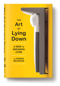
The-Art-of-Lying-Down-209x300 _Christopher King


Christopher King will describe how to run an entire art department when you’re its only member, along with other lessons learned so far from a life in publishing—both in-house and outhouse. He is a graphic designer and illustrator. Formerly the art director of Melville House, he now operates an independent studio at the Pencil Factory in Brooklyn.


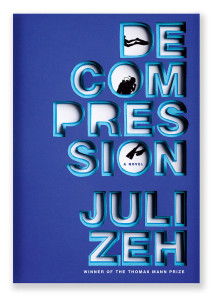
tdc_decompression__emily_mahon-221x300


A Philadelphia native, Emily Mahon studied Graphic Design and Spanish at Penn State before making her way to New York. She became an Art Director at Doubleday in 2006. Emily will talk about her process, collaborations, current publishing trends, and inspiration for her recent work.


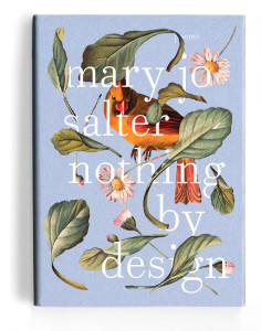
tdc_Booher_NothingbyDesign-236x300


Jason Booher will reveal the secrets of his design, his failures, his love, and why he left the best design job in publishing. Jason has been designing book covers for 8 years, mostly at Knopf. He is now the art director of Blue Rider Press. He also teaches at Parsons School for Design.

Editor: Katarzyna Gruda