Bottle Project

In our Process and Skills class we just recently wrapped up our 4-week Bottle Project, focused on coinciding or contrasting themes.

Initially we had to start off by putting together 50 thumbnail sketches of what idea we would like to have and I can confidently say that the large majority of my sketches were absolutely ridiculous and infantile. However, this allowed me to get the silly ideas out of my system and focus on those that were more interesting. I ended up deciding on “Nature vs. Nurture.” My idea was to create a curved DNA band with beads and a curved band to represent nature (flowers, leaves etc.) to intertwine to the DNA to reflect how much both pieces take part in a person.


Next I set out to get my materials and start putting the project together… yarn, wire and glue, and then thicker wire, then shiny beads, then some more yarn, then decided to go with thread, then gold wire–too thin-then bought some shiny round things don’t know what they are–too small-glue didn’t stick so decided to go with the glue gun- ran out of sticks-bought more- tried to paint the shiny beads-CATASTROPHE-beads all over my living room floor-paint won’t dry-paint all over my hands-super glue won’t come off-decided I might need to change up my game plan for the DNA-on the other side the yarn was too unrealistic for the greenery so-went to Central Park-discretely took some leaves, berries and branches-hope no one saw…- Back to the DNA: tried finding wood beads-sold out-tried another store-wrong size-tried online-will arrive in February from China…eventually found a store that carried them and successfully completed the DNA! As for the greens, I took the making a wreath approach and added little by little real greens to heavy wire and twisted it to look like DNA..not too bad!  Took about a million tries and a ton of visits to the store, but it all eventually came together and I am happy with the final result of the project.

bottles_blog

The art of starting over:

Or why Parsons totally owes me a manicure.

My photo book is actually a collection of “records” acting pages and which are bound by an LP sleeve.

My original intent was to create a full sized 33rd record book—a.k.a  12-inch diameter book. However, confronted with design challenges posed by an off line vinyl sticker printer in the Parson’s Art, Media, and Technology lab, I was forced to resize to a paper size accommodated by sticker paper manufacturers. The design was modified again post-critique and goo-goned to Hell and back in order to make refinements and (hopefully) take advantage of the AMT lab vinyl printer.

unnamed-1
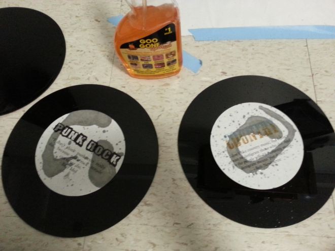
At the moment my pages are soaking in a bucket of 1-part water to 2-parts isopropyl alcohol in the hope that someday they won’t smell and feel like orange goo-gone. They soak while I blog and file down the finger stumps I am left with after picking off 18 stickers!

unnamed
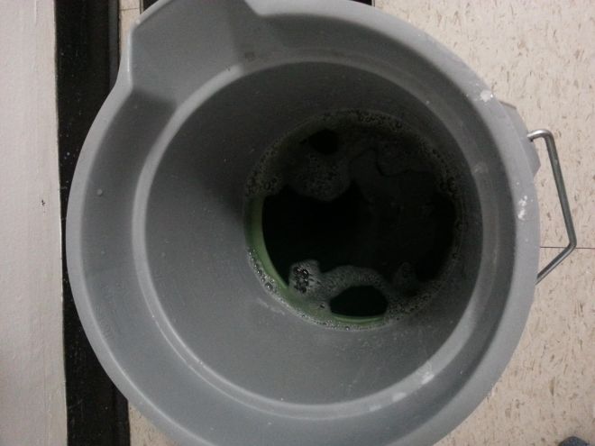
As much as I was less than enthusiastic about starting over I did learn a lot about my process as a designer.  I suffer from a tendency to plow ahead without thinking fully about the final product.  Or rather, I know what the ideal final product would be in my head but occasionally fail to think through the steps to get there.  I believe that, having worked out in the ‘real world’ for a number of years before returning to school I have been trained to work to completion, if not perfection–and I am seeing this across all my classes.

Definitely a habit that is…almost broken by this class.

BUT, now that the Parsons AMT lab vinyl printer is back in business,  I am thrilled to refine the project!

My Neighbor’s a Rat: Project #2 – Photo Collage

To be quite honest, the words “our art book is going to be replaced with…” coming out of Carmile’s mouth brought tears to my eyes (internally), until hearing the rest of the sentence and the assignment. Photo collages are something I’ve always been interested in and drawn to, but I’ve never taken the time to complete one, so I was pretty psyched about this project from the start.

The backside of my building (which I guess is a “city park” of some sort) is an interesting place. It’s filled with bags and bags of bottles, a few shopping carts, too many rats, a highway, and a makeshift basketball hoop straight out of Home Depot. Every time I decide to climb through the fence—which is the doorway—I find myself taking way too many photos, so I knew this was a perfect subject for my collage.

“Always live in the ugliest house on the street – then you don’t have to look at it.” – David Hockney

hoop

IMG_6354

Clocked In: Project #1 – Self Poster

For our first project, we were instructed to design a black & white self-poster out of nothing more than a black and white photograph (taken in a photo booth), some found typography, and a photocopier.Photobooth_DW

The Beginning

After roaming from bar to bar looking for an “old fashioned” photo booth—and
consuming one too many beers—I finally discovered one at the Bushwick Country Club. Since my inspiration was the song “Clocked In” by Black Flag and a wanted poster, I knew exactly how to position myself before entering the booth.

FaIMG_20150914_0001st forward a few days—as I was walking by Strand on my way home from work, a book titled ‘The Women of The Wild West” caught my eye. I knew that this would be a great choice for my type since it fit the theme of my poster perfectly. All it needed was some scissors and a lighter (see my final poster below).

The Poster

I envisioned the type to be front and center like a traditional wanted poster you’d see in the wild west, combined with the feel of one of my favorite poster styles of all time–70/80’s punk. To add in some sense of eeriness, I decided to include two images and flip one over so the viewer feels like someone is staring at them. And not in a cute spiderman way.

After a few rounds of critiquing and a lot of great feedback from Carmile and my classmates, my poster turned out exactly how I wanted it to.

First Round DraftSecond Round DraftFinal Version

Self Portrait Poster

I really enjoyed seeing the process of each poster of my classroom, they all developed in a great way, having creative and amazing final results.

It was a hard task because the project had many limitations but that makes you be more creative and explore elements and techniques you would never do.

I discovered that research plays an important role in the process of design.

This are my three posters, so you can see my process.


Edit
Posters (left to right): First, Second and the Final.

Process&Skills The Substructure of All

Clear enough, the experience in Process&Skills with Professor Gruda and talented classmates was a substructure of everything. Due to my situation I was taking this Process&Skills and other advanced classes in this semester. Some of those advanced classes were to be supposed to take in the very last semester. I was being lost, struggling, frustrating in those classes. Yet I figured out everything I needed to resolve difficulties in advanced classes was taught in this Process&Skills.

Process of establishing concept, process of production, knowledge of material, places to go, research for inspiration, how to distill essence from research, photography, bookbinding… I realize I learned so many things that I cannot list up. Also I experienced having fun with art and design which is most important for me. Thank you everyone for incentive semester.

Production in Fall 2014

Self Portrait Poster

Well, I know we were supposed to post these posters at the beginning of the semester, but I’d like to point out that it’s already a bit of a challenge to present a (in some cases, poster-size) picture of yourself in front of a classroom where the majority of the people are strangers and then talk about how it’s art. Second of all, it’s even more disconcerting to place said poster online for more Parsons fellows (also strangers mostly) to view and then try to say something meaningful. Moving on: I used a photocopier to blow up the size of my face and it was definitely scary. Once I started pasting things on foam core, the voice in my head was saying, “Who the hell are you to enlarge your face over 400%?” “Are you some famous rock star?” “The nerve.” But we made our likenesses into art. All of us. And maybe that’s the way we broke the ice in our classroom, however awkwardly.

And that goes for blogging, too. We’ve been “reminded” repeatedly to visit this blog and post and comment, but that, too, proves intimidating. Who are the people on this blog? What is the purpose? Why is this important? Process and Skills has a blog?… but why? I agree it’s a great resource, but students should blog because they WANT to communicate and not because they are forced to. Happy Critiques, All!

SelfPoster1_KChinh

Book Project

My original book idea was grid, focusing on the grids in the city. However, as I went on taking photos for the book, I realized that the idea of grid is very limiting. Like grids, everything and everyone in the city are expected to play a certain role which they’re restrained by. As a result, I decided to get out of the grids and do something completely freeing.

Cover for the Book: 7″x7″ painted newsprint covered carboard

IMG_5384

Inside of the pages.

IMG_5316

IMG_5385

Details

IMG_5386

I also did another book on old family photos with similar materials.

Cover for the second book

IMG_5387

Inside pages:

IMG_5388

IMG_5389

IMG_5390

By Flora

Poster Project

Amanda Blake - Final Self Poster

I wanted to be sure to share my final self self poster. After several revisions, I pared my photo booth strip down to one strong image accented by simple, sans serif type. I cropped and enlarged “A,” my first initial, and explored viewing typography as shapes. While I struggled through the process of this first project (it was an adjustment to create enlargements and compositions by hand rather than the computer) I’m pleased that the final project conveyed an attitude that was “strong, direct– no nonsense.”