The Bottle Project

The bottle project assignment required us to demonstrate using two plastic bottles. The bottles were used to exhibit and bring two matching or opposing words to life. This demonstration could be displayed in any possible way, there were no restrictions. I decided to use science to illustrate my ideas and concepts, and to engage the viewer further more through live experiments conducted on the bottles.

 We were asked to create 50 thumbnail sketches of our ideas and concepts. The bottles represented two words that had some sort of relationship (antonyms, synonyms, etc.)

The final three selections I went with were:

Calm v/s Excited

Construct v/s Deconstruct

Social v/s Antisocial 


  1. Calm v/s Excited (or hyper)

‘Calm’ was extremely easy to display. I had diluted coke in one bottle with no fizz. Diet coke + Mentos did the trick to demonstrate the word ‘excited’ in the other bottle. When diet coke was put into a newly poured bottle of diet coke it immediately fizzes up due to the carbon dioxide produced by the mixture, this gives it a feeling of being hyper or excited. Unfortunately I’m having difficulty in embedding videos or uploading pictures so I am adding links. Hope it works!

Click here to view.

2. Construct v/s Deconstruct

I used two balloons, some vinegar, and Eno powder for this one. The balloons were attached to the nozzle of the bottles and as soon as the powder was poured into the vinegar the balloons began to inflate. While both the balloons inflated, I poked a hole in one of them to demonstrate the words “construct” and deconstruct” at the same time.

This was the end result of the experiment.

3. Social v/s antisocial

This was so much of fun to work with, but yet the most hands on experiment. After plenty of trial and errors did I finally get it right. The social bottle was extremely easy to show. I mixed water, food colouring, Savalon. All these were soluble liquids that blended well to illustrate the definition of the word “social”.

“Anti-social” was a bit tricky to do. After three trials I finally accomplished what I had initially aimed to do. I used immiscible liquids for this one, there was vegetable oil, water, milk, and maple syrup. Due to their various densities they all settled as separate layers instead of mixing as one. 
Passport Photo Essay

The Photo Essay was a lot of fun to make.  I had started out by continuing what I had put together for the photo collage, and using some of the same pictures.  For my photo collage, I had taken a lot of pictures of New Orleans as that was where I was going to go for looking at wedding venues the week prior.  I had taken those photos and thought of maybe making a passport booklet with them as I was traveling from New York to NOLA for this big event and the photos were going to be really fun and vibrant.  The collection of photos were fun but I was also hoping to take more and obviously I had left the state with only so many already taken.  I focused on practicing how to make books first.  The result of which can be found here.

The following week I was heading into NYC to look at dresses, I currently live on Long Island.  While shopping for them was going to take up a lot of time, I decided that maybe the second half of my passport could contain a lot of pictures from New York.  I could have some from my hometown, some from the city, and some from New Orleans which would fill up my book nicely and would work with the idea of a traveling passport.  I took a lot of those pictures out and printed them and put them on boards next to each other so that I could decide which ones I really want to work with. The result of that can be found here.

The next steps were putting all the pages together in a way that made sense with quotes to back them up.  I spent a lot of time researching good quotes on both locations, and thought I came up with a decent amount of quotes that outlined why I loved both places.  While also looking at many of the photos that I could choose from, I took my teacher’s suggest and decided that this would be a flip book that once you got to the center, you could flip around.  The New Orleans section would go one way and you would flip the  passport over for New York to go another way.  I really liked the idea, so when creating the basic first outline, I went for different typography, and other factors to help differentiate the locations.  The first draft of that can be found here.

The second draft of the passport can be found right here.  I did my best to try and plot out my first attack of how the pages would need to be printed in order for it to make sense with the flipping of the book.  A task that I would later find out was somehow still off and the only way to fix it was to print out a couple of first copies to see how and where the images went.  I also picked up what looked like nice blue paper for the cover and inside that reminded me of a passport’s colors.  I decided to work with the initial stitching we were taught as that is how I found out that passports are put together.  All of those I put in the next round of the draft to see how it was going.

The last and final piece of putting this passport together can be found here in a little video that I created. I also posted it again here with a slightly higher resolution. I worked on the typography a bit adding more spacing, and making sure the ascenders and descenders worked and weren’t touching, as well as giving the authors of the quotes an identical size and type.  The cover was also posted with stamps from both locations to give it a nice passport feel to it.  I really liked the result.  It was actually something that I found to be really nice to have personally as they were big trips that were put together.  The images came out really nice and clear, and even though some paper was used to figure out the coordination of the two different locations, in the end it was really fun.  It made me want to go out and make a couple more of them!

Bottle Project

The bottle project was a lot of fun to put together.  The idea of creating 50 thumbnails originally scared me, but then as I got to it, I had a really good time creating new ideas for word pairings.  I have attached the original 50 thumbnails here to take a look at.  I hope this website link works as unfortunately I can’t seem to upload any files or pictures currently.

50 Sketches

After I was finished putting the sketches together, we narrowed down the choices to three that I was going to reach further into.  I chose Death and Taxes, Trapped versus Freedom, and Inner versus Outer.  There were many fun combinations that I had put together, but these three really allowed me to deconstruct the bottle as well as come up with many solutions for the words. I saw the most promise in those three, so I created multiple sketches for each one.  Those solutions can be found right here.

When it came to selecting what materials to use and which one of those final sketches I could put together, I decided on Death and Taxes.  I wasn’t quite sure if I was going to rip open the bottle completely or if I was going to put a skull in the middle for the Death bottle, so I started with the tax bottle. My teacher had said that she liked the idea of the mailbox for the taxes bottle, so I went ahead and created an actual mailbox.  I had the mailbox as an outside entity at first but then decided to use the bottle, turn it over on its side and make it.  Inside the mailbox was an envelope that I stuck inside, with a sticky note on it saying April 15th.  I then took a red piece of paper and stuck it on the outside in the shape of the flag you see on a mailbox.  I thought the design looked pretty nice, but then went back to how to create death.

For the Death bottle, I surfed the internet for something to spark my mind, and had the hardest time finding something I wanted to pursue. I then came across this idea for a hologram that you can make, so I went around to articles and videos on how to do that.  I cut the bottle open, removing the cap and the bottle neck.  I then took the rest of the bottle and cut it up so that it became almost an upside pyramid.   I put a couple of those sticky notes saying April 15th on the outside and then placed the bottle on to my iPad, which had four rotating skulls on all sides of the bottle.  The result of doing that, was that now they are reflected to the center and created what looked like a hologram.  I like the fact that the mail comes usually during the day, and then for the death bottle, you had to turn the light off for the full effect, giving it a nice contrasting pair.  The result of those bottles, which contains videos as well can be seen here and here.


TIME Picks the Best Magazine Covers of 2015

By David Schonauer   Thursday December 17, 2015

Magazines fired back with photography in 2015.

“Today we continue our look back at the year that was by featuring Time magazine’s choice of the best magazine covers the year.  “Our selection of the top 10 covers of 2015 displays an exquisite use of photography, notes Time Director of Photography and Visual Enterprise Kira Pollack.

Her staff compiled its list after looking at a range of magazine categories, from news and sports to celebrity and fashion, and then interviewing the people behind the covers, including photographers, creative directors and top editors…”

Read and See More at AMERICAN PHOTOGRAPHY’s site: http://www.ai-ap.com/publications/article/16143/the-year-that-was-time-picks-the-best-magazine-co.html

Better Late Than Never!

I didn’t stay on top of documenting my projects through the blog throughout the semester, so I thought the portfolio I put together would be a good way to show what I worked on this semester – basically this is like 4 or 5 blog posts for the price of one!

Here’s a link to the portfolio.

I think the photo essay book was my favorite, even though it was the one that almost made me cry! I really felt like the hard work (and it felt sometimes like a lot of work!) paid off and I am very proud of the finished product. Also, any excuse to eat Raffetto’s ravioli is fine with me.

My biggest takeaway from this class was needing to be patient about the process and realizing that you might hit a lot of dead ends before getting to what works. Each of those dead ends might involve a ton of time and effort, but you need to move on and try other things out if it’s not coming together. Definitely a valuable lesson for future work!


A Tantalizing, Mysterious Art Book (Or Is It Book Art?)

Yes, here I am again blogging about a new book.

I saw this The New York Times on line review. The timing is perfect for all our exploration into book designing from photo essays to art books.

“The artist’s book, a medium that originated in France at the turn of the last century, gets a digitally inspired reboot with “RadioPaper,” a project launching today at Studio Leigh in Hoxton, East London.Taking its title from the electronic paper that replicates the physical page in Kindles and other e-readers, the exhibition provides a showcase for the debut book work by the British artist Mary Ramsden, which will also be available to buy in an edition of 30. Framed in fluorescent-edged Perspex boxes, each of the copies of “RadioPaper” contains a series of abstract artworks by Ramsden, and perhaps more surprisingly, submerged within their French folds, five specially composed super-short stories by the Granta award-winning novelist Adam Thirlwell…” Read more of Aimee Farrell’s article published on December 12, 2015

See Image: A page in “RadioPaper,” a new collaborative artist’s book by the artist Mary Ramsden and the novelist Adam Thirlwell.CreditCourtesy of the artists and Studio Leigh

AAS GD Type Meet up

Throughout the month of November and into the first week of December, I attended two out of the six AAS GD Type Meet up Peer Led Sessions. I met the lovely Lauren Peters-Collaer who is a third semester AAS GD student that will be graduating later this month. Since I was usually the only person there, the sessions were based around what I wanted to learn and work on. Lauren would always have some sort of activity/workshop planned and we would start from there. She is a great mentor that introduced me to many different resources such as: Fonts in UseType Wolf, and Typographic Posters.

Check out this animated video called Word As Image by Ji Lee and try creating your own!

She also introduced me to two typography based summer courses that would be worth checking out from SVA. If you are looking for something to do over the summer, you may want to check these out: Typography as Language and Masters Workshop. Typography as Language is a one month program that is based in New York. Masters Workshop is a two-week program that is in Italy. These sessions are taught by different guest lecturers.

For those that are interested in typography should definitely attend these sessions! Hopefully more will be scheduled soon.

“Before” and “After”: Bottle Project

The Bottle project requirements were very simple:  take two Fiji bottles, along with two related concepts, and produce a design piece portraying those concepts.  Other than the Fiji bottles, the materials were up to us.  However, as anyone in art/design fields might agree, unlimited materials, unlimited possibilities, can be quite overwhelming in the early developmental phases of a project.  This was definitely the case with me–it took awhile to develop a solid concept for my bottles, and a few tried-and-failed experiments.

After the initial brainstorming with 50 thumbnails of various ideas for the bottles, I was still baffled as to what I was going to do.  My ideas were silly, or would be impossible to implement, or were just plain bad.  The best idea I came up with in that first round revolved around the words “nervous” and “excited”…I would reshape the bottles as best as I could to look like stomachs, tint them slightly pink, and fill one with butterflies suspended on string, and the other with a mess of knots.  It wasn’t a great idea, but I made myself work through it anyway to see what would come of it.

To reshape the bottles, I tried to melt them in the oven  (the things we do for art).  At first, I put them in without the caps on…and nothing happened.  On high heat for around 40 minutes, the bottles really didn’t change shape. Then, for some reason, I put them in with their caps on, to see what would happen.  Then, believe it or not, the bottles shrunk…and the normally square shape of the Fiji bottles became round.

I then tried putting in the butterflies and knots to see how my bottles looked, and just as I expected, they looked juvenile.  At this point I decided to rework my idea and shoot for a new concept, beyond what was in my fifty thumbnails.  Professor Zaino encouraged me to make a larger concept out of my two choice words.  I also decided to give myself an additional limitation to push against, to avoid multiple trips to the store and far too much wasted money as I worked through and re-worked my ideas.  I challenged myself to make my project as cheaply as possible.

The new idea, after that, came surprisingly quickly.  I decided that my new bottles would represent the words “before” and “after,” and my larger concept would make a commentary on environmental issues.  I decided to make one bottle as if it were a birthday piñata: covered in paper maché, and then green, blue, and brown crepe paper to represent the main colors of the earth .  My second bottle would be filled with trash.  As luck would have it, I was able to use one of my shrunken, melted bottles from my previous experiment to fill with trash and then place inside the colorful piñata bottle.  I also constructed a small bat covered in brown crepe paper as well.

So here we have it: a bottle made to look like a birthday piñata, representing the earth, alongside a bat.  When the piñata is opened, rather than candy and sweets, we find garbage.  Before pollution, and after pollution.  My idea to make this cheaply/with limited materials definitely worked with my concept as well!  Although it took a little while to get my final idea, I’m glad I had to work through the earlier ones.  Without my previous mistakes, I would not have known how to fit one Fiji bottle inside another!

(Currently unable to post any photos, will do so when possible)

Project #3 – Photo Essay

Since I grew up with a father who was a firefighter in Ohio for 25 years, I’ve visited a firehouse or twelve in my day. There they are—their own separate entities—normally free from sharing walls with any other business or buildings. Sometimes in the middle of nowhere, and sometimes in an urban area, but still standing free. I figured this is just how it was until I moved to New York City in May of 2010 and basically lived above a ladder company.

To showcase these firehouses to those who live outside of New York City, I chose to have this be the topic of my photo essay. My main goal was to give my book the feel of some sort of walking tour, where the leader goes from firehouse to firehouse across both Brooklyn and Manhattan. I even stopped along to way to take photos of the more overlooked markings of the NYFD—cones, fire hydrants, trucks parked on the street, etc.

First Half of Book
Second Half of Book

Bottle Project

In our Process and Skills class we just recently wrapped up our 4-week Bottle Project, focused on coinciding or contrasting themes.

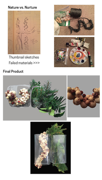
Initially we had to start off by putting together 50 thumbnail sketches of what idea we would like to have and I can confidently say that the large majority of my sketches were absolutely ridiculous and infantile. However, this allowed me to get the silly ideas out of my system and focus on those that were more interesting. I ended up deciding on “Nature vs. Nurture.” My idea was to create a curved DNA band with beads and a curved band to represent nature (flowers, leaves etc.) to intertwine to the DNA to reflect how much both pieces take part in a person.


Next I set out to get my materials and start putting the project together… yarn, wire and glue, and then thicker wire, then shiny beads, then some more yarn, then decided to go with thread, then gold wire–too thin-then bought some shiny round things don’t know what they are–too small-glue didn’t stick so decided to go with the glue gun- ran out of sticks-bought more- tried to paint the shiny beads-CATASTROPHE-beads all over my living room floor-paint won’t dry-paint all over my hands-super glue won’t come off-decided I might need to change up my game plan for the DNA-on the other side the yarn was too unrealistic for the greenery so-went to Central Park-discretely took some leaves, berries and branches-hope no one saw…- Back to the DNA: tried finding wood beads-sold out-tried another store-wrong size-tried online-will arrive in February from China…eventually found a store that carried them and successfully completed the DNA! As for the greens, I took the making a wreath approach and added little by little real greens to heavy wire and twisted it to look like DNA..not too bad!  Took about a million tries and a ton of visits to the store, but it all eventually came together and I am happy with the final result of the project.

bottles_blog