Museum Project: Nasreen Mohamedi

First of all, I loved this project. I was hoping get to create a graphic identity for something this semester, as a first stab at making something “portfolio worthy,” and this project offered a challenging and engaging opportunity to do so.

The exhibit I chose to work with was the Nasreen Mohamedi retrospective at The Met Breuer. Prior to visiting the museum to check out what they had done with the old Whitney space, I had never heard of Mohamedi, but ended up being so inspired that I purchased the exhibit book and went back multiple times. Her work, while minimalistic and very reduced, primarily consisting of ink and graphite lines on paper, contains multitudes.

As inspired as I was by Mohamedi’s work, coming up with a cohesive idea for an integrated exhibit identity proved more challenging than anticipated. The fine graphite lines do not lend themselves well to photo reproduction / scanning, and most of the drawings are on a paper with a slightly sepia toned ground that looked jarring and out of place on white paper. She also did not use color, at all, so I wasn’t presented with very many obvious options PMS color-wise.

In the face of these limitations, I decided to research more about Mohamedi’s process and inspirations to see if I could draw some inspiration of my own there. I found through various readings that she was very fascinated with light and dark, and the interplay of shadows on surfaces. Her studio / living quarters were starkly bare, almost empty, with large windows, and she would draw sitting on the floor for hours, observing the different angles upon which shadows fell on the walls and floor. Much of her work also dealt with vanishing points, like the horizon line on the ocean. I decided to try to create a sort of typographic image using Mohamedi’s name and employing the ideas of light / dark contrast and the lines approaching points in the distance.

I chose Antique as my typeface for the project. I felt a sans serif was appropriate, seeing as how Mohamedi’s work is so modernist and clean. I liked that Antique only has one weight, as this forced me to create a very clear hierarchy only using type size, color, and arrangement. I created a text block out of Mohamedi’s name and bisected it with white bands of varying widths, to evoke the linear quality of her primary works. I used this text block image on the cover of the folded brochure, the mailer, and a modified version of it on my poster. I wanted to create exhibit pieces that seemed very industrial and mass-market, nothing one-off or precious seemed appropriate given the austere (yet beautiful) quality of  Mohamedi’s art. For my PMS color, I ended up using the same red as the Met Breuer logo. I initially thought to try a deep indigo / blue color to evoke the ocean that gave Mohamedi so much inspiration, but found it didn’t create enough of a contrast with the black and white.

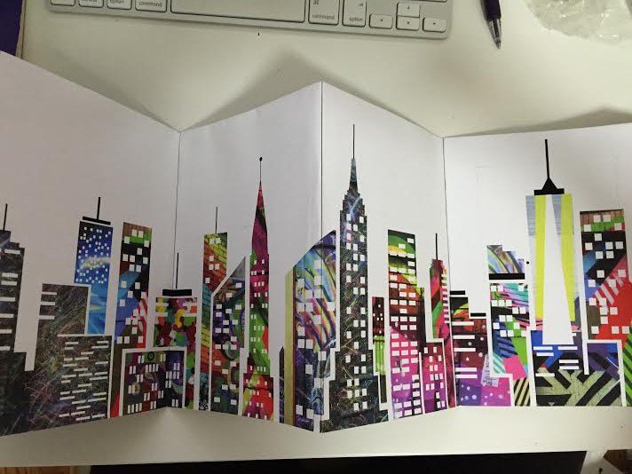
I struggled a bit with the mailer, as I don’t think I really did enough front-end research here. I conceptualized it as more of an invite that comes in an envelope, but I do plan on revisiting this project and perhaps changing the format and layout of that item. I liked how my brochure came out, but I do think I can also tweak the layout of that, specifically where the “M” diagonal lines get chopped off in the margin, and the images that are bisected by the lines. All in all, I was happy with the way this project turned out and I think I was successful in creating a memorable graphic identity that ended itself well to the various formats of the printed materials, and look forward to going back and polishing it up in the future!

Link to photos


Pallet Magazine: What a Beauty

Are you a fan of both drinking and beautiful print magazines filled with everything from Breaking Bad-inspired label artwork to the history of Zamrock? Of course you are, so I hiiiiighly recommend picking up issue one of Pallet Magazine—a brand spankin’ new print quarterly magazine that is a collaborative effort between Dogfish Head Founder, Sam Calagione, and the founding editors of Smith Journal, an Australian men’s quarterly. I’m not one of their sales people, I promise. Much like Calagione, I’ve never read a book or magazine on a tablet or mobile device, so I also appreciate the little things like deluxe uncoated stock.

If anyone is still working on their photo essay and needs some inspiration, you should head down to any of these places in NYC to pick up a copy. Eataly has a bunch of them on a rack by the front door if you’re in the Flatiron area. There’s a great photo essay on America’s big rig trucking culture that you should check out. Enjoy!

New York Books for Your Coffee Table or Your Coffee Break

As you know by now about my blogging on the latest and the greatest… I love books. I took a stroll after Thanksgiving dinner and that stroll led me right to The Strand on Broadway & 12th St. NYC. BUT – I am on a book fasting diet (for now). I woke up this morning and found myself in front of my computer reading my New York Times alerts. One alert was about books. The topic, New York!

Many of your photo essays focused on New York as the subject from firehouses to the subway to the people. The book list is as varied as your essays.

29jpBOOKSHELFSUB-master675-v2

Coffee table books about New York.

Credit Tony Cenicola | The New York Times

Here are a few of the title but take a look at the article,too. You may find a topic (or topics) you want to dive into a bit more.

• “Interior Landmarks: Treasures of New York” (The New York School of Interior Design, the Monacelli Press; $60), by Judith Gura and Kate Wood

• “Graffiti Murals: Exploring the Impacts of Street Art”(Schiffer Publishing; $29.99), Patrick Verel embraces the vibrant collaboration with building owners to ward off vandalism and vapidity.

• From Andy Warhol’s house to Keith Haring’s Pop Shop, “Unforgotten New York” redeems its subtitle: “Legendary Spaces of the 20th-Century Avant-Garde” (Presetel; $39.95).

• As sylvan escape or jostling playground, Central Park has inspired painters from Milton Avery to William Zorach. Robert F. Pasquier explores New York’s premier oasis through their prism in “Painting Central Park”(the Vendome Press; $60), an evocative visual festival.

http://www.nytimes.com/2015/11/29/nyregion/coffee-table-books-about-new-york.html?emc=edit_tnt_20151126&nlid=66721447&tntemail0=y&_r=0

What? Two Bottles? Start Looking Sideways…

Always roaming in and out of book stores and on book sites, a few years ago I saw the book The Art of Looking Sideways by Alan Fletcher. I thought – what a visual feast. In some ways it reminded me of Bruno Munari’s book Design as Art. (BUT – not in size). The Art of Looking Sideways has over 500 pages.

The Art of Looking Sideways by Alan Fletcher publish by Phaidon Press in 2001.
The Art of Looking Sideways by Alan Fletcher
publish by Phaidon Press in 2001.

This book contemplated the differences between pictures as words – and vice versa. As Alan Fletcher states “the pleasing incongruities and serious science behind perception, process and the imagination that fills in the gaps”. A perfect book to review as we start exploring creative solutions to our bottle project.

Fletcher doesn’t set out to teach lessons. It is more of his experiences and insight that he gathered by – well – just being there and absorbing the world around him.

Here is a series of spreads from

The Art of Looking Sideways by Alan Fletcher:

A spread from The Art of Looking Sideways by Alan Fletcher

A spread from The Art of Looking Sideways by Alan Fletcher

6

8

The Art of Looking is wonderful inspiration to visual awareness, an interesting compilation that will entertain and inspire all of you as you start to SEE the interplay between word and image.

• Here is a link to an interesting interview with Alan Fletcher:

https://www.youtube.com/watch?v=meKUDU0sH5w

• Here is a link to The Art Directors Club Hall of Fame page for BIO info.

http://adcglobal.org/hall-of-fame/alan-fletcher/

NOTE: more on Bruno Munari’s book Design as Art from Google Books: https://books.google.com/books?id=fIJjI0UC7AEC&printsec=frontcover&dq=amazon+Bruno+Munari’s+book+Design+as+Art.&hl=en&sa=X&ved=0CDAQ6AEwAGoVChMIzabT9uyIyQIVxT4-Ch3IzgA_#v=onepage&q&f=false

Cover for Design as Art By Bruno Munari (paperback).

Find past Munari posts about his books on this blog.

Visually Defining The Gender Spectrum

From The New York Times web site | STYLE Section | In All-Genger Restrooms, the Signs Reflect the Times | By Aimee Lee Ball | November 5,2015

Top, from left, all-gender restrooms at the Whitney; the University of Utah; Founding Farmers restaurant in Washington, D.C. Center, from left, the Folk Art Museum; Civic Hall; the University of Nevada. Bottom, from left, the Whitney; Hampshire College; Barnard College.
Top, from left, all-gender restrooms at the Whitney; the University of Utah; Founding Farmers restaurant in Washington, D.C.
Center, from left, the Folk Art Museum; Civic Hall; the University of Nevada.
Bottom, from left, the Whitney; Hampshire College; Barnard College.

…”Before the Whitney Museum of American Art moved to its new location in Lower Manhattan, it hosted a discussion about what it means for a museum to be a safe and welcoming space.

Providing restrooms for everyone on the gender spectrum was near the top of the list.

Read more: http://www.nytimes.com/2015/11/08/style/transgender-restroom-all-gender.html?hp&action=click&pgtype=Homepage&module=mini-moth&region=top-stories-below&WT.nav=top-stories-below&_r=0

Landmarks in the History of Photography | From TASCHEN BOOKS

A new publication to be released this month from Taschen Books.
A new publication to be released this month from Taschen Books.

50 Photo Icons | The Story Behind The Pictures by Hans-Michael Koetzle

“A meticulous analysis by an erudite historian.

Each shot is accompanied by a fascinating commentary.”— Le Monde, Paris

I saw this newly published book the other day at a friend’s home. Each photo, each essay, takes you to a different point in history. Each photographer becomes a visual historian – for our eyes to take in what they wanted to convey.

“Photographs have a strange and powerful way of shaping the way we see the world and influencing our perceptions of reality. To demonstrate the unique and profound influence on culture and society that photographs have, Photo Icons puts the most important landmarks in the history of photography under the microscope.

A spread from the book of photographer Bert Stern's images of Marilyn Monroe.
A spread from the book of photographer Bert Stern’s images of Marilyn Monroe.
VietNam_Outskirts of Trang Bang
Outskirts of Trang Bang | VietNam

Each chapter of this special edition focuses on a single image which is described and analyzed in detail, in aesthetic, historical, and artistic contexts. The book begins with the very first permanent images (Nicéphore Niépce’s 1827 eight-hour-exposure rooftop picture and Louis Daguerre’s famous 1839 street scene) and takes the reader up through the present day, via the avant-garde photography of the 1920s and works such as Dorothea Lange’s Migrant Mother (1936), Robert Doisneau’s Kiss in Front of City Hall (1950), and Martin Parr’s ’New European photography.” from TASCHEN |  See & Read more at their web site:

http://www.taschen.com/pages/en/catalogue/photography/all/44933/facts.50_photo_icons_the_story_behind_the_pictures.htm

Fashion photographer , Horst for Paris Vogue in the 1930's.
Fashion photographer, Horst P. Horst, for Paris Vogue in the 1930’s.

Availability: October 2015 | US$ 29.99 | Edition: English 

My Obsession. Books!

NO,not the latest from romantic queen of suspense, Nora Roberts or hot new memoir from the “it” celebrity.

Books on design,typography,photography,printmaking,pottery,illustration,sculpture,architecture…STOP!

I promise to stop walking into every,YES every, bookstore I pass.

I promise to stop reporting on the latest book review about the subjects I love.

WAIT! I saw a review in The New York Times so I want to share ONE MORE book find before I cross my heart to these promises.

The Ladies of Letterpress. This new book features the best work of the members of Ladies of Letterpress, an international organization that champions the work of women printers. And,it is a wonderful printing resourse.

This is what Amazon has to say about this $40 gallery of prints: “Valuable as a handy resource, it includes a wide range of pieces, from greeting cards to broadsides and posters, printed in a variety of type and illustration styles. Each piece is accompanied by details of paper, inks, and press used in its printing, and a profile of its printer. Whether you’re drawn to elegant greeting cards, humorous note cards, or calendars and posters, you’re sure to find inspiration in this volume. And when you do, there are eighty detachable pages just begging to be pinned up.”

For more info on this book and letterpress here are a few links from The New York Times and others: http://tmagazine.blogs.nytimes.com/2015/04/21/graduation-present-ladies-of-letterpress/?ref=design

http://www.papress.com/html/book.details.page.tpl?isbn=9781616892739

http://www.bremelopress.com

Book Info:
The Ladies of Letterpress
A Gallery of Prints with 80 Removable Posters
Jessica White, Kseniya Thomas
ISBN 9781616892739
Publication date 04/21/2015
11 x 14 inches (27.9 x 35.6 cm), Paperback
192 pages, 350 color illustrations
Missive's
Missive’s “Flamingo” by LisaWillis
Concrete Lace’s
Concrete Lace’s “Eating Seasonally” print by Katie Daniels
Joey Hannaford’s
Joey Hannaford’s “Converge II” by Joey Hannaford

Street Art Poster Essay & Street Book

The first part of the project was a photo essay.   We had to shoot a minimum of 75 photos and then narrow it down 12 photos and post it on a 15×20 illustration board.  The photos had to be printed and not altered.  My subject was street art in NYC.  I’ve always been fascinated and passionate about and NYC is the perfect place for that.  I think that street art is one of the most beautiful things about NY and also very misunderstood.  Even when I’m in a rush if I come across murals I will stop and stare.  This was a really interesting and exciting project to work on because it was very inspiring and fun.  So it didn’t seem like work, more like an adventure.  It was really exciting to find new pieces.  The photo essay was incredibly inspiring that I decided to carry it onto my next project where we had to make a book.

street-art-photo-essay-e1428076830892

From this essay I began working on my Street Art book.  The book had to be non-adhesive and 16 pages. I wanted to make a book inspired by the beautiful street art that  lives in our backyard.  Banksy said “People become cops to make the world a better place.  People become vandals to make the world a better looking place.”  This was a powerful quote that really aims at the misconceptions about street art.  I wanted to make a book that showed the beauty of street art, the beautiful colors, patterns and illustrations.  I started looking up different types of folded books and photo collages.   I decided to draw NYC city and then use the photos I had taken and clip them behind the buildings to build a colorful bright city with street art from all over the city.  Imagine a world with color. Because of this concept I decided to  go with an accordion fold where the book would open to a landscape of NYC.

unnamed-4unnamed-2unnamed-3unnamed-1

After all my research I had to go digital to create the city illustration and edit the photos.  I made several rounds of mockups. One issue that I came across in the beginning was that each image was gigantic and I had about 15 images and (I needed a total of 25-30 images) my file was already 3 gigabytes! (Yikes). Then I had to start over but luckily it was early in enough that I didn’t really panic.  Another issue I came across was how to make the images look cohesive with all these different patterns and colors.

unnamed-6unnamed-10unnamed-8unnamed-9unnamed-11

Some images that I really loved had to be take out because it didn’t go with the color palette.  I was a little bummed but I’m sure I’ll be able to use the images for other projects.  For the back pages  I included the actual images of the street art so whoever bought the book can put have a souvenir of the actual art piece.  After the  mockups and various versions it was time to fine tune the placement of each image which was incredibly gruesome but all worth it in the end and narrowing the images used.

And now the Final Piece!

unnamed-12

And folded (Front) & (Back)

unnamed-13unnamed-14

Cover

unnamed-16

I was happy with the way the piece turned out.  Even though the city was made up of so many different images it somehow remained cohesive and powerful.  The entire process was a great adventure and only fueled the fire for my love of street art.

Important & interesting article | A Legendary Redesign of Helvetica, Reborn After 30 Years

Wired_rectangle

Written by: Kyle Vanhemert for wired.com 04.07.15

If you have eyeballs, you’ve almost certainly seen Helvetica. It’s one of the most widely used typefaces ever created, so popular that it generated a documentary examining its popularity. It’s almost equally certain that you have not seen Haas Unica, the typeface designed to be Helvetica’s sequel of sorts. Introduced in 1980, it was lost to history almost instantly upon its arrival.

Now, after languishing in obscurity for decades, Unica has been rescued and remastered. Thanks to an effort by Monotype designer Toshi Omagari, the legendary typeface is finally available as Neue Haas Unica, an 18-font family tuned-up for the digital age. Drawn to be legible at small sizes, it could be a perfect Helvetica-substitute for user interfaces and other on-screen text elements. For designers, though, the new Unica is an exciting visitor from the past. As Pentagram partner J. Abbott Miller puts it, “There is a Rip van Winkle quality of a font having woken up after 30 years of sleep.”

Helvetica_02-482x315
WIRED

A Stillborn Typeface

Helvetica was developed in 1957 by Swiss designer Max Miedinger. Designed as an update of the so-called “grotesque” typefaces developed in Germany in the late 19th Century, it was explosively popular, and by the mid-1970s, it had utterly transformed how the written word appeared throughout modern life. It was the de facto typeface for corporations of the day, employed by Knoll, BMW, American Airlines and hundreds of other companies. It brought a clear, modern look to magazine ads, subway signs, letterheads, and Presidential campaigns. As designer Michael Bierut once remarked, at the height of its popularity, Helvetica simply seemed elemental, like air, or gravity.

For people who scrutinize letters for a living, however, Helvetica’s ubiquity in the 1960s and 1970s offered a great many opportunities to notice its quirks. Designed for short blasts of texts like headlines and advertisements, Helvetica didn’t always look great at small sizes or when used for lengthy blocks of text. And because it had been designed for the hot metal typesetting techniques prevalent in the 1950s, it hadn’t translated perfectly to the phototypesetting process that became popular in the 1970s.

So, in 1974, Haas, the centuries-old Swiss type foundry that had introduced Helvetica in 1957, commissioned a Swiss design team called Team’77 to come up with a follow-up to the world’s most popular typeface. The group—André Gürtler, Erich Gschwind and Christian Mengelt—set out to create something native to phototypesetting that combined the best elements of Helvetica and Univers, another hugely popular sans-serif typeface of the day with a slightly more formal design. Team’77 was rigorous in its analysis of the parent typefaces and meticulous in creating their offshoot. It took them three years to complete the job.

By the time they finished Unica, however, Haas was going out of business. Further, the typographic world was on the verge of being rocked by another new technology: desktop publishing. The advent of personal computers, particularly the Macintosh, would make it possible to experiment with type in tremendous new ways. Phototypesetting, for which Unica had been designed, was quickly losing relevance. As a result, Unica got lost in the shuffle. “People didn’t get to see a lot of it,” says Monotype type director Dan Rhatigan. “It was almost a stillbirth.”

Unica, Found

In the years that followed, Unica slipped into obscurity, accumulating a sort of mythology along the way. It had been digitized in the 1980s by another company—that also promptly folded. “Because it was released by companies who went out of business, there was kind of murkiness for a while about whether or not people could do anything with Unica, which I think added to its legend,” Rhatigan says.

NeueHaasUnicaSpecimen41-482x314
MONTYPE: Neue Haas Unica Specimen 41

In late 2012, Rhatigan was visiting Monotype’s outpost in Germany, which had previously been the office of storied typesetting outfit Mergenthaler Linotype Company. He was rooting around in storage, looking for old material, when he happened upon a box of tracing paper and transparent sheets. The transparent pages each had a single letter, crisp and clean and ten inches tall: The photographic film masters for Unica.

Rhatigan had been dimly aware of the typeface from postings on typography forums, and for a designer who wears his love of typography on his sleeves quite literally, in the form of tattoos of cherished letters, finding the fabled typeface was a thrill. “It was so exciting,” he says. “We tried to find out, does this really mean that we are free to do with this what we want?” A short investigation revealed: Yes, Monotype owned both the name and the rights.

Rhatigan showed the materials to Monotype designer Toshi Omagari, who quickly took up its resurrection as a side project. Omagari redrew the letters from scratch, following the intention of original design but fine-tuning the letters and spacing for modern, digital work. Omagari drew a number of different weights and languages. When he and Rhatigan would mention the project, people would invariably get excited.

“The cult aspect became more and more obvious as we talked to people about working on it,” Rhatigan says. “People knew about Unica. But since it wasn’t widely available, a lot of people did not have a chance to work with it and see if it was as good as the legend that had grown up around it. It really was this sort of lost treasure.”

NeueHaasUnicaSpecimen1-482x410
MONOTYPE: Neue Haas Unica Specimen 1

<small><strong>Editor: Katarzyna Gruda<small><strong>

Read the rest…

Jason Booher | AAS GD Faculty & Alumni is featured in AIGA article

A Graphic Designer on Why You Should Always Judge Books by Their Covers

 By
Margaret Rhodes
March 2, 2015

These days, the screen is king. So it’s a (delightful) surprise when designer Jason Booher says, with zero hesitation, that “being a book cover designer is possibly the best job in the world.” Booher is the art director of Blue Rider Press, one of Penguin Book’s imprints, and the mind behind many of its most inventive book covers.

Booher_Lord of the flies

It’s easy to see why Booher is so enamored of his profession. Novels naturally lend themselves to illustration, so coming up with the best solution for a few square inches of real estate must be an especially savory visual challenge for a designer. Booher is especially suited to the job. As a kid, he wanted to have a career as a high school English teacher, but when that didn’t pan out, he found his way to design by way of graphic novels. Then a lucky break landed him a stint at the art department at Penguin, and things came full circle. It became his job to read manuscripts and analyze them—for cover designs, not a captive lit class.The key to creating stellar covers, according to Booher, is to first throw out the tired adage about not judging books by them. “Graphic design is really about selling things,” he says. Lest that sound soulless, the good news here is that Booher is selling other people’s creative ideas. And while every book is unique, Booher says he starts by reading the six or so manuscripts he gets per season, and then mentally digests them all. “You read it, you try and find the soul of the book, something that makes it special, and make it come alive,” he says.

booher-nothing-by-design-cover

 Read the rest…