A Tantalizing, Mysterious Art Book (Or Is It Book Art?)

Yes, here I am again blogging about a new book.

I saw this The New York Times on line review. The timing is perfect for all our exploration into book designing from photo essays to art books.

“The artist’s book, a medium that originated in France at the turn of the last century, gets a digitally inspired reboot with “RadioPaper,” a project launching today at Studio Leigh in Hoxton, East London.Taking its title from the electronic paper that replicates the physical page in Kindles and other e-readers, the exhibition provides a showcase for the debut book work by the British artist Mary Ramsden, which will also be available to buy in an edition of 30. Framed in fluorescent-edged Perspex boxes, each of the copies of “RadioPaper” contains a series of abstract artworks by Ramsden, and perhaps more surprisingly, submerged within their French folds, five specially composed super-short stories by the Granta award-winning novelist Adam Thirlwell…” Read more of Aimee Farrell’s article published on December 12, 2015

See Image: A page in “RadioPaper,” a new collaborative artist’s book by the artist Mary Ramsden and the novelist Adam Thirlwell.CreditCourtesy of the artists and Studio Leigh

AAS GD Type Meet up

Throughout the month of November and into the first week of December, I attended two out of the six AAS GD Type Meet up Peer Led Sessions. I met the lovely Lauren Peters-Collaer who is a third semester AAS GD student that will be graduating later this month. Since I was usually the only person there, the sessions were based around what I wanted to learn and work on. Lauren would always have some sort of activity/workshop planned and we would start from there. She is a great mentor that introduced me to many different resources such as: Fonts in UseType Wolf, and Typographic Posters.

Check out this animated video called Word As Image by Ji Lee and try creating your own!

She also introduced me to two typography based summer courses that would be worth checking out from SVA. If you are looking for something to do over the summer, you may want to check these out: Typography as Language and Masters Workshop. Typography as Language is a one month program that is based in New York. Masters Workshop is a two-week program that is in Italy. These sessions are taught by different guest lecturers.

For those that are interested in typography should definitely attend these sessions! Hopefully more will be scheduled soon.

Photo Essay

My photo essay initial idea was to take photos of different perspectives that are different from our usual view. I wanted to play with bird’s eye view and also low angle perspectives, like what my dog would see. During my first few rounds of taking pictures, I brought my dog with my and included him in various shots.

Knowing that the photo essay would be later placed in a book; I decided to pay the Center for Book Arts a visit to get some inspiration on possible book layout and ideas. The visit was fun and I was able to see letterpress in action, but I still did not know what kind of binding I would use for my book. I was certain I wanted to bind and not fold an instant book though.

I kept exploring the internet to see what I could do and I came across a scrapbook idea that I really liked. By this point of reviewing and choosing pictures, the photo essay was shaping into a photo essay around Bentley, my bichon frise and poodle mix dog. It was becoming like “A day in the life of Bentley.” Although I love my dog to bits and pieces, reviewing my pictures again the week before it was due, I realized I wasn’t completely happy with what I had. I felt like I was beefing up the book with a lot of craft and that the story and pictures itself were not all that strong. I spoke to Carmile and showed her some of the shots that I really liked and she told me to take the week to go back to taking pictures.

This slideshow requires JavaScript.

At this point, I knew I had to work fast and work hard so I wouldn’t fall behind. I narrowed down 600+ pictures to 24 and sent contacts sheets to Carmile for feedback. Coincidentally, in my Typography class that week, we were starting our new project, a fun facts book so our professor actually brought in a bunch of samples of book mockups that she created and I saw the perfect layout for my subject! Remember how I said I really wanted to bind? Guess what, that changed. I opted for a folded instant book instead. I also created a sleeve for it and made the book reversible and can be folded both ways.

I’m actually quite happy with the final product, even though I didn’t get to bind. Production was painful though. It took approximately four 2-hour sessions at the AMT Lab plotter to be able to print the two documents the way I wanted it.

This slideshow requires JavaScript.


“Pacino”! Sells the Poster? Who Sells the Play?

29DOLLPOSTER1-blog427 “The advertising agency Serino/Coyne created a muscular poster design for the sex-and-power drama about a wealthy businessman (Mr. Pacino), his fiancée and a phone call that upends their lives. It’s a bold treatment that features the sinewy back of a pricey-looking jet, above. Mr. Pacino’s name and the show’s title are rendered in clean, oversize block letters that change colors as they overlap the jet’s tail”.

See five more sample designs (all rejected designs) as well as read more of the NY Times article about the design process to promote this Broadway show that is scheduled to open in February 2016.

SECTION: THEATER “China Doll”: An Image Ready for Take Off | The New York Times | November 25,2015 |

http://www.nytimes.com/2015/11/29/theater/selling-china-doll-the-art-of-choosing-the-art.html?ribbon-ad-idx=5&rref=arts/design&module=Ribbon&version=origin&region=Header&action=click&contentCollection=Art%20%26%20Design&pgtype=article Continue reading “Pacino”! Sells the Poster? Who Sells the Play?

New York Books for Your Coffee Table or Your Coffee Break

As you know by now about my blogging on the latest and the greatest… I love books. I took a stroll after Thanksgiving dinner and that stroll led me right to The Strand on Broadway & 12th St. NYC. BUT – I am on a book fasting diet (for now). I woke up this morning and found myself in front of my computer reading my New York Times alerts. One alert was about books. The topic, New York!

Many of your photo essays focused on New York as the subject from firehouses to the subway to the people. The book list is as varied as your essays.

29jpBOOKSHELFSUB-master675-v2

Coffee table books about New York.

Credit Tony Cenicola | The New York Times

Here are a few of the title but take a look at the article,too. You may find a topic (or topics) you want to dive into a bit more.

• “Interior Landmarks: Treasures of New York” (The New York School of Interior Design, the Monacelli Press; $60), by Judith Gura and Kate Wood

• “Graffiti Murals: Exploring the Impacts of Street Art”(Schiffer Publishing; $29.99), Patrick Verel embraces the vibrant collaboration with building owners to ward off vandalism and vapidity.

• From Andy Warhol’s house to Keith Haring’s Pop Shop, “Unforgotten New York” redeems its subtitle: “Legendary Spaces of the 20th-Century Avant-Garde” (Presetel; $39.95).

• As sylvan escape or jostling playground, Central Park has inspired painters from Milton Avery to William Zorach. Robert F. Pasquier explores New York’s premier oasis through their prism in “Painting Central Park”(the Vendome Press; $60), an evocative visual festival.

http://www.nytimes.com/2015/11/29/nyregion/coffee-table-books-about-new-york.html?emc=edit_tnt_20151126&nlid=66721447&tntemail0=y&_r=0

Why are these 32 symbols found in ancient caves all over Europe?

FROM TODAY’S TED TALK: Written language, the hallmark of human civilization, didn’t just suddenly appear one day. Thousands of years before the first fully developed writing systems, our ancestors scrawled geometric signs across the walls of the caves they sheltered in. Paleoanthropologist and rock art researcher Genevieve von Petzinger has studied and codified these ancient markings in caves across Europe. The uniformity of her findings suggest that graphic communication, and the ability to preserve and transmit messages beyond a single moment in time, may be much older than we think…

Paleoanthropologist and rock art researcher Genevieve von Petzinger studies the geometric signs found in early European Ice Age rock art sites. Full bio

Manhattan Street Performance: A Photo Essay

The process of developing my photo essay over the course of two months was an interesting one.  For worse or for better, very little of my original idea survived to the final stages of the process.

If this project taught me anything (in fact, it taught me many things), it is that sticking to your original vision of a final product can actually limit its development. As my Digital Layout professor KC Witherell says, “Don’t get married to an idea.”  This project, like all others at Parsons, put me to the test: could I gracefully allow my ideas and my work to change from my original vision?

When we were first assigned the project, I had my heart set on photographing the performers who jump on the subways and dance on the poles; I saw them everywhere I went during my first month in New York, and I thought that the way the performers affected the body language of the subway riders was very interesting.  People immediately cast their eyes to the floor, to the wall, anywhere but at the performers.  By betraying even the slightest hint of amusement or attention, it was as if the subway riders were entering into a contract with the performers: you must tip us.

Alas, the very day I decided to photograph the contrast between the performers’ body language and the subway riders’ body language was the last day I saw the subway performers until–get this–3 days after the final photo essay was due.  I spent the first weekend of the project riding around the city for hours until finally I decided to cast a wider net and photograph performers anywhere I found them, and any form I found them.  I photographed violinists, break dancers, saxophonists, children’s entertainers, bands; everyone I could find.  I tried to get close-ups of the performers’ faces and the spectators’ faces, looking for contrasts.

After the first critique with Michael Durham, former photojournalist at Life Magazine, it was decided that the close-ups weren’t really working, and in fact the most interesting photos were of the breakdancers.  Photos from days of photographing were discarded.

At that point, too, I needed to come up with a concept for the text that would accompany my photos when they were bound into my final book.  Luckily, with inspiration from Michael Durham, the idea to interview the breakdancers for my text came quickly, and the following week I went back to City Hall where I had initially seen the street performers to ask some questions.  After weeks of observing street performers, I had grown very curious about the lives they lead.

When I got to City Hall, I saw that many of the performers I had originally photographed were there again in the same spot, nearly a month later.  I watched a performance, took some photos, and then approached some of the men for an interview.  I am naturally shy, so the thought of choosing people as my subjects in the first place had been a bit nerve-racking; the thought of interviewing my subjects was even more so.  Ultimately, though, I’m so glad I chose to do these things for my work, because the results were so rewarding.  This is the work that I’m most proud of (so far) at Parsons.

With my photos taken and text written, I set about the task of laying out my book and then binding it.  This took some weeks of revision as well.  Some photos of my mock-ups:

This slideshow requires JavaScript.

I decided to make my book into a circle accordion.  That way, my book would fit neatly into a cover and could be pages through as an ordinary book, but could also be displayed in a circle to mimic a street performance: photographs of performers in the center; spectators circling around.  I had to scale my book down slightly for practical reasons. Finding reasonably priced and manageable ways to print a document that’s 6.25 inches by 85 inches was unsurprisingly a bit of a mission!

Here are some photos of the (almost) final version (small refinements will be made before the end of the semester):

This slideshow requires JavaScript.

Though the process was long, this was a project that I enjoyed from start to finish, and learned many things along the way.  I discovered that I love bookbinding, and that interviewing subjects isn’t half bad either.  I’m looking forward to producing many more photo essays in the future!

This slideshow requires JavaScript.

Abbas: Children of Abraham

“My photography is a reflection, which comes to life in action and leads to meditation. Spontaneity – the suspended moment – intervenes during action, in the viewfinder.”
Abbas_
GB. ENGLAND. Yorkshire. Batley. At the Zakaria Muslim Girls High School, funded by the muslim community, girls in hijab (islamic dress) play touchball. 1989.

November 21, 2015 – March 20, 2016

“Children of Abraham presents 66 photographs of the monotheistic religions: Judaism, Islam, and Christianity, by renowned Magnum photographer Abbas. Since 1970 Abbas has documented through his camera lens the “political and social life of societies in conflict.” This exhibition is the culmination of over 13 years of research and travel by the artist to record religious practices and their manifestations in all parts of the world. This is Abbas’ first exhibition in America exclusively devoted to the theme of religion. Abbas will travel from Paris, France to present an artist talk, and a series of related programs and events are planned.” from the Arthur Ross Gallery at the University of Pennsylvania website – 11/19/2015

arg

For More Information: http://www.arthurrossgallery.org

Wojciech Fangor

Wojciech Fangor, one of the most distinctive painters to emerge from postwar Poland, died on Oct. 25 in Warsaw. He was 92.

His death was confirmed by Prof. Margaret Soltan of George Washington University, a family friend.

Mr. Fangor, who was known for his blurred circles, amoebas and cloud shapes in dense, saturated colors that seemed to throb and swirl, first became known in the United States in the 1960s, when his work was included in two group exhibitions at the Museum of Modern Art in New York. In 1970, he had a one-man show at the Guggenheim Museum.

His work, perched midway between Color Field painting and Op Art, dazzled critics, notably John Canaday of The New York Times, who reviewed the work in rapturous tones.

“As a colorist he has extended the limits — and keeps on expanding them — of the simplest optical laws,” Mr. Canaday wrote, calling him “the great romantic of Op Art, working not by rule but by a combination of intuition and experiment, appealing not to reason but to our yearning toward the mysterious.” In Mr. Fangor’s hands, he wrote, the visual trickery of Op Art became “a portal opening on to new experiences of color in space.”

Wojciech Fangor (pronounced VOY-teck FAHN-gor) was born in Warsaw on Nov. 15, 1922, into a wealthy family. After the outbreak of World War II, he joined his mother and sister at a family home in Klarysew, about 10 miles southeast of Warsaw, and took private art lessons with Tadeusz Pruszkowski and Felicjan Kowarski.

After the war he was granted a diploma in absentia from the Academy of Fine Arts in Warsaw, where he later taught, and for a time painted in a figurative style that reflected his interest in Cubism, French Impressionism and German Expressionism.

After Socialist Realism became Poland’s official style in 1949, Mr. Fangor turned out paintings with a political message, notably “Korean Mot

her,”which depicted a small Korean boy grieving over the body of his mother, killed by American bombs, and “Lenin in Poronin.” In the arresting “Figures,” he placed two stalwart proletarian workers, a man and a woman, next to a coolly glamorous Western woman, with bright-red manicured nails, wearing oversize sunglasses and a chic dress emblazoned with the words “London,” “Wall Street,” “Miami” and “Coca-Cola.”

Dissatisfied with painting as a propaganda medium, he became a founding member of the Polish Poster School, known for its bold, modernist design, and created hundreds of film posters. In the new atmosphere of artistic freedom that took hold in the Soviet bloc after Stalin’s death, Mr. Fangor began experimenting with abstraction, using oil on primed canvas, rather than acrylic, as most Color Field painters did. Oils gave his work a much denser concentration of color.

He achieved national fame with a 1958 installation at the New Culture Salon in Warsaw, “Study of Space.” Staged in collaboration with the architect Stanislaw Zamecznik and the designer Oskar Hansen, it put 20 of his optical paintings on display. A more ambitious version of the installation, called “Color in Space,” was shown in Amsterdam at the Stedelijk Museum the following year.

In 1961, MoMA included one of his paintings in the exhibition “15 Polish Painters,” and a year later he toured colleges and art schools in the United States on a grant. Along the way, he met the powerful critic Clement Greenberg, a champion of Color Field painting.

It was not a happy encounter, as Mr. Fangor recalled in an interview with the art magazine Zoo last year. “In 1962, during a private dinner, Greenberg said, ‘It is interesting what you are doing, it connects with our young American painting school, but you should paint on raw canvases. A painting is not a lollipop.’ I tried to explain my idea about space to him, but he was totally uninterested.”

In 1965, MoMA included Mr. Fangor, with 98 other artists, in “The Responsive Eye,” a comprehensive survey of Op Art that traveled around the United States.

After teaching in West Berlin and in Britain, he emigrated to the United States in 1966 and soon began showing at the Galerie Chalette on the Upper East Side. He also taught art at Fairleigh Dickinson University in Teaneck, N.J. By the time of that Guggenheim show, however, interest in Op Art was waning, and his career went into decline.

In the 1970s, he began incorporating images from television into his work, breaking them into pixel-like dots of color. He later included fragments of scenes, characters and objects drawn from famous paintings or popular magazines in his work.

In 1999, Mr. Fangor, who is survived by his wife, Magdalena Shummer-Fangor, returned to Poland, where he set up a studio in an old mill in Bledow, near Warsaw, and enjoyed a career resurgence.

He created graphic design for the new metro line in Warsaw, whose first segment opened in March, and in 2012 he was the subject of a retrospective exhibition at the National Museum in Krakow. Last week, a survey show of his installations and sculptures opened at the Center for Polish Sculpture in Oronsko.

“Pity that this came when I was 90 and not when I was 40,” he told Zoo magazine.

Last year, the gallery 3 Grafton Street in London reintroduced Mr. Fangor in “Color, Light, Space,” exhibiting his most vibrant abstractions from the 1960s in the show curated by Simon and Michaela de Pury. For many critics it was a revelation. In Artnet News, Coline Milliard praised Mr. Fangor for his “absolute command of the blur,” a technique that sent his forms into tremulous motion.

“The impression of movement is so striking at times that it looks as if the pigment is dancing on the picture plane, permeating the space that separates viewer and canvas,” she wrote. “The ensemble is a joyfully riotous inversion of traditional perspective: infectious, unsettling, exhilarating.”

What? Two Bottles? Start Looking Sideways…

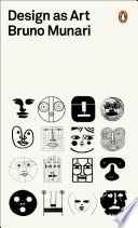
Always roaming in and out of book stores and on book sites, a few years ago I saw the book The Art of Looking Sideways by Alan Fletcher. I thought – what a visual feast. In some ways it reminded me of Bruno Munari’s book Design as Art. (BUT – not in size). The Art of Looking Sideways has over 500 pages.

The Art of Looking Sideways by Alan Fletcher publish by Phaidon Press in 2001.
The Art of Looking Sideways by Alan Fletcher
publish by Phaidon Press in 2001.

This book contemplated the differences between pictures as words – and vice versa. As Alan Fletcher states “the pleasing incongruities and serious science behind perception, process and the imagination that fills in the gaps”. A perfect book to review as we start exploring creative solutions to our bottle project.

Fletcher doesn’t set out to teach lessons. It is more of his experiences and insight that he gathered by – well – just being there and absorbing the world around him.

Here is a series of spreads from

The Art of Looking Sideways by Alan Fletcher:

A spread from The Art of Looking Sideways by Alan Fletcher

A spread from The Art of Looking Sideways by Alan Fletcher

6

8

The Art of Looking is wonderful inspiration to visual awareness, an interesting compilation that will entertain and inspire all of you as you start to SEE the interplay between word and image.

• Here is a link to an interesting interview with Alan Fletcher:

https://www.youtube.com/watch?v=meKUDU0sH5w

• Here is a link to The Art Directors Club Hall of Fame page for BIO info.

http://adcglobal.org/hall-of-fame/alan-fletcher/

NOTE: more on Bruno Munari’s book Design as Art from Google Books: https://books.google.com/books?id=fIJjI0UC7AEC&printsec=frontcover&dq=amazon+Bruno+Munari’s+book+Design+as+Art.&hl=en&sa=X&ved=0CDAQ6AEwAGoVChMIzabT9uyIyQIVxT4-Ch3IzgA_#v=onepage&q&f=false

Cover for Design as Art By Bruno Munari (paperback).

Find past Munari posts about his books on this blog.