Bottle Project: Reveal.Conceal.

IMG_0518 (1)

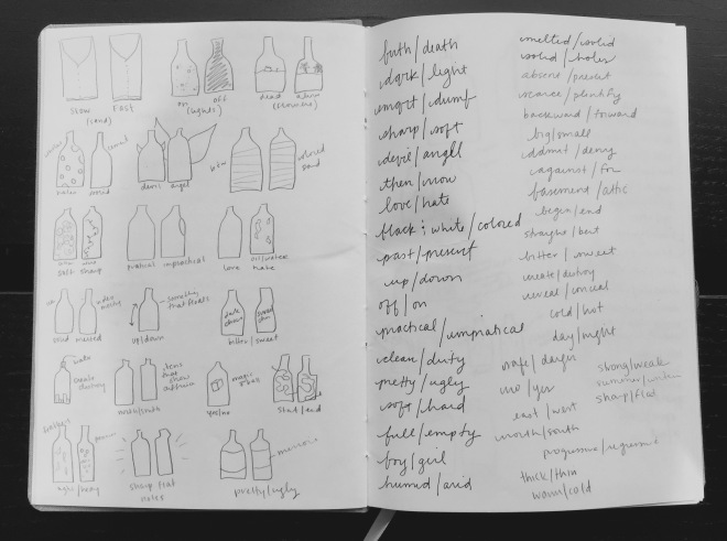
For the past month (or so), our class has been dedicated to the Bottle Project. The prompt was to take two empty Fiji bottles- a liter each- and transform them using any medium or any technique to portray two companion concepts. Let the brainstorming begin as you can see above! Don’t worry those are only two pages of the six.

From there, I decided to explore the idea of Reveal and Conceal because I very quickly focused on playing with wax and melting it over the bottles in some capacity. The initial concept was to construct a candle using one of the Fiji bottles as a mold and have the wax melt over the other Fiji bottle which would conceal whatever was inside. The problem with falling in love with a technique so early on is that it is so hard to let it go when it just isn’t working!

I spent the next 2 weeks continually building candles, melting them, and getting a lot of the below over and over again!

unnamed (1)  unnamed-1 (1)


At this point, I was definitely having more fun with the inside bottle. I made small strips of paper that have the prompt “When I am alone in my apartment…” and had pretty much everyone I saw finish the sentence. It was great getting to interact with everyone and see the different levels of uncertainty people had with this. I then had them push the paper into the bottle themselves to keep their anonymity.

IMG_0510

It was time to move on with the outside bottle especially since the wax didn’t necessarily enhance my reveal/conceal concept. After researching new ways to make a mold of the second bottle, I decided on paper mache to build a cast that could open and close revealing the inside bottle.

IMG_0403 (1)

From here, I knew that I needed to paint the outside of the bottle to make it more graphically appealing as well as integrate it with the inside bottle. I decided on staying with the black/white/grey color scheme but playing with a darker background and white typography. Therefore, I painted grey horizontal strips that progressively got darker down the bottle. While I was questioning the grey rings and thinking about changing it to just black, Carmile so nicely pointed out that it plays into the idea of people’s layers and what everyone choses to reveal and conceal to the world. Then adding typography to the outside really brought it all together and integrated the inside bottle and outside shell nicely!

IMG_0511

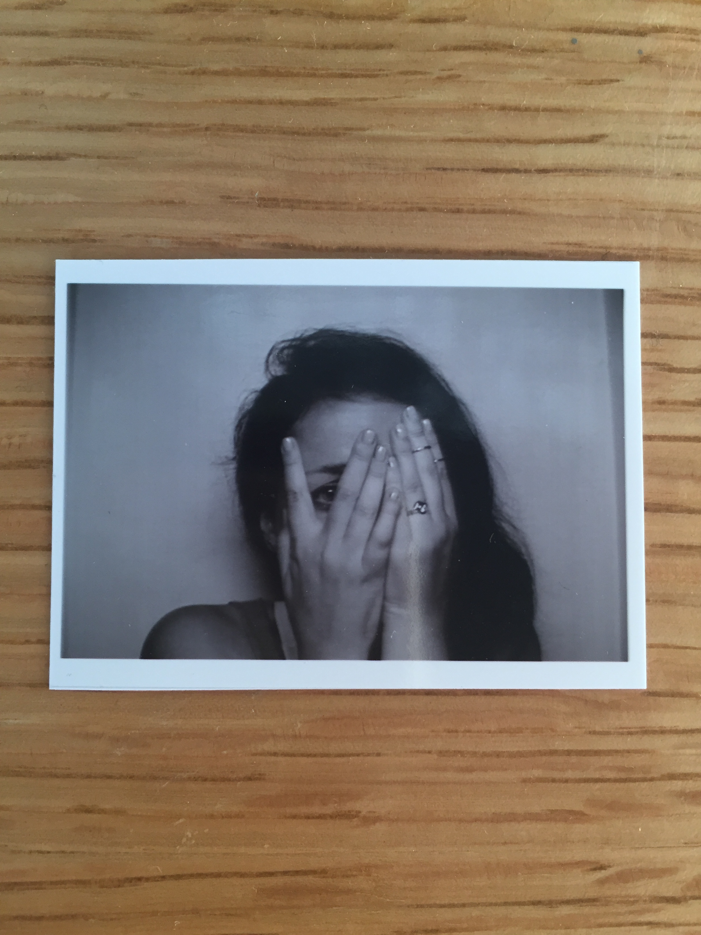
Below are a few pictures of my finished bottles. Thanks for reading and enjoy!

IMG_0512IMG_0513

IMG_0516


Photo Collage: David Hockney-esque

For our latest project in Process and Skills, we were asked to study David Hockney’s “joiners” or his cubist photography. I really appreciated reading about his views on photography and how his new technique came to be. In an interview he says the following about photography- “So, the moment you’ve looked at [the photograph] for even four seconds, you’re looking at it far more than the camera did. It dawned on me this was visible, actually, it is visible, and the more you become aware of it, the more this is a terrible weakness; drawings and paintings do not have this.” From this, he decided to break down this weakness and try to use photography to show space and time by layering multiple images as though he was approaching it as a drawing or painting.

IMG_0156

Above is my first attempt with his technique! I decided to use a manageable object, so that I wouldn’t get overwhelmed and I could really focus on understanding his process. After taking a million pictures of this fire hydrant and probably worrying a number of people around me, I knew I wanted to show it from the perspective of standing above. With a few tweaks in class especially on the background, I think it is starting to give off that impression!

The Masters Series- Michael Bierut at SVA

Although a trek to the SVA gallery on 11th Ave. and 26th St., I highly recommend the Michael Bierut exhibit! The gallery was extremely well organized and included a wide range of his work in all scales and mediums. It even included an entire room dedicated to his sketch books, which helps a student like me really get inside his head and see his process. It was amazing to see the simplicity of a lot of his logos but then see all the steps that lead to each final decision. Below are a few things that caught my eye!

IMG_9743IMG_9748IMG_9739IMG_9738

Project 1 – Self Portrait Poster

For our first project in Process and Skills, we constructed black and white posters using only photobooth selfies and found typography for our initials. I really appreciated the strict parameters of this projects making it more about problem solving and the steps to the final image as opposed to the image itself. It is amazing what you can do with a photocopier and some scissors!

IMG_9629

IMG_9528

The image to the left is my original photograph. I was instantly drawn to the hands and the shape they made. I spent A LOT of time at the photocopier playing with contrast and scale of the hands, which you can see in the final image to the right. Seeing it in a small scale image, I really love the diagonal the hands form and the movement that happens with the different shades of grey and black!

P.S. Fun picture of everyone’s projects together!

IMG_9529