The Fragmented Self | Self Poster

So I’m fairly new to blogging, I’ve been keeping it off for a while, but my Professor, Carmile Zaino has can be quite convincing and I’m glad that I’m climbing onto a new digital platform, and hopefully I can be as endearing as I am in person (or so I’m told).

Okay so enough about me, this post is about my very first assignment for the subject Process & Skills. This assignment seemed fairly simple at first, but as I went through the three weeks of revisions, I realised how much we need to push ourselves, and the main struggles for me have been to:

  • To make choices
  • To increase the contrast  and make it raw
  • To find a Photo Booth

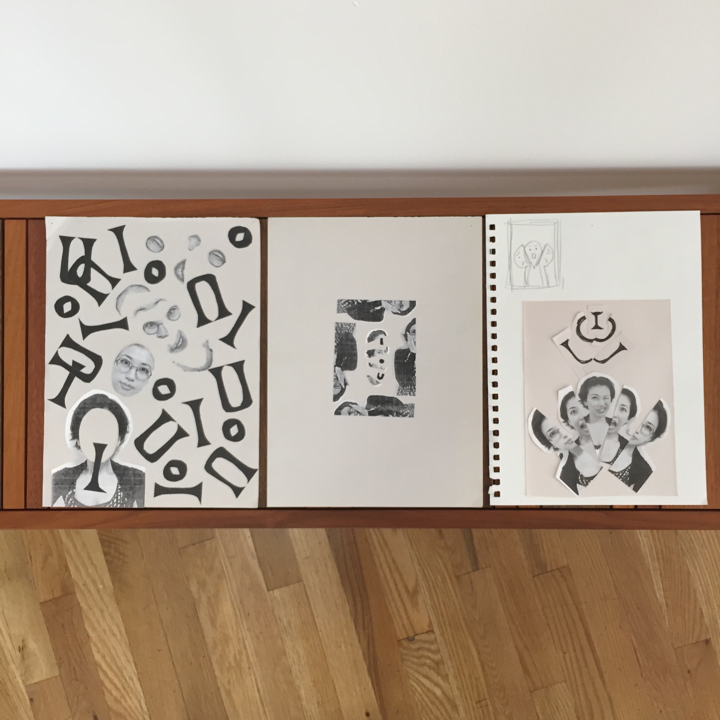
We were asked to take grayscale photographs of ourselves at a Photo Booth in the city and use either our initials or our name with typefaces we found in any publication. The assignment required us to do everything by hand (minus a laptop).  I did not manage to find a single Photo Booth in the city I live in, Bombay. So I finally decided to take my pictures against a white backdrop at home. These are few of my home-booth photos that I had taken.

DSC_3010

When I started clicking pictures for my self-portrait, I had a clear idea of what I wanted to be represented as. I believe that none of us are just one thing, we are all fragments of different personalities, feelings, emotions, moods. Not only this, but we alter ourselves based on the opposite person. If it is a stranger, I’m polite, with my friends I can go completely nuts, with my family I can be all that I am; even my worst possible self, at work I want to look competent, when I am with myself I day dream, I tie my hair back and it doesn’t matter how I look.

So there were so many different sides that I have, I cannot be defined by only one thing. That was the core around which I designed my entire self poster.


Week 1:

process

My house was A MESS. My parents were frantic. I was thoroughly enjoying myself. This assignment took me back to school, and all the craft classes I loved to take.

Self-poster_Angel
First Attempt

I created a box format, to show that even though we are seen only as one thing (the background image), we are fragmented into so many little things. I wanted to show this sort of contrasting personalities even in my typeface and so I have mixed it up a bit. The A is made of two alphabets, the g is in lowercase, the N is very light, the L is again two different typefaces.

Feedback

The feedback I received was to make the poster more raw, have a lot of contrast, make the design clean, and use punk posters to take inspiration from.


Week 2:

Untitled-2-01

punk art-01

There were different things that jumped right at me while I was browsing the various punk posters. Initially I was not a fan of them, but being a designer requires us to broaden our perspectives, not stick to only one path, one opinion but test out different waters. As I researched more, I saw beauty in the little things. There were things I loved and things that I did not, but each poster had a lot to display. The montage’s, cut body parts, rawness, cut out alphabets, hints of colour, rebellion, freedom, anti-neat approach, all these character appealed to me.

Poster 2
Second Attempt

Alternatives:

Alternative ideas
Alternative 1
Screenshot 2015-09-15 01.06.34
Alternative Idea 2

To be honest, I misunderstood the feedback I received from the previous week, and was of the mindset that I had to improve my poster by creating something  new. So I went on a different path, and took and decided to increase the contrast and make it raw by tearing the edges of all the pictures, and tried to recreate the montages I had seen in the punk poster’s.

Feedback:

I had two very distinct posters, and needed to decide which way to go. Also, I had to push myself and make the poster look raw, and use a photocopy machine to get that effect.


Week 3:

All the research on the poster designs of the different eras, Russian Constructivists, Avant Grande movements, artists like Lucian Bernard, helped me make my choices, and refine final design. I decided to stick to my original idea, and below is my final self-poster.

Final_AngelSalot
THE FRAGMENTED SELF

So I decide to use symbols throughout my poster to denote my core concept of having various identities and personalities. I hope the text in the image below is readable, if not here are the contrasting symbols:

  • Photocopied images v/s modern printed images
  • one big image v/s many small images
  • neat grid v/s the alphabet ‘a’ breaking the grid
  • whole pictures v/s cut out’s

image-16.

Selfie Poster

IMG_0434

I started my selfie poster by going to a local bar I know that has one of the selfie booths and I took a series of photos that I thought would allow my personality to come through a little bit.  I wasn’t exactly sure what to do with my selfie poster so I started by cutting out the individual boxes of the selfies I had taken and then I proceeded to try and cut out some of the faces into silhouettes.  I found myself playing around and creating this sort of pyramid shape and I thought that for the letters A and G, that I would have them sort of trickling down the side of the pyramid.  The first submission of my selfie poster is listed below:

IMG_0431

I got some great initial comments on the poster and I did like how it had started to look but then I realized that yes I had the wrong orientation for that poster.  I then did some research into Russian Contructivism and tried to use some of that to influence the second submission of my selfie poster.  I have included some of those sketches below as well as the second submission.  As you can see, I created three different triangles instead of one and also like the left over black space from cutting out the silhouettes and I decided to incorporate that as well.

IMG_0433IMG_0435IMG_0495IMG_0578IMG_0490

I liked this version a lot more than the first version of the selfie poster that I had submitted.  We did discuss though that I needed to go ahead and to something more with the top.  There needed to be a bigger difference in sizes and perhaps contrast as well.  So I went back to photocopying and trying out different sizes for the silhouettes in particular.  I really liked the bottom half, it was just the top that I was trying to fix.  I have included some other sketches and research as well as the last submitted selfie poster.

IMG_0575IMG_0492IIMG_0579IMG_0585IMG_0574I really liked the final version of the poster.  When looking back at the first edition, it really did take a different turn and made great progress.  I like how the top triangle looks like it is pushing down into the bottom of the poster.  I like the contrast between the three different sections and how different they all are.  I had a lot of fun with the poster and I hope that shows!

My Process & Skills (1) Self Poster

As many freshmen already mentioned on this blog, I also tried to introduce myself with the first project — a self-portrait poster.

Conditions are equal at each class, methods are also similar, but ways of thinking are totally different between each students. First of all, I don’t like my initials so much. “I.O.U.”, it sound like “I owe you”, and also it has so geometric shape that frequently be mistaken for “1.0.∪” or else. But these three letters are all I could use for the poster.

Furthermore, I don’t like my face, too. I’m not good at posing in the Photo booth, my smile looks like a fake. Umm, I really want to cut it off. So I did it.

sketches by Iku Okada

Center of the photo is my early sketch. Both of my figure and initials are so small. I look like a humble type person, feeling negative about this assignment. Right side one is my improved sketch, inspired by ‘Statue of Priest Houshi’ at Saiou-ji temple in Kyoto Japan. If I don’t like my face, I could peel it off. I will shed the old skin and let reborn myself. I even could cut my initials off.

Statue of Priest Houshi

Left side one is my another sketch, inspired by a beautiful poster of Yale Symphony Orchestra, designed by Jessica Svendsen. If I don’t like my initials, let them multiplied until nobody can be read them as “I.O.U.”!

Poster by Jessica Svendsen

After a class-crit, I made the final version of poster, below.

IMG_7483

Hands, scissors and glue-sticks gave me an opportunity to see myself from the third person’s view. I still don’t like my face and initials so much, but I love what I’ve done with unwelcome materials. It was very good first practice for me to understand the name of the class, “Process and Skills”. And, there are by-products of my piece, in process.

IMG_6844 IMG_6845

Self Poster Project

For our first Project in Process and Skills class we were asked to create black and white self poster based in the Punk Rock era posters and Japanese, Polish and Russian posters starting from a photo taken in a photo booth. The poster should have only our initials or name and just one photo.

The project had so many restrictions that at the beginning I thought it was going to be horrible but working on progress and researching helped me to develop a lot of good ideas with just a photo and my initials.

Its was amazing to see the final posters of all and  how everyone turned 2 things into different  great ideas.

Here is my process and my final poster.

Featured image3rd poster

2nd posterselfportrait4

Self Portrait Poster

For my Process and Skills class we were given the task to create a self portrait poster using a Photo Booth picture and photocopier. This is my final iteration of the poster. I had been playing around with the different saturations on the copier and wanted to create a contrast within my actual picture which I also reflected in my type as well. DSC_0021

Project #1: The Self-Poster

For our first project of the fall 2015 semester, we graphic-designers-in-training were asked to design a black and white self-poster over the course of three weeks.  The requirements:

  • Use a black and white photograph of ourself taken in a retro photo booth
  • Use found type for either our initials or first or last name
  • Use a photocopier to reproduce all elements, which could be repeated, enlarged, or reduced as much as we liked
  • Formatted 18×24

With just one image and our found type to work with, nothing more and nothing less, we were encouraged to rely on our creativity and resourcefulness to create compelling posters.  Though the project presented quite a few interesting challenges, I really enjoyed the process of designing my first poster.

The first challenge, of course, was to hunt down a black and white photo booth and successfully capture a poster-worthy photo.  For me, this involved two photo booths, five sessions, and twenty total images to choose from.  I wanted to take a photo that would capture the essence of my personality; which is, decidedly, a very difficult task!

Choices
It took a few tries to get it right!

I eventually settled on the only photo in which I am using a prop.  I still wasn’t sure if just one image could even cover the half of someone’s personality, but I liked the eye contact and the ways the sunglasses placement could be interpreted.

Voila, my choice photo

The next challenge was blowing up the image to a size I wanted to work with.  I was worried about losing a lot of image quality through photocopying and enlarging, but luckily a photocopying angel at Staples helped me successfully turn my tiny photo into an 8.5×11 image.  For my first poster idea, I decided to place four 8.5X11 images on my 18×24 foam board, in varying degrees of contrast and saturation.  The image with the least amount of contrast was paired with the largest copy of my initials, and the image with the most amount of contrast was paired with the smallest copy of my initials.

Thank goodness this class is all about process!  At our first poster crit, I was blown away by the creativity of the other students, and inspired to take my design to the next level.  Before starting design school, I had never had the opportunity to revise a project after presenting it.  Being able to respond to critiques to produce a better design solution was a first, and I was grateful for the opportunity to change things up.

This time, I studied the work of Polish designer Roman Cieslewicz for inspiration.  One image in particular got my attention.  I didn’t realize it at the time, but this work in particular would inform the way my poster would progress.

This design inspired how my poster would progress.

Having made over a dozen photo copies of my image, I decided to just let myself have fun and cut and reassemble my image however I pleased.   I had just bought my first olfa knife, and I have to admit, I was excited to play with it.  I cut the image up like a wild woman, taking my head and hand out of the background, the sunglasses, my eyes, my mouth, everything.  Then, I started collaging.  Suddenly, I realized I didn’t have to work with just one image; I could take one image and reassemble it into as many images as I wanted, thereby displaying not just one, but various facets of my personality.

Inspired by the Cieslewicz design, I used multiple copies of my hand to simulate motion, and placement to convey different movements.

Collaging image3 image4 image5 image6 image7

The second version I presented for critique

After the second crit, I decided to play more with the scale of the images, and also to work more with the negative space. The general consensus that the images were placed in too ordered of a way for such an abstract poster.  The size and placement of the type was bothering me too, so I decided to replace them.

My final task was to find a way to arrange my name on the board.  Before photocopying, I tried horizontal and diagonal placements, with varying degrees of separation between the letters.  Nothing felt quite right.

I wasn't happy with the orderly placement of the type.
I wasn’t happy with the orderly placement of the type.

I decided to go ahead and photocopy the type while I thought placement over.  To my surprise, when the copy of my type came out, it was exactly what I was looking for.  The random placement felt entirely appropriate for my poster.

This was exactly what I was looking for. And it happened completely by accident!

The last challenge was scanning my foam board to create my final poster.  Without a large enough scanner, I had to scan it in four parts, and then knit the images together in InDesign before sending my final poster off to the copier.  Each scan had a slightly different level of exposure, so the black background came out uneven.  In spite of that unforeseen little obstacle, I kind of liked the patchy feel it created.

Here is my final poster on display in class, with version 2 on display for comparison underneath.

Overall, I was pleased with my first-ever poster, and I loved seeing all the final posters lined up side-by-side!

Final presentations image14 image15 image16 image17

Self-Portrait Poster

The self-portrait poster for Process & Skills had a very specific criteria: it could only be made up of our photos taken in a black and white photo booth, found type from our name or initials, and we could only use a photocopier to manipulate our images.

The first thing I did was head to the library to do some research. The Russian Constructivism posters were the ones that I identified with the most because of how geometric and bold they are. These are some of the images that inspired me.

Russian Constructivism Posters

After doing some research, I decided to make the shape of my poster out of my initials, M and N, and create a strong contrast between the photos and the found type by working with a positive vs. negative and chaos vs. order concept. During the process, I did a lot of sketching to help me visualize the ideas I had in my head. It was the most efficient and quickest way to determine whether an idea had potential or not.

Found Type
Sketches
Sketches

My poster went through three different phases. The concept remained the same throughout, but the execution needed to be improved in order to make the concept clearer and stronger.

First Version
Second Version

FINAL POSTER

The concept of my poster is the duality between positive vs. negative and chaos vs. order. The poster is divided in two: the photos (positive area) and the type (negative area). The order vs. chaos comes into play in both the photos and the type.

The shapes and lines that make up the poster are my initials, M and N, which create six right triangles. The poster has no up, down, left, or right. It could be seen from any angle and you will always be able to read the initials. The poster contains juxtapositions of chaos and order and how they work together. The photos hold a random pattern, indicating chaos. But the pattern is created using the same strip of photos over and over in the same direction, indicating order. The type is very geometric, angular, and increasing in size in an organized way, indicating order. However, they aren’t all the same type or size, indicating chaos.

Final Version

Self Portrait Poster

Well, I know we were supposed to post these posters at the beginning of the semester, but I’d like to point out that it’s already a bit of a challenge to present a (in some cases, poster-size) picture of yourself in front of a classroom where the majority of the people are strangers and then talk about how it’s art. Second of all, it’s even more disconcerting to place said poster online for more Parsons fellows (also strangers mostly) to view and then try to say something meaningful. Moving on: I used a photocopier to blow up the size of my face and it was definitely scary. Once I started pasting things on foam core, the voice in my head was saying, “Who the hell are you to enlarge your face over 400%?” “Are you some famous rock star?” “The nerve.” But we made our likenesses into art. All of us. And maybe that’s the way we broke the ice in our classroom, however awkwardly.

And that goes for blogging, too. We’ve been “reminded” repeatedly to visit this blog and post and comment, but that, too, proves intimidating. Who are the people on this blog? What is the purpose? Why is this important? Process and Skills has a blog?… but why? I agree it’s a great resource, but students should blog because they WANT to communicate and not because they are forced to. Happy Critiques, All!

SelfPoster1_KChinh

Self Poster: better late than never…

First Attempt:

First Attempt

When approached with the ‘Self Poster’ project I was thinking very basic and clean, too inside my head. The outcome was not very strong at all. Carmile Zaino gave me the advice to “stay up watching television until 3am and then go to work” or something along those lines. Basically, she wanted me to stop thinking and just do/play around.

Inspiration:

Cieslewicz Inspiration

After reading Roman Cieslewicz’s book Master of Graphic Design, this poster was one that I found very inspiring. As well as his Q & A with Mary Rouard-Snowman:

M.R. You produce a great deal of work. How do you work? What is your professional method, what are your special tools?

R.C. I use all techniques – photography, paint, watercolour, but not drawing. I have one constant inspiration: the circle, the round figure. I often use a screen, which I discovered at Elle when I was making photographic enlargements to focus on a detail. I like the flexibility of the offset screen and its circular shape which allows you to bring in each spontaneous movement of the line. The impossibility of silk-screen prints paying for themselves led me to repeat myself, to fill some spaces between screens with the points of felt-tipped pens. I have made thousands of screens by hand. It was the lack of means, the need for an immediate response to my ideas, which led me to the repetitive reproduction of mechanical techniques. I delight in their numerous imperfections. My favourite colours are black and red. I don’t like blue and I adore lemon yellow, which produces such startling effects when used with black. For all my projects I make sketches to scale: 8 x 12 cm or 4 x 6 cm for 40 x 60 cm posters. First I create the format. I begin with the four corners, draw a slanting vertical and the diagonals from the outside edges. After that I place the figurative elements, framing them more and more tightly, sometimes cutting down. This classic compositional technique suits my eye perfectly. My professional choices and my responses to commissions are driven by impatience – a drawn line or a pencil conveys my ideas more swiftly than any mechanical tool.

Final Result:

Self_Poster

Taking Carmile Zaino’s advice, and combining it with the inspiration from Roman Cieslewicz, this is what I came up with.

-J. Tucker Rose