My Process & Skills (7) Human Rights, Human Wrongs

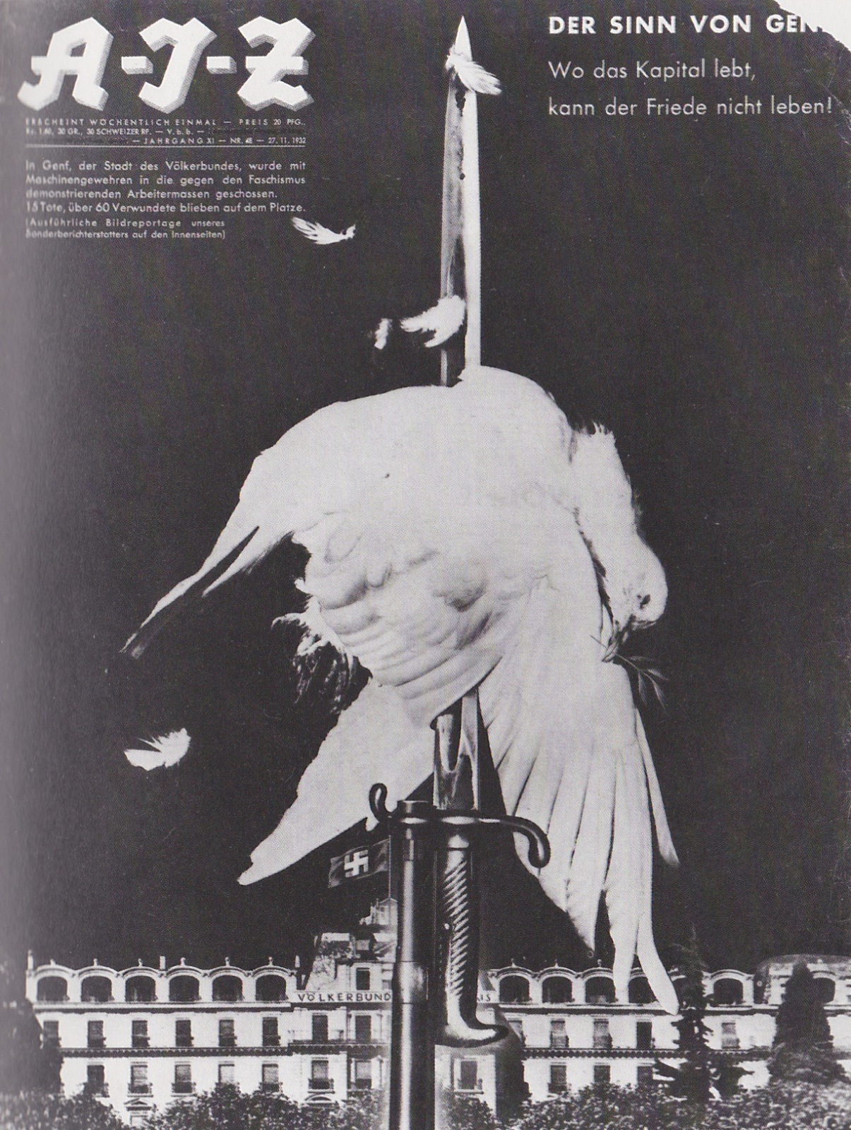
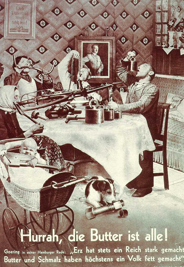
This is my eighth and the last entry for this semester.
Our class had a final assignment called “Human Rights, Human Wrongs”.

“Human Rights, Human Wrongs” is a poster assignment that allows the student to chose and interpret a social issue of interest to him or her. The student will voice their opinion in the chosen topic by creating a visual, conceptual statement using the juxtaposition of type and image.
The poster is directed at the general public and it’s aim is to create awareness for the issue and invite the viewer to question or consider his or her point if view on the topic. To achieve this, use the medium to your advantage. The poster is a medium whose intent is to grab the attention and draw the viewer in. It can be a powerful medium when designed and executed successfully.


The topic I took was child labor abuse in apparel industry, especially in brands so-called “fast-fashion”.

The other day, one of my ESL teachers said, “You fashion-conscious students must buy the fast-fashion clothing wisely, because it’s cheaper than the high-end brands and as fashionable as them! haha!” — I couldn’t believe what my ears heard. Of course, my ESL classmates majoring fashion design never agreed with this teacher.

And I noticed that many American people like her never think of what a fast-fashion means. They never care the reason why fast-fashion brands can sell their products in such a low, too much low prices. They can’t imagine what has happened in the opposite side of the earth, they don’t pay attentions to that kind of news or documentary films.

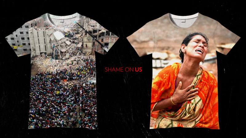
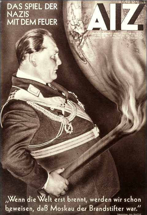
Shame on us. It reminds me an article about the Tazreen factory fire that killed 112 garment workers, and the Rana Plaza building collapse killing 1,129 people. No, honestly, I totally forgot the names of the buildings and the numbers of killed workers in Bangladesh. All I remembered is this featured image of the article.

http://jezebel.com/whats-the-solution-to-the-worlds-sweatshop-problem-511688272

Well, well, I never say that I’ve never bought fast-fashion clothing ever and forever. Sometimes I do buy their cheap products, as you do. But when I saw the store is filled with tons of cheap mass-products and it looks like mountains of garbage, it hurts my heart every time. I feel so guilty to buy a T-shirt in $9.99. Am I a wise customer, indeed?

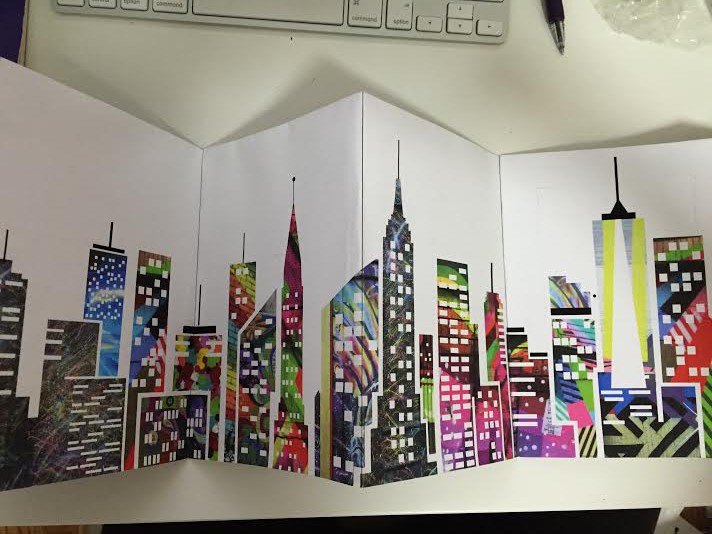
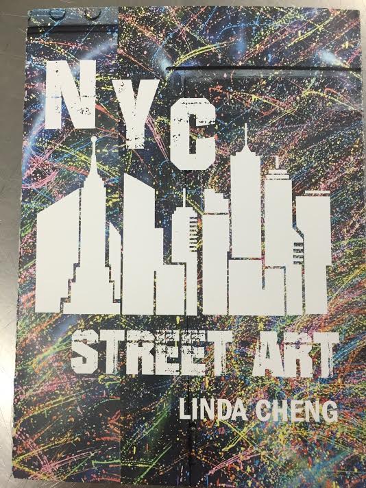
So I went to “fast-fashion districts” at Fifth Avenue. You might know where it is, very close to our University Center. I took some spy photos (again! I’m quite good at it), and designed an opinion poster concerning child labor abuse.


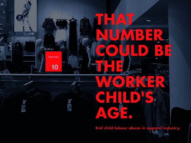
The more cheaper we buy clothing, The more younger sweatshop workers become. Someone should stop this bad loop, and it must be us, customers. We can be more and more ethical.

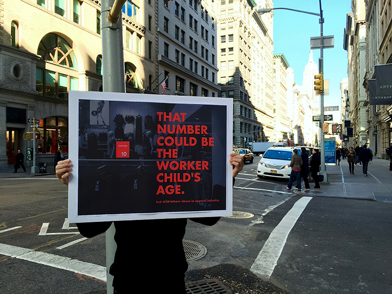
You can use this poster to your social activities. For example, a protest against demonstration on the street like this.


A Visit to the Cooper Hewitt

This past Wednesday, my Graphic Design 1 class taught by Julia Gorton took a trip to the Cooper Hewitt Museum to view the Poster Exhibit and the Wallpaper Exhibit.  Exhibitions aside, the Cooper Hewitt on its own is worth a visit.  The building was originally a mansion; the home of Andrew Carnegie (1835-1919), steel magnate and philanthropist.  The architecture is stunning, and the location on Fifth Avenue, just across from Central Park, isn’t too shabby either.

Before this Wednesday’s visit, I had been to the Cooper Hewitt to see the poster show as research for my own poster project for my Process and Skills class.  I was thrilled with the show the first time I visited; the museum offers visitors a special “pen” to record display items with a simple touch for later viewing on a personal online page, and to virtually design various objects on large tables equipped with enormous screens.  The interaction was great, and it made saving my favorite posters so much easier than constantly taking photos and writing down names.  However, as my first visit was very early on in the semester, I could not fully appreciate exactly what I was looking at.  Now that we have done so much in-depth research, both in Graphic Design 1 and Process in Skills, on various graphic designers, I was able to make my way through the exhibit with a lot more awareness and appreciation; of Stefan Sagmeister’s work, Massimo Vignelli’s work, and so on.  It was definitely worth the second visit.

This time, too, we all got to “play” in the immersion room of the museum, where the curator has set up hundreds of patterns for visitors to project onto the wall, and design their own.  Patterns could be resized, rotated, and more.  It was very inspiring!

The “How Posters Work” exhibit is on view until January 24, 2016.  A visit is definitely recommended.  Two thumbs up!

http://www.cooperhewitt.org/events/current-exhibitions/how-posters-work/

My Process & Skills (1) Self Poster

As many freshmen already mentioned on this blog, I also tried to introduce myself with the first project — a self-portrait poster.

Conditions are equal at each class, methods are also similar, but ways of thinking are totally different between each students. First of all, I don’t like my initials so much. “I.O.U.”, it sound like “I owe you”, and also it has so geometric shape that frequently be mistaken for “1.0.∪” or else. But these three letters are all I could use for the poster.

Furthermore, I don’t like my face, too. I’m not good at posing in the Photo booth, my smile looks like a fake. Umm, I really want to cut it off. So I did it.

sketches by Iku Okada

Center of the photo is my early sketch. Both of my figure and initials are so small. I look like a humble type person, feeling negative about this assignment. Right side one is my improved sketch, inspired by ‘Statue of Priest Houshi’ at Saiou-ji temple in Kyoto Japan. If I don’t like my face, I could peel it off. I will shed the old skin and let reborn myself. I even could cut my initials off.

Statue of Priest Houshi

Left side one is my another sketch, inspired by a beautiful poster of Yale Symphony Orchestra, designed by Jessica Svendsen. If I don’t like my initials, let them multiplied until nobody can be read them as “I.O.U.”!

Poster by Jessica Svendsen

After a class-crit, I made the final version of poster, below.

IMG_7483

Hands, scissors and glue-sticks gave me an opportunity to see myself from the third person’s view. I still don’t like my face and initials so much, but I love what I’ve done with unwelcome materials. It was very good first practice for me to understand the name of the class, “Process and Skills”. And, there are by-products of my piece, in process.

IMG_6844 IMG_6845

Project 1 – Self Portrait Poster

For our first project in Process and Skills, we constructed black and white posters using only photobooth selfies and found typography for our initials. I really appreciated the strict parameters of this projects making it more about problem solving and the steps to the final image as opposed to the image itself. It is amazing what you can do with a photocopier and some scissors!

IMG_9629

IMG_9528

The image to the left is my original photograph. I was instantly drawn to the hands and the shape they made. I spent A LOT of time at the photocopier playing with contrast and scale of the hands, which you can see in the final image to the right. Seeing it in a small scale image, I really love the diagonal the hands form and the movement that happens with the different shades of grey and black!

P.S. Fun picture of everyone’s projects together!

IMG_9529

My Obsession. Books!

NO,not the latest from romantic queen of suspense, Nora Roberts or hot new memoir from the “it” celebrity.

Books on design,typography,photography,printmaking,pottery,illustration,sculpture,architecture…STOP!

I promise to stop walking into every,YES every, bookstore I pass.

I promise to stop reporting on the latest book review about the subjects I love.

WAIT! I saw a review in The New York Times so I want to share ONE MORE book find before I cross my heart to these promises.

The Ladies of Letterpress. This new book features the best work of the members of Ladies of Letterpress, an international organization that champions the work of women printers. And,it is a wonderful printing resourse.

This is what Amazon has to say about this $40 gallery of prints: “Valuable as a handy resource, it includes a wide range of pieces, from greeting cards to broadsides and posters, printed in a variety of type and illustration styles. Each piece is accompanied by details of paper, inks, and press used in its printing, and a profile of its printer. Whether you’re drawn to elegant greeting cards, humorous note cards, or calendars and posters, you’re sure to find inspiration in this volume. And when you do, there are eighty detachable pages just begging to be pinned up.”

For more info on this book and letterpress here are a few links from The New York Times and others: http://tmagazine.blogs.nytimes.com/2015/04/21/graduation-present-ladies-of-letterpress/?ref=design

http://www.papress.com/html/book.details.page.tpl?isbn=9781616892739

http://www.bremelopress.com

Book Info:
The Ladies of Letterpress
A Gallery of Prints with 80 Removable Posters
Jessica White, Kseniya Thomas
ISBN 9781616892739
Publication date 04/21/2015
11 x 14 inches (27.9 x 35.6 cm), Paperback
192 pages, 350 color illustrations

Missive's
Missive’s “Flamingo” by LisaWillis

Concrete Lace’s
Concrete Lace’s “Eating Seasonally” print by Katie Daniels

Joey Hannaford’s
Joey Hannaford’s “Converge II” by Joey Hannaford

Street Art Poster Essay & Street Book

The first part of the project was a photo essay.   We had to shoot a minimum of 75 photos and then narrow it down 12 photos and post it on a 15×20 illustration board.  The photos had to be printed and not altered.  My subject was street art in NYC.  I’ve always been fascinated and passionate about and NYC is the perfect place for that.  I think that street art is one of the most beautiful things about NY and also very misunderstood.  Even when I’m in a rush if I come across murals I will stop and stare.  This was a really interesting and exciting project to work on because it was very inspiring and fun.  So it didn’t seem like work, more like an adventure.  It was really exciting to find new pieces.  The photo essay was incredibly inspiring that I decided to carry it onto my next project where we had to make a book.

street-art-photo-essay-e1428076830892

From this essay I began working on my Street Art book.  The book had to be non-adhesive and 16 pages. I wanted to make a book inspired by the beautiful street art that  lives in our backyard.  Banksy said “People become cops to make the world a better place.  People become vandals to make the world a better looking place.”  This was a powerful quote that really aims at the misconceptions about street art.  I wanted to make a book that showed the beauty of street art, the beautiful colors, patterns and illustrations.  I started looking up different types of folded books and photo collages.   I decided to draw NYC city and then use the photos I had taken and clip them behind the buildings to build a colorful bright city with street art from all over the city.  Imagine a world with color. Because of this concept I decided to  go with an accordion fold where the book would open to a landscape of NYC.

unnamed-4unnamed-2unnamed-3unnamed-1

After all my research I had to go digital to create the city illustration and edit the photos.  I made several rounds of mockups. One issue that I came across in the beginning was that each image was gigantic and I had about 15 images and (I needed a total of 25-30 images) my file was already 3 gigabytes! (Yikes). Then I had to start over but luckily it was early in enough that I didn’t really panic.  Another issue I came across was how to make the images look cohesive with all these different patterns and colors.

unnamed-6unnamed-10unnamed-8unnamed-9unnamed-11

Some images that I really loved had to be take out because it didn’t go with the color palette.  I was a little bummed but I’m sure I’ll be able to use the images for other projects.  For the back pages  I included the actual images of the street art so whoever bought the book can put have a souvenir of the actual art piece.  After the  mockups and various versions it was time to fine tune the placement of each image which was incredibly gruesome but all worth it in the end and narrowing the images used.

And now the Final Piece!

unnamed-12

And folded (Front) & (Back)

unnamed-13unnamed-14

Cover

unnamed-16

I was happy with the way the piece turned out.  Even though the city was made up of so many different images it somehow remained cohesive and powerful.  The entire process was a great adventure and only fueled the fire for my love of street art.

Punk Rock Art in the Raw!

This collection of work is art,illustration,typography – design – in the raw. Take a look at this newly published book, WHITE GLOVE TEST : LOUISVILLE PUNK FLYERS 1978 -1994 (DragCity $40), when you buy your next cup of Starbucks at your local Barns & Noble bookstore.
WhiteGlove_BookJ
Here is a sneak-peek from The New York Times article if you don’t get a chance to view it “live”…
Celebrating The Lost Art of Flyers The Through the Lens of the Louisville Punk Music Scene
“Gone are the days when all a person needed to disseminate information were some paper, markers, a glue stick and a stapler — along with the required telephone poles on which to attach the resultant flyers…”
read more: 

From left:
From left: “No Fun in Vogue,” 1978; “Ideals of Order (Your Food and Falconetti),” 1983; “Kinghorse (and Endpoint) Descend,” 1989.

Also, The Kentucky Museum of Art and Craft has an exhibit up until May 10th displaying some of the flyers.
Here is a link to view some more Punk Art: http://www.kmacmuseum.org/#!white-glove-test/c8o8

Photomontages | John Heartfield

John Heartfield (1891-1968) was a pioneer in photo manipulation and in the use of art as a political weapon in the design history.

In a very distant time from Photoshop, this genius photographer already created his photomontages, skillfully demonstrating to be far ahead of their time. All of his work was done by hand, which makes his art even more impressive.
He studied drawing, film and photography in Munich.

Some of his photomontages were anti-Nazi and anti-fascist statements, to satirize the stupidity and brutality of the Nazi regime.

He is best known for political montages which he had created during the 1930s to expose German Nazism. Some of his famous montages were created during the 1930s and 1940s.

  • Adolf, the Superman (published in the Arbeiter-Illustrierte-Zeitung, Berlin, July 17, 1932),used a montaged X-ray to expose gold coins in Fuehrer’s esophagus leading to a pile in his stomach as he rants against the fatherland’s enemies.

AdolfderUbermensch

  • In Göring: The Executioner of the Third Reich (AIZ, Prague, September 14, 1933), Hermann Göring is depicted as a butcher.

Goering

  • The Meaning of Geneva, Where Capital Lives, There Can Be No Peace (AIZ, Berlin, November 27, 1932), shows the dove of peace impaled on a blood-soaked bayonet in front of the League of Nations, where the cross of the Swiss flag has morphed into a swastika.

IMG_20140311_0005

  • Hurrah, die Butter ist Alle! (English: Hurray, the Butter is All Gone!) was published on the frontpage of the AIZ in 1935. A parody of the aesthetics of propaganda, the photomontage shows a German family at a dinner table eating a bicycle, where a nearby portrait of Hitler hangs and the wallpaper is emblazoned with swastikas. The baby gnaws on an axe, also emblazoned with a swastika, and the dog licks a huge nut and bolt. Below, the title is written in large letters, in addition to a quote by Hermann Göring during food shortage. Translated, the quote reads: “Hurray, the butter is all gone! As Goering said in his Hamburg address: “Iron ore has made the Reich strong. Butter and dripping have at most made the people fat.”

???????????????????????????????????????????????

Heartfield’s artistic output was prolific. His works appeared as covers for the Arbeiter Illustrierte Zeitung (AIZ, Workers’ Illustrated Newspaper) from 1929 to 1933, a popular weekly whose circulation rivaled any magazine in Germany during the early nineteen thirties. During 1931 Heartfield’s photomontages were featured monthly on the AIZ cover, an important point, because most copies of the AIZ were sold at newsstands.

It was through rotogravure, an engraving process whereby pictures, designs, and words are engraved into the printing plate or printing cylinder—that Heartfield’s montages, in the form of posters, were distributed in the streets of Berlin in 1932 and 1933.

His photomontages satirising Adolf Hitler and the Nazis often subverted Nazi symbols such as the swastika in order to undermine their propaganda message.

Heartfield also created book jackets for authors such as Upton Sinclair, as well as stage sets for such noted playwrights as Bertolt Brecht and Erwin Piscator.

book_cover

Below is the series of photos from 1931. Shows John Heartfield directing a photoshoot for the cover of Upton Sinclair’s Mountain City.

book

More Posters:

1 4_heartfield-800x1182_Copy_Copy_Copy And_Yet_it_Moves_Copy1 Metamorphose_Copy

Research: graphic artist Roman Cieślewicz

Roman Cieślewicz Portrait

Roman Cieślewicz (born 1930 13 January in Lwów Poland, now Lviv Ukraine – died 1996 21 January in Paris France) was a Polish (naturalized French) graphic artist and photographer.

From 1943 to 1946 he attended the School of Artistic Industry Lvov and from 1947 to 1949 attended the Kraków’s Fine Arts Lycee. He studied at Kraków’s Fine Arts Academy (ASP) from 1949 to 1955. He was artistic editor of “Ty i Ja” monthly in Warsaw 1959-1962 . In 1963 he moved to France and naturalized in 1971. He worked as art director of Vogue, Elle (1965-1969) and Mafia – advertising agency (1969-1972) and was artistic creator of Opus International (1967-1969). Kitsch (1970-1971) and Cnac-archives (1971-11974). Taught at the Ecole Superieure d’Arts Graphiques (ESAG) in Paris. In 1976 he produced his “reviev of panic information” – “Kamikaze”/No. 1/ published by Christian Bourgois. In 1991 he produced “Kamikaze 2” with Agnes B. He took part in numerous group exhibitions of graphic, poster and photographic art and was a member of AGI. 


RCA logo

Roman Cieslewicz was one of the most influential graphic design artists of the 20th century. Living on the very cusp of the computer age he was happier with scissors and glue than new technology. The Royal College of Art in London hosted a major retrospective exhibition of his work in 2010. BBC’s report is by David Hannah: www.bbc.co.uk/news/entertainment-arts-10698599


eye logoSummer 1993 |  Reputations: Roman Cieslewicz

‘Posters are dying out. They need strong themes, which at present they lack. As a form of communication, they belong to another age
Interview with Roman Cieślewicz by Margo Rouard-Snowman  


moma-logo

 MoMA has 11 of Cieślewicz’ posters in their collection.
Polish Posters 1945–89

CRI_5132During the political Thaw after 1956, Polish Communist authorities turned their attention from heavy industry to the promotion of consumer goods as a means of earning hard currency from the West. Cieslewicz pays homage here to the surreal fashions popularized by Italian designer Elsa Schiaparelli. In 1963 Cieslewicz moved to Paris and became immersed in avant-garde art and fashion, winning international acclaim for his innovative art direction of Elle and Vogue magazines.

CRI_198971This disquieting image of a figure constrained within an armored shell and suffocating from an eruption of flames and blood synthesizes Luigi Dallapiccola’s nightmarish operatic tale. In it a Spanish prisoner thinks he has escaped punishment only to find himself in the arms of the Grand Inquisitor and led to a burning stake. Both poster and opera conveyed the pessimism and sense of deception and entrapment prevalent in Cold War Europe.

CRI_5884

“It was my dream to make public pictures that could be seen by as many people as possible,” Cieślewicz said. “Hence the top importance of the poster—the street picture.” At a time when the dictates of Socialist Realism conventionalized the human figure and required a relentlessly optimistic image of the future, posters for theater and film were able to adopt a more abstract and psychological approach.
CRI_212211
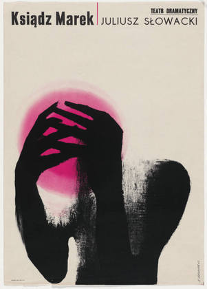
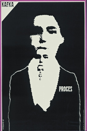
A keen sense of the absurd and the macabre drew Polish audiences to such writers as Franz Kafka, Harold Pinter, and Friedrich Dürrenmatt. This poster was commissioned and printed for a Warsaw dramatization of Kafka’s novel and was also subsequently printed and circulated in Paris, where the designer had moved in 1963. “I wanted to leave Poland to see how my posters would stand up to the neon lights of the West,” he explained in 1993. “I dreamed of Paris.”


Le_Monde_logo copyHommage à Roman Cieslewicz | 1930-1996 


amazon logo_sm

Roman Cieślewicz book cover


Roman Cieślewicz
by Margo Rouard-Snowman, Thames and Hudson 1993