The Bottle Project

The bottle project assignment required us to demonstrate using two plastic bottles. The bottles were used to exhibit and bring two matching or opposing words to life. This demonstration could be displayed in any possible way, there were no restrictions. I decided to use science to illustrate my ideas and concepts, and to engage the viewer further more through live experiments conducted on the bottles.

 We were asked to create 50 thumbnail sketches of our ideas and concepts. The bottles represented two words that had some sort of relationship (antonyms, synonyms, etc.)

The final three selections I went with were:

Calm v/s Excited

Construct v/s Deconstruct

Social v/s Antisocial 


  1. Calm v/s Excited (or hyper)

‘Calm’ was extremely easy to display. I had diluted coke in one bottle with no fizz. Diet coke + Mentos did the trick to demonstrate the word ‘excited’ in the other bottle. When diet coke was put into a newly poured bottle of diet coke it immediately fizzes up due to the carbon dioxide produced by the mixture, this gives it a feeling of being hyper or excited. Unfortunately I’m having difficulty in embedding videos or uploading pictures so I am adding links. Hope it works!

Click here to view.

2. Construct v/s Deconstruct

I used two balloons, some vinegar, and Eno powder for this one. The balloons were attached to the nozzle of the bottles and as soon as the powder was poured into the vinegar the balloons began to inflate. While both the balloons inflated, I poked a hole in one of them to demonstrate the words “construct” and deconstruct” at the same time.

This was the end result of the experiment.

3. Social v/s antisocial

This was so much of fun to work with, but yet the most hands on experiment. After plenty of trial and errors did I finally get it right. The social bottle was extremely easy to show. I mixed water, food colouring, Savalon. All these were soluble liquids that blended well to illustrate the definition of the word “social”.

“Anti-social” was a bit tricky to do. After three trials I finally accomplished what I had initially aimed to do. I used immiscible liquids for this one, there was vegetable oil, water, milk, and maple syrup. Due to their various densities they all settled as separate layers instead of mixing as one. 

My Process & Skills (7) Human Rights, Human Wrongs

This is my eighth and the last entry for this semester.
Our class had a final assignment called “Human Rights, Human Wrongs”.

“Human Rights, Human Wrongs” is a poster assignment that allows the student to chose and interpret a social issue of interest to him or her. The student will voice their opinion in the chosen topic by creating a visual, conceptual statement using the juxtaposition of type and image.
The poster is directed at the general public and it’s aim is to create awareness for the issue and invite the viewer to question or consider his or her point if view on the topic. To achieve this, use the medium to your advantage. The poster is a medium whose intent is to grab the attention and draw the viewer in. It can be a powerful medium when designed and executed successfully.


The topic I took was child labor abuse in apparel industry, especially in brands so-called “fast-fashion”.

The other day, one of my ESL teachers said, “You fashion-conscious students must buy the fast-fashion clothing wisely, because it’s cheaper than the high-end brands and as fashionable as them! haha!” — I couldn’t believe what my ears heard. Of course, my ESL classmates majoring fashion design never agreed with this teacher.

And I noticed that many American people like her never think of what a fast-fashion means. They never care the reason why fast-fashion brands can sell their products in such a low, too much low prices. They can’t imagine what has happened in the opposite side of the earth, they don’t pay attentions to that kind of news or documentary films.

Shame on us. It reminds me an article about the Tazreen factory fire that killed 112 garment workers, and the Rana Plaza building collapse killing 1,129 people. No, honestly, I totally forgot the names of the buildings and the numbers of killed workers in Bangladesh. All I remembered is this featured image of the article.

http://jezebel.com/whats-the-solution-to-the-worlds-sweatshop-problem-511688272

Well, well, I never say that I’ve never bought fast-fashion clothing ever and forever. Sometimes I do buy their cheap products, as you do. But when I saw the store is filled with tons of cheap mass-products and it looks like mountains of garbage, it hurts my heart every time. I feel so guilty to buy a T-shirt in $9.99. Am I a wise customer, indeed?

So I went to “fast-fashion districts” at Fifth Avenue. You might know where it is, very close to our University Center. I took some spy photos (again! I’m quite good at it), and designed an opinion poster concerning child labor abuse.


The more cheaper we buy clothing, The more younger sweatshop workers become. Someone should stop this bad loop, and it must be us, customers. We can be more and more ethical.

You can use this poster to your social activities. For example, a protest against demonstration on the street like this.


My Process & Skills (6) Twin Box

This is my product for Twin Box Project.

Build two 4″x4″x4″ boxes. Then, present 2 companion concepts using your boxes. They can be opposites, twin deities, or any pairing that you would like. The idea is to communicate your concept through these two boxes.

  • To think conceptually
  • To recognize and use the power of metaphor
  • To gain experience solving problems three dimensionally

I chose the theme “Depth/Height” by the result of a majority vote in class. Other themes are “Night/Day” and “In/Out”.

To depict the concept in three dimensional, once I tried to use popsicle sticks, and it totally failed. Then I found a pack of ‘golf pencils’ at Staples. I got cheap 200  short pencils by $15. Not so bad.

I measured the height of pencils, neatly arranging in line. Then I built them up to express “Height”. Unexpectedly, it looks like a Christmas tree, while I had imagined it’s gonna like a bonfire.

“Depth” box took so much time. I spent about four-times hours compared to “Height”. I cut them up with a saw, sharpened them by hand pencil sharpeners, and sanded them by a rough file and sandpaper, to arrange in line according to height. There are 14 pencils on one side, which means there are total 196 pencils on a box.

I was so surprised that most of classmates and my instructor didn’t believe the pencils were hand-sharpened. Yes, they were!!! I did!!! Until my fingers became swollen, and further and further!!!

They screamed “Why don’t you use an electric sharpener!?” And my answer was “It didn’t work for this kind of sensitive work. Automatic equipment sharpens too much than I desired.”

To me, it was not the 2 BOX project, but the 200+ PENCIL project. But I’m happy with it.

A Tantalizing, Mysterious Art Book (Or Is It Book Art?)

Yes, here I am again blogging about a new book.

I saw this The New York Times on line review. The timing is perfect for all our exploration into book designing from photo essays to art books.

“The artist’s book, a medium that originated in France at the turn of the last century, gets a digitally inspired reboot with “RadioPaper,” a project launching today at Studio Leigh in Hoxton, East London.Taking its title from the electronic paper that replicates the physical page in Kindles and other e-readers, the exhibition provides a showcase for the debut book work by the British artist Mary Ramsden, which will also be available to buy in an edition of 30. Framed in fluorescent-edged Perspex boxes, each of the copies of “RadioPaper” contains a series of abstract artworks by Ramsden, and perhaps more surprisingly, submerged within their French folds, five specially composed super-short stories by the Granta award-winning novelist Adam Thirlwell…” Read more of Aimee Farrell’s article published on December 12, 2015

See Image: A page in “RadioPaper,” a new collaborative artist’s book by the artist Mary Ramsden and the novelist Adam Thirlwell.CreditCourtesy of the artists and Studio Leigh

My Process & Skills (5) Photo Book

This is my product for Photo Book Project.

(I don’t know why but I couldn’t upload my photos on this blog, so I posted them to my site and linked to them below.)

For this Book Project, our class had the same theme as Photo Essay Project. Since I finished my Photo Essay with “Texture”, my book naturally has the same theme.

I named this book “You can’t touch this”. There are no captions for each photo, I only put this statement inside of the cover, as an introduction.

More than twenty years ago, a certain hit tune of M.C.Hammer had hailed around the world. A Japanese little girl also loved it, and interpreted the lyric; “Anything essential coolness is untouchable to your hands, because it’s always intangible.”

Since then, I have been fascinated to release a shutter to it. Something far away, something over the fence, something only visible in a finder. Something tactile but not touchable. All photographs in this book were taken in New York City 2015, and have a kind of texture. Unkempt plants, stickers placed by hands, or old trodden lacking pavements. We can see some patterns and orders in them, but it’s not with a computer-measured neatness. An error attracts us to touch it, just like a hole in a hand-knitting sweater.

But you, and even I, can’t touch this. These are all tactile things that you can only feel its beauty through printed pictures.

I used a technique of accordion folding, and chose red and black cardboard to the cover page. All I focused on was “Texture”.

These are some of mock-ups, which were made by recycled paper, small sticky tabs, a cardboard which picked up from the refuse room of my apartment.


Project #3 – Photo Essay

Since I grew up with a father who was a firefighter in Ohio for 25 years, I’ve visited a firehouse or twelve in my day. There they are—their own separate entities—normally free from sharing walls with any other business or buildings. Sometimes in the middle of nowhere, and sometimes in an urban area, but still standing free. I figured this is just how it was until I moved to New York City in May of 2010 and basically lived above a ladder company.

To showcase these firehouses to those who live outside of New York City, I chose to have this be the topic of my photo essay. My main goal was to give my book the feel of some sort of walking tour, where the leader goes from firehouse to firehouse across both Brooklyn and Manhattan. I even stopped along to way to take photos of the more overlooked markings of the NYFD—cones, fire hydrants, trucks parked on the street, etc.

First Half of Book
Second Half of Book

Bottles

For my Bottles project, I was initially stumped on what I could do. I wasn’t crazy about my sketches and none of the ideas I had really stuck to me. I was also in the process of finishing up my Photo Essay since I decided to redo the essay the week before it was due so I really wasn’t giving this project my full attention.

My first bottle idea that I really liked but never executed came to me when I was walking my dog. As I was walking him, I noticed heaps of garbage bags occupying the sidewalk and obstructing our way to walk. Then I thought about the assignment and the fact that we’re using plastic bottles and adding even more to the waste we produce and adding to landfills. I wanted to do a time lapse video of all the garage I produce in a week and document that and in an alternative week, I would reduce my footprint and restrict myself to only producing waste that would be able to fit into the bottle. This first idea lead to me explore beyond the obvious. I started to think about my past and what influences have impacted my life. I initially started with my geography background and then moved to my healthcare background. Listing out words that were important concepts in both of those worlds, I landed on creating a set of binoculars that would reflect visually impaired and perfect vision.

I cut out the bottom of both the bottles and started to think about creating filter lenses to show different visual impairments. At some point during my brainstorming, kaleidoscope popped into my head as well. I started with a list of eight that I narrowed down to five after coming across some technical difficulties with implementing three. My original list consisted of: myopia, hyperopia, presbyopia, cataracts, floats, retinal detachment, peripheral vision loss and age-related macular degeneration. Since, I wanted the binoculars to be reflective of real life objects in that given point in time the person is looking into it, I had a hard time demonstrating myopia, hyperopia and presbyopia. With the aforementioned, it seemed like the only way to be able to show this properly was to actually place a static picture on the filter. This would change my original idea of having the binoculars be interactive and reflect what is being seen at that point in time so I decided to give those three up and worked with the others.

My process then led me to research and get some images of what vision would be like for the remaining five impairments. I knew right away that I wanted to use plastic sheets to create my filters so I went down to Canal Plastics and picked up a few pieces. I also knew that for many of the filters, I would use spray paint to create the filters. At one point, I did get stuck on the floaters filter because I wanted it to be as realistic as possible so I wanted the black dots/floating lines to actually be able to move in the filter. This wasn’t as easy as I thought it was going to be. In the end, I settled for piercing holes through the plastic and using tread to create the floaters.

I also wanted the filters to be educational so I used the vinyl sticker printer in the AMT lab to print labels for the tops of each filter. At first, I wanted to sticker cutout the names of the filters and have the letters punched out. After the stickers were cutout and the letters were removed, it became apparent that this would not work because of the small counters in some of the letters so I opted to have the entire label printed on clear vinyl instead to still give the same look.

As for the actual bottles, the bottoms were cut out and a small slit was cut for the filter to sit in, but I still had another problem. The bottles needed to be attached together somehow and still allow for angle adjustment for different pupil distances. At that point, I decided to use elastic bands to hold the filters together and the cap of the bottom became a wedge in the middle to create the perfect angle. This solution actually also automatically solved another problem I had with the filter always falling out when people moved around to look at different things in their surroundings.

bottles imagesbottles images2

Photo Essay

My photo essay initial idea was to take photos of different perspectives that are different from our usual view. I wanted to play with bird’s eye view and also low angle perspectives, like what my dog would see. During my first few rounds of taking pictures, I brought my dog with my and included him in various shots.

Knowing that the photo essay would be later placed in a book; I decided to pay the Center for Book Arts a visit to get some inspiration on possible book layout and ideas. The visit was fun and I was able to see letterpress in action, but I still did not know what kind of binding I would use for my book. I was certain I wanted to bind and not fold an instant book though.

I kept exploring the internet to see what I could do and I came across a scrapbook idea that I really liked. By this point of reviewing and choosing pictures, the photo essay was shaping into a photo essay around Bentley, my bichon frise and poodle mix dog. It was becoming like “A day in the life of Bentley.” Although I love my dog to bits and pieces, reviewing my pictures again the week before it was due, I realized I wasn’t completely happy with what I had. I felt like I was beefing up the book with a lot of craft and that the story and pictures itself were not all that strong. I spoke to Carmile and showed her some of the shots that I really liked and she told me to take the week to go back to taking pictures.

This slideshow requires JavaScript.

At this point, I knew I had to work fast and work hard so I wouldn’t fall behind. I narrowed down 600+ pictures to 24 and sent contacts sheets to Carmile for feedback. Coincidentally, in my Typography class that week, we were starting our new project, a fun facts book so our professor actually brought in a bunch of samples of book mockups that she created and I saw the perfect layout for my subject! Remember how I said I really wanted to bind? Guess what, that changed. I opted for a folded instant book instead. I also created a sleeve for it and made the book reversible and can be folded both ways.

I’m actually quite happy with the final product, even though I didn’t get to bind. Production was painful though. It took approximately four 2-hour sessions at the AMT Lab plotter to be able to print the two documents the way I wanted it.

This slideshow requires JavaScript.


My Process & Skills (4) Photo Board

These are my long journey of Photo Essay Project. http://processandskills.com/2015/10/31/my-process-skills-2-photo-essay/
http://processandskills.com/2015/11/08/my-process-skills-3-photo-editting/

And, this is my final presentation board of Photo Essay Project. 12 pictures on a 15 x 20 inches light-gray board.

As writing before, once I lost the theme. And it was found at last, with reviewing hundreds of photos I took. These two photos became my key principle.

I’m not sure what these are, though I myself took pictures of them. The one is a discarded vase on the roadside. It has been thrown away as a trash, because of its crack. But it’s beautiful. The other is a lighting covered with a mesh net, at the entrance of Vera List Center (6 E.16th building). I took this for killing time while I was waiting for the elevator (Yes, the most frustrating one in our school).

“Texture” — that’s what I found from these 2 photos. So I chose and edited 12 photos, through exploring the texture of them. My eyes caught abstract pictures, and lost meanings on it. Finally, human-beings have totally disappeared from my choice.

IMG_9554.jpg

12 photos were selected as 3 each by 4 sets of similarities: “Something litten”, “Something fragile”, “Something dotted”, and “Something to be palpated”. I made my rough sketches with thumbnails on my notebook. And shuffled them for putting on the board. You can see the difference between the sketch and the final board.

I cut all of my 5 x 3 photos into squares. Seeing a picture in the typical photo size (such as 3×5 or 4×6), your eyes naturally seek “What is seen? What did the photographer take?” because the size has meanings. However, I just wanted to let them be as collections of “Texture”. I must fit them into the exact same size in flat, so that they become more and more abstract.

IMG_9594.jpg


Prestone Printing Company Tour

A few weeks back, I was given the opportunity to visit Prestone Printing Company. This impressive print production facility is location in Long Island City. Glenn Baken, Parsons Graphic Design Continuing Education Professor for Print Production in a Digital World provided use with the tour of the facility.

IMG_6296

Glenn began the tour with giving us tips on production and working with a printer:

  1. It is the printer’s job to worry about the turn around time frame, not the designer’s.
  2. The best way to produce a project is to discuss budget and time frame from the get-go with your client and the printer.
  3. It is important to talk to production BEFORE starting any project and the more you know about production, the more choices you have to solve your design problem. Sit down with printer/production representative and talk about what you want. Always aim high, put in all the things you want and get a quote. If it exceeds your budget, pull things out and downgrade. A five-minute face-to-face meeting will save days of emailing. Bring and show samples to your printer.
  4. ALWAYS check proofs provided by the printer. This will minimize reprints and incurring extra costs if something is not right. Check the colors and the have someone else proofread the copy to ensure that there are no typos, errors or mistakes!

Glenn then went on to explain that Prestone Printing Company has a lot of different equipment in order to stay competitive. He explained offset printing and showed us Pantone Matching System (PMS) books along with a print done in CMYK process and another using two pantone colors. A PMS book is like a recipe book. It is the licensed formula for mixing ink. The formula to mix color ink is always the same but the paper will change what the color looks like so there are two major types of books. One comes on uncoated paper and starts with the letter U and the other is on coated paper, which can include gloss, satin or dull. A common mistake they experience is that people will specify a coated number and ask for uncoated paper, but this doesn’t work. The color will not be right even though it is the exact same formula to mix the ink. The only way to get around this is to look at the uncoated paper book and find a color that best match the intended color required.

Here are some pictures of the equipment they have for offset printing:

CMYK process printing is when cyan, magenta, yellow and black ink are separated onto four individual plates and put back together by application on the paper. Offset printing plates are super smooth. They get wrapped around a cylinder, picks up the ink and The plates are created after the job has been approved. The blue edge on the plates are photo sensitive.

Indigo press can print 1000 sheets per hour. This large press have 6 towers  that can house the for process color and a coater. This printer prints only one side at a time so double sided jobs needs to be fed back in to do the second side. The prints come out wet so also require drying time. There is a limited range of paper for this printer. It mostly only handles coated paper within a specific weight range.

Finishing

The digital press can do texture printing on materials similar to foam core. The prints comes out dry and also allow for manual double side printing. The digital die cutter can handle large sheets that can fit 28 pages on an 8×10 board.

The saddle stitch machine allows books to be stapled together and packaged as well. Each hanger can hold 16 pages depending on the paper weight, it can score a crease on the cover, saddle stitch the pages together, cut off the excess on the other three sides to make everything even and shrink wrap packages of the books together that are ready to be boxed and shipped off.

There is a special room for Duratan printing, they are the most expensive to produce, but also the most beautiful. These types of prints are mostly used for signage in department store cosmetic counters.

Being about to foil and die cut in house saves a lot of time. The die cutter won’t care what color the foil it, but the foil colors have a much smaller palette than Pantone so it is always advisable to pick review the foil book and pick that color first. Foil does not always have to be shiny on uncoated paper.

As seen in the image above, the die cutters have pink foam around the razor blade that protects it. When the machine runs, the foam gets pushed back and the blades are revealed. The die cutters are usually not keep for more than a year and if the client requests it, they can keep their die cut after the bill has been settled.

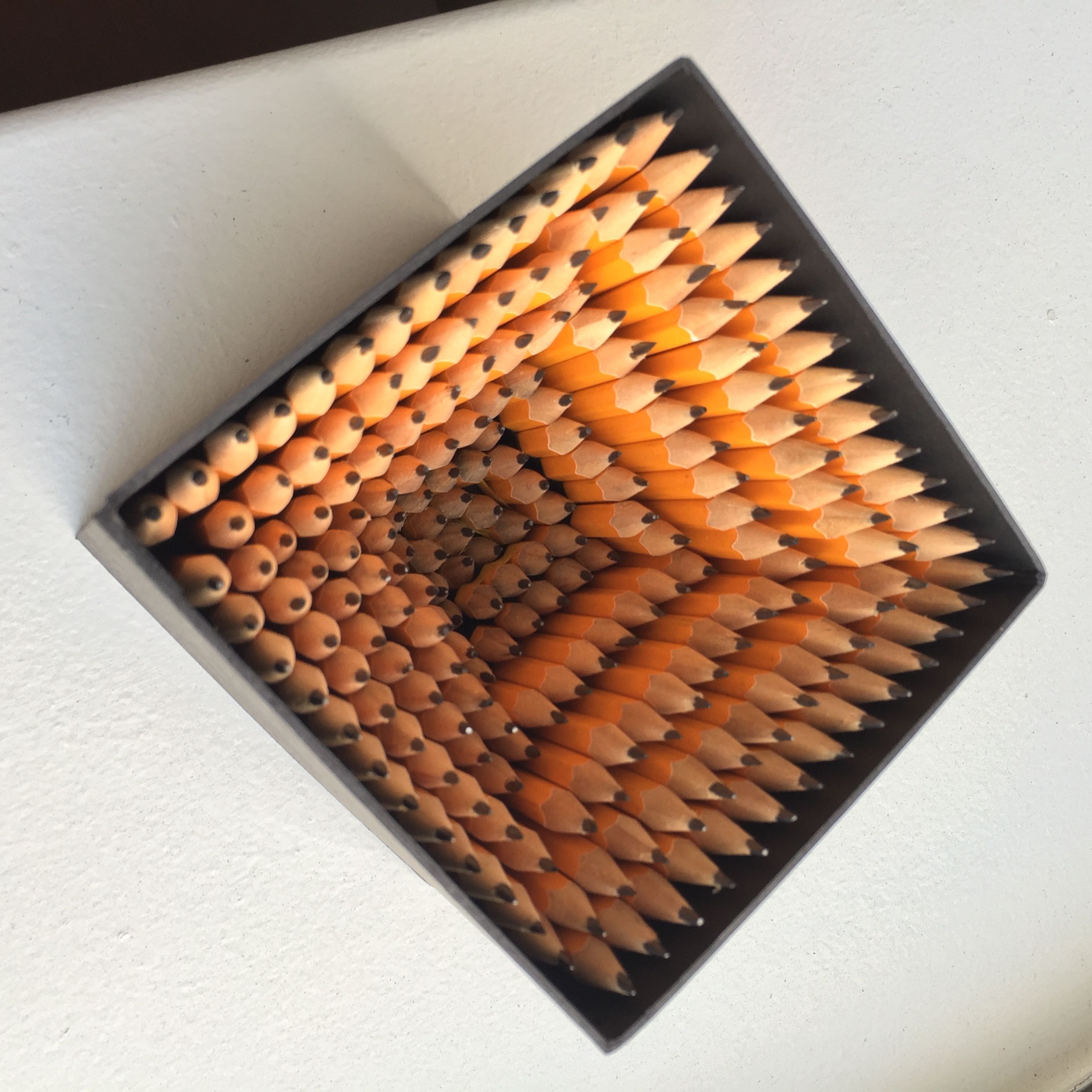
This tour was very insightful and provided me with a lot more knowledge on print production and has made me realize how important this is to know for any graphic designer.