My Process & Skills (7) Human Rights, Human Wrongs

This is my eighth and the last entry for this semester.
Our class had a final assignment called “Human Rights, Human Wrongs”.

“Human Rights, Human Wrongs” is a poster assignment that allows the student to chose and interpret a social issue of interest to him or her. The student will voice their opinion in the chosen topic by creating a visual, conceptual statement using the juxtaposition of type and image.
The poster is directed at the general public and it’s aim is to create awareness for the issue and invite the viewer to question or consider his or her point if view on the topic. To achieve this, use the medium to your advantage. The poster is a medium whose intent is to grab the attention and draw the viewer in. It can be a powerful medium when designed and executed successfully.


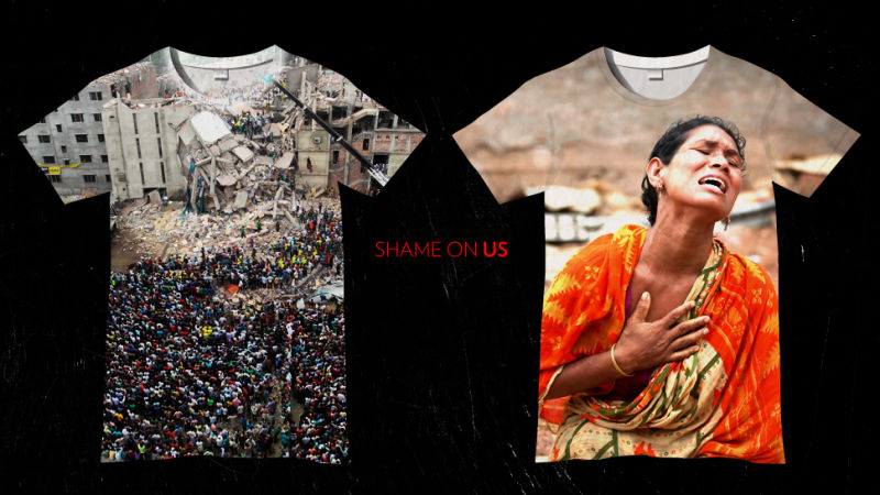
The topic I took was child labor abuse in apparel industry, especially in brands so-called “fast-fashion”.

The other day, one of my ESL teachers said, “You fashion-conscious students must buy the fast-fashion clothing wisely, because it’s cheaper than the high-end brands and as fashionable as them! haha!” — I couldn’t believe what my ears heard. Of course, my ESL classmates majoring fashion design never agreed with this teacher.

And I noticed that many American people like her never think of what a fast-fashion means. They never care the reason why fast-fashion brands can sell their products in such a low, too much low prices. They can’t imagine what has happened in the opposite side of the earth, they don’t pay attentions to that kind of news or documentary films.

Shame on us. It reminds me an article about the Tazreen factory fire that killed 112 garment workers, and the Rana Plaza building collapse killing 1,129 people. No, honestly, I totally forgot the names of the buildings and the numbers of killed workers in Bangladesh. All I remembered is this featured image of the article.

http://jezebel.com/whats-the-solution-to-the-worlds-sweatshop-problem-511688272

Well, well, I never say that I’ve never bought fast-fashion clothing ever and forever. Sometimes I do buy their cheap products, as you do. But when I saw the store is filled with tons of cheap mass-products and it looks like mountains of garbage, it hurts my heart every time. I feel so guilty to buy a T-shirt in $9.99. Am I a wise customer, indeed?

So I went to “fast-fashion districts” at Fifth Avenue. You might know where it is, very close to our University Center. I took some spy photos (again! I’m quite good at it), and designed an opinion poster concerning child labor abuse.


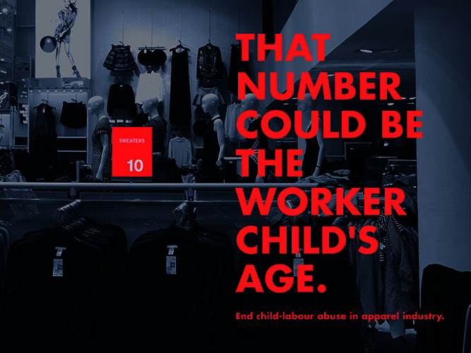
The more cheaper we buy clothing, The more younger sweatshop workers become. Someone should stop this bad loop, and it must be us, customers. We can be more and more ethical.

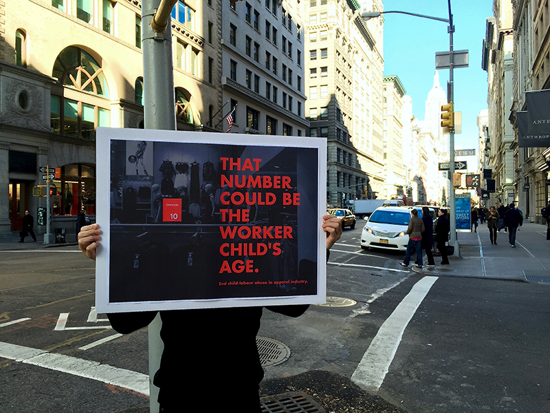
You can use this poster to your social activities. For example, a protest against demonstration on the street like this.


TIME Picks the Best Magazine Covers of 2015

By David Schonauer   Thursday December 17, 2015

Magazines fired back with photography in 2015.

“Today we continue our look back at the year that was by featuring Time magazine’s choice of the best magazine covers the year.  “Our selection of the top 10 covers of 2015 displays an exquisite use of photography, notes Time Director of Photography and Visual Enterprise Kira Pollack.

Her staff compiled its list after looking at a range of magazine categories, from news and sports to celebrity and fashion, and then interviewing the people behind the covers, including photographers, creative directors and top editors…”

Read and See More at AMERICAN PHOTOGRAPHY’s site: http://www.ai-ap.com/publications/article/16143/the-year-that-was-time-picks-the-best-magazine-co.html

My Process & Skills (5) Photo Book

This is my product for Photo Book Project.

(I don’t know why but I couldn’t upload my photos on this blog, so I posted them to my site and linked to them below.)

For this Book Project, our class had the same theme as Photo Essay Project. Since I finished my Photo Essay with “Texture”, my book naturally has the same theme.

I named this book “You can’t touch this”. There are no captions for each photo, I only put this statement inside of the cover, as an introduction.

More than twenty years ago, a certain hit tune of M.C.Hammer had hailed around the world. A Japanese little girl also loved it, and interpreted the lyric; “Anything essential coolness is untouchable to your hands, because it’s always intangible.”

Since then, I have been fascinated to release a shutter to it. Something far away, something over the fence, something only visible in a finder. Something tactile but not touchable. All photographs in this book were taken in New York City 2015, and have a kind of texture. Unkempt plants, stickers placed by hands, or old trodden lacking pavements. We can see some patterns and orders in them, but it’s not with a computer-measured neatness. An error attracts us to touch it, just like a hole in a hand-knitting sweater.

But you, and even I, can’t touch this. These are all tactile things that you can only feel its beauty through printed pictures.

I used a technique of accordion folding, and chose red and black cardboard to the cover page. All I focused on was “Texture”.

These are some of mock-ups, which were made by recycled paper, small sticky tabs, a cardboard which picked up from the refuse room of my apartment.


Photo Essay

My photo essay initial idea was to take photos of different perspectives that are different from our usual view. I wanted to play with bird’s eye view and also low angle perspectives, like what my dog would see. During my first few rounds of taking pictures, I brought my dog with my and included him in various shots.

Knowing that the photo essay would be later placed in a book; I decided to pay the Center for Book Arts a visit to get some inspiration on possible book layout and ideas. The visit was fun and I was able to see letterpress in action, but I still did not know what kind of binding I would use for my book. I was certain I wanted to bind and not fold an instant book though.

I kept exploring the internet to see what I could do and I came across a scrapbook idea that I really liked. By this point of reviewing and choosing pictures, the photo essay was shaping into a photo essay around Bentley, my bichon frise and poodle mix dog. It was becoming like “A day in the life of Bentley.” Although I love my dog to bits and pieces, reviewing my pictures again the week before it was due, I realized I wasn’t completely happy with what I had. I felt like I was beefing up the book with a lot of craft and that the story and pictures itself were not all that strong. I spoke to Carmile and showed her some of the shots that I really liked and she told me to take the week to go back to taking pictures.

This slideshow requires JavaScript.

At this point, I knew I had to work fast and work hard so I wouldn’t fall behind. I narrowed down 600+ pictures to 24 and sent contacts sheets to Carmile for feedback. Coincidentally, in my Typography class that week, we were starting our new project, a fun facts book so our professor actually brought in a bunch of samples of book mockups that she created and I saw the perfect layout for my subject! Remember how I said I really wanted to bind? Guess what, that changed. I opted for a folded instant book instead. I also created a sleeve for it and made the book reversible and can be folded both ways.

I’m actually quite happy with the final product, even though I didn’t get to bind. Production was painful though. It took approximately four 2-hour sessions at the AMT Lab plotter to be able to print the two documents the way I wanted it.

This slideshow requires JavaScript.


My Process & Skills (4) Photo Board

These are my long journey of Photo Essay Project. http://processandskills.com/2015/10/31/my-process-skills-2-photo-essay/
http://processandskills.com/2015/11/08/my-process-skills-3-photo-editting/

And, this is my final presentation board of Photo Essay Project. 12 pictures on a 15 x 20 inches light-gray board.

As writing before, once I lost the theme. And it was found at last, with reviewing hundreds of photos I took. These two photos became my key principle.

I’m not sure what these are, though I myself took pictures of them. The one is a discarded vase on the roadside. It has been thrown away as a trash, because of its crack. But it’s beautiful. The other is a lighting covered with a mesh net, at the entrance of Vera List Center (6 E.16th building). I took this for killing time while I was waiting for the elevator (Yes, the most frustrating one in our school).

“Texture” — that’s what I found from these 2 photos. So I chose and edited 12 photos, through exploring the texture of them. My eyes caught abstract pictures, and lost meanings on it. Finally, human-beings have totally disappeared from my choice.

IMG_9554.jpg

12 photos were selected as 3 each by 4 sets of similarities: “Something litten”, “Something fragile”, “Something dotted”, and “Something to be palpated”. I made my rough sketches with thumbnails on my notebook. And shuffled them for putting on the board. You can see the difference between the sketch and the final board.

I cut all of my 5 x 3 photos into squares. Seeing a picture in the typical photo size (such as 3×5 or 4×6), your eyes naturally seek “What is seen? What did the photographer take?” because the size has meanings. However, I just wanted to let them be as collections of “Texture”. I must fit them into the exact same size in flat, so that they become more and more abstract.

IMG_9594.jpg


Photo Essay

This one was a special one. The project required us to learn the basics of photography, choose a topic of our liking and get clicking. The problem with having your own choice, is that there are so many wonderful things to choose from, and like the last project I was pulled in various directions.

I wanted to capture colours, non-materialistic happiness, joy in the little things, the beach.

Decisions, decisions decisions!!

For the first topic, I combined ‘little joys’ and ‘by the waterside’. Here are some of the pictures I took at different times in the day.

The next step was to try my hand at book-binding. I never anticipated that I would ever create my own book from scratch, book cover maybe but not the entire thing. I was really excited about choosing the kind of paper I was using, what method I would use, and to see if my final outcome reflected the ones in the various book binding youtube videos I had researched.

This slideshow requires JavaScript.

These are two trial books that I made. For one I used the non-adhesive three style sewing method while for the other I used the concertina gluing method by Scott Mccarney.

Final Choice

The topic that I chose to go with was one that I was extremely passionate about. After a hospital visit and eating pancakes for lunch,  I decided to take a stroll in a Bombay afternoon (not weird at all). On doing so I was so inspired by the street art, and run-down locations. My e-classmates work was another reason I was so inspired to go ahead with this topic.

I clicked photographs of street art that can be considered vandalism or freedom of expression, I choose to believe in the latter. It reminded me of being in the present because most of the time there is so much going on in our mind, that we are seeing but not really looking.

I photographed dilapidated houses that spoke to me in a certain way. There was a sadness, but still so much beauty. It was old and forgotten but to me it just felt like so much more. I went into so many tiny lanes, and felt like a tourist in my own city.

Snippets of the book

Look through some of my favourite spreads below.

This slideshow requires JavaScript.

DSC_3921

5

DSC_3817

4

DSC_3863

DSC_3857

1

image_4


Book Cover

Below is the process of how I decided on the logo for my book.

Untitled-2


Deconstructed Beauty Logo

I adopted the three style sewing method by Scott Mccarney for the final book. It was a really easy method and worked really well since I printed 4″ by 6″  pages. I wanted the cover to symbolise my entire experience and represent my photographs in a cohesive  way. The white background was striking but looked very clean, and organised unlike the free rustic nature of my pictures. Hence I decided to choose a tan paper as my backdrop and I used rope as well in the corner.

Back pocket

I used a map to pin down the source of all my photographs. I used the back flap of my book as a pocket and inserted the map inside.


New York Books for Your Coffee Table or Your Coffee Break

As you know by now about my blogging on the latest and the greatest… I love books. I took a stroll after Thanksgiving dinner and that stroll led me right to The Strand on Broadway & 12th St. NYC. BUT – I am on a book fasting diet (for now). I woke up this morning and found myself in front of my computer reading my New York Times alerts. One alert was about books. The topic, New York!

Many of your photo essays focused on New York as the subject from firehouses to the subway to the people. The book list is as varied as your essays.

29jpBOOKSHELFSUB-master675-v2

Coffee table books about New York.

Credit Tony Cenicola | The New York Times

Here are a few of the title but take a look at the article,too. You may find a topic (or topics) you want to dive into a bit more.

• “Interior Landmarks: Treasures of New York” (The New York School of Interior Design, the Monacelli Press; $60), by Judith Gura and Kate Wood

• “Graffiti Murals: Exploring the Impacts of Street Art”(Schiffer Publishing; $29.99), Patrick Verel embraces the vibrant collaboration with building owners to ward off vandalism and vapidity.

• From Andy Warhol’s house to Keith Haring’s Pop Shop, “Unforgotten New York” redeems its subtitle: “Legendary Spaces of the 20th-Century Avant-Garde” (Presetel; $39.95).

• As sylvan escape or jostling playground, Central Park has inspired painters from Milton Avery to William Zorach. Robert F. Pasquier explores New York’s premier oasis through their prism in “Painting Central Park”(the Vendome Press; $60), an evocative visual festival.

http://www.nytimes.com/2015/11/29/nyregion/coffee-table-books-about-new-york.html?emc=edit_tnt_20151126&nlid=66721447&tntemail0=y&_r=0

Manhattan Street Performance: A Photo Essay

The process of developing my photo essay over the course of two months was an interesting one.  For worse or for better, very little of my original idea survived to the final stages of the process.

If this project taught me anything (in fact, it taught me many things), it is that sticking to your original vision of a final product can actually limit its development. As my Digital Layout professor KC Witherell says, “Don’t get married to an idea.”  This project, like all others at Parsons, put me to the test: could I gracefully allow my ideas and my work to change from my original vision?

When we were first assigned the project, I had my heart set on photographing the performers who jump on the subways and dance on the poles; I saw them everywhere I went during my first month in New York, and I thought that the way the performers affected the body language of the subway riders was very interesting.  People immediately cast their eyes to the floor, to the wall, anywhere but at the performers.  By betraying even the slightest hint of amusement or attention, it was as if the subway riders were entering into a contract with the performers: you must tip us.

Alas, the very day I decided to photograph the contrast between the performers’ body language and the subway riders’ body language was the last day I saw the subway performers until–get this–3 days after the final photo essay was due.  I spent the first weekend of the project riding around the city for hours until finally I decided to cast a wider net and photograph performers anywhere I found them, and any form I found them.  I photographed violinists, break dancers, saxophonists, children’s entertainers, bands; everyone I could find.  I tried to get close-ups of the performers’ faces and the spectators’ faces, looking for contrasts.

After the first critique with Michael Durham, former photojournalist at Life Magazine, it was decided that the close-ups weren’t really working, and in fact the most interesting photos were of the breakdancers.  Photos from days of photographing were discarded.

At that point, too, I needed to come up with a concept for the text that would accompany my photos when they were bound into my final book.  Luckily, with inspiration from Michael Durham, the idea to interview the breakdancers for my text came quickly, and the following week I went back to City Hall where I had initially seen the street performers to ask some questions.  After weeks of observing street performers, I had grown very curious about the lives they lead.

When I got to City Hall, I saw that many of the performers I had originally photographed were there again in the same spot, nearly a month later.  I watched a performance, took some photos, and then approached some of the men for an interview.  I am naturally shy, so the thought of choosing people as my subjects in the first place had been a bit nerve-racking; the thought of interviewing my subjects was even more so.  Ultimately, though, I’m so glad I chose to do these things for my work, because the results were so rewarding.  This is the work that I’m most proud of (so far) at Parsons.

With my photos taken and text written, I set about the task of laying out my book and then binding it.  This took some weeks of revision as well.  Some photos of my mock-ups:

This slideshow requires JavaScript.

I decided to make my book into a circle accordion.  That way, my book would fit neatly into a cover and could be pages through as an ordinary book, but could also be displayed in a circle to mimic a street performance: photographs of performers in the center; spectators circling around.  I had to scale my book down slightly for practical reasons. Finding reasonably priced and manageable ways to print a document that’s 6.25 inches by 85 inches was unsurprisingly a bit of a mission!

Here are some photos of the (almost) final version (small refinements will be made before the end of the semester):

This slideshow requires JavaScript.

Though the process was long, this was a project that I enjoyed from start to finish, and learned many things along the way.  I discovered that I love bookbinding, and that interviewing subjects isn’t half bad either.  I’m looking forward to producing many more photo essays in the future!

This slideshow requires JavaScript.

The art of starting over:

Or why Parsons totally owes me a manicure.

My photo book is actually a collection of “records” acting pages and which are bound by an LP sleeve.

My original intent was to create a full sized 33rd record book—a.k.a  12-inch diameter book. However, confronted with design challenges posed by an off line vinyl sticker printer in the Parson’s Art, Media, and Technology lab, I was forced to resize to a paper size accommodated by sticker paper manufacturers. The design was modified again post-critique and goo-goned to Hell and back in order to make refinements and (hopefully) take advantage of the AMT lab vinyl printer.

unnamed-1
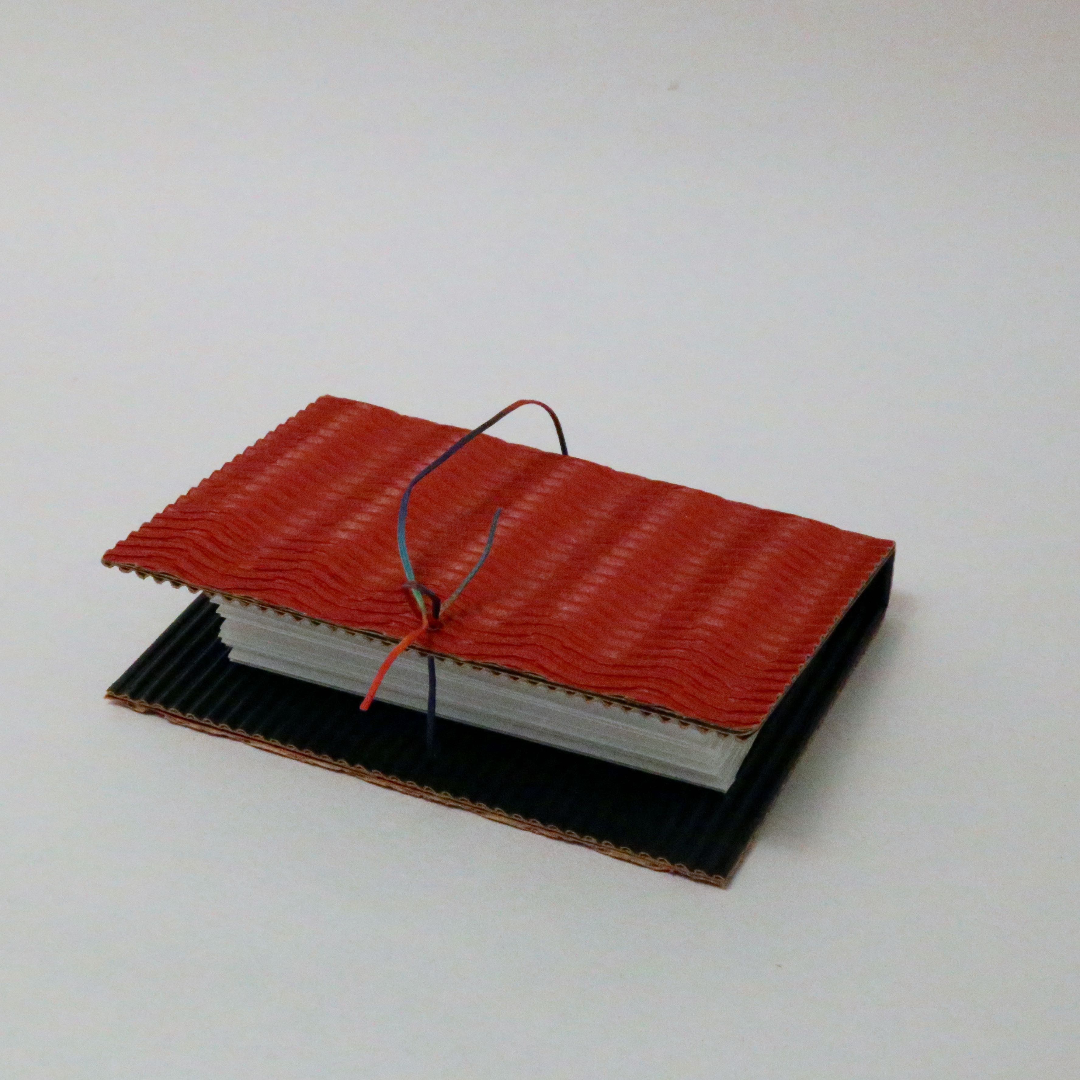
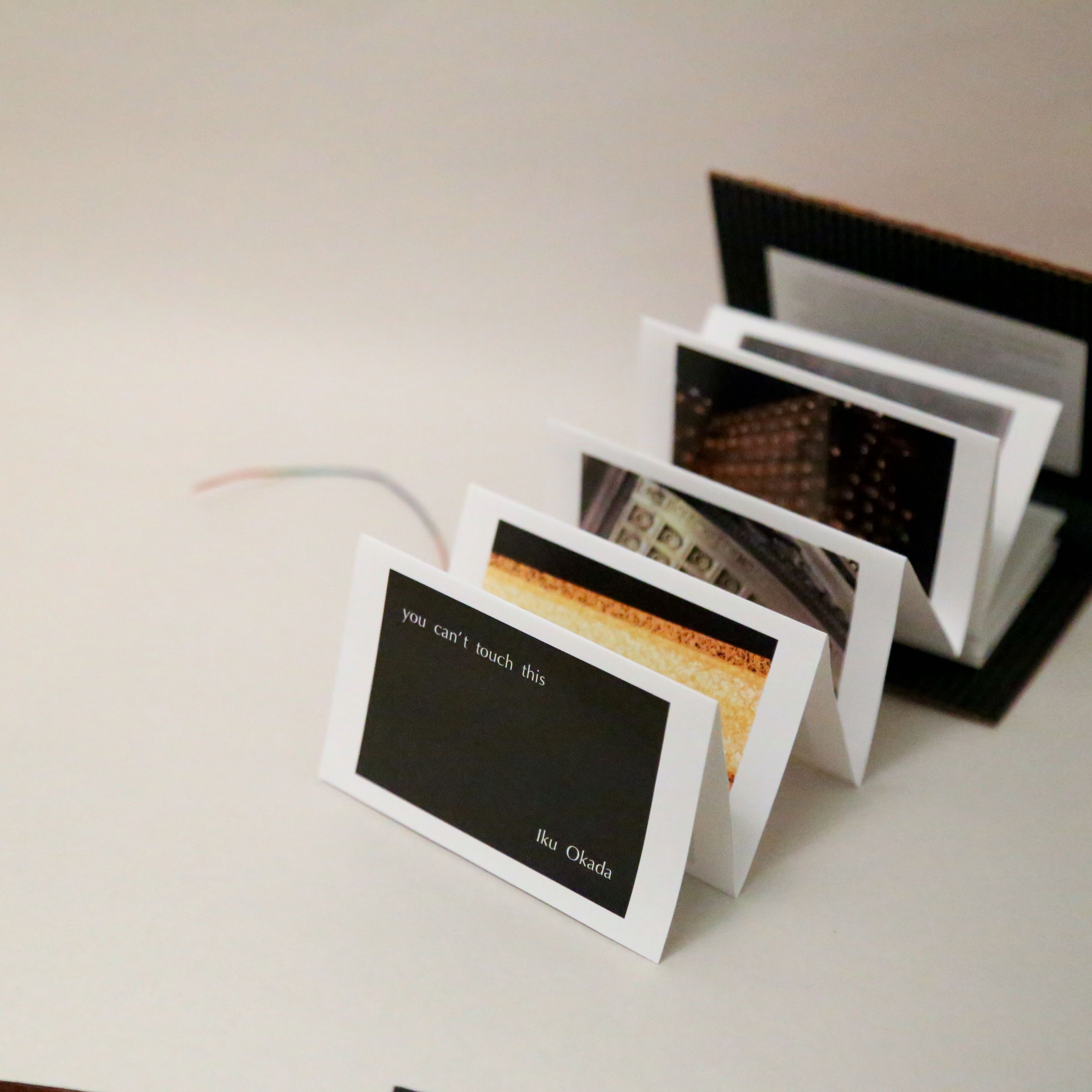
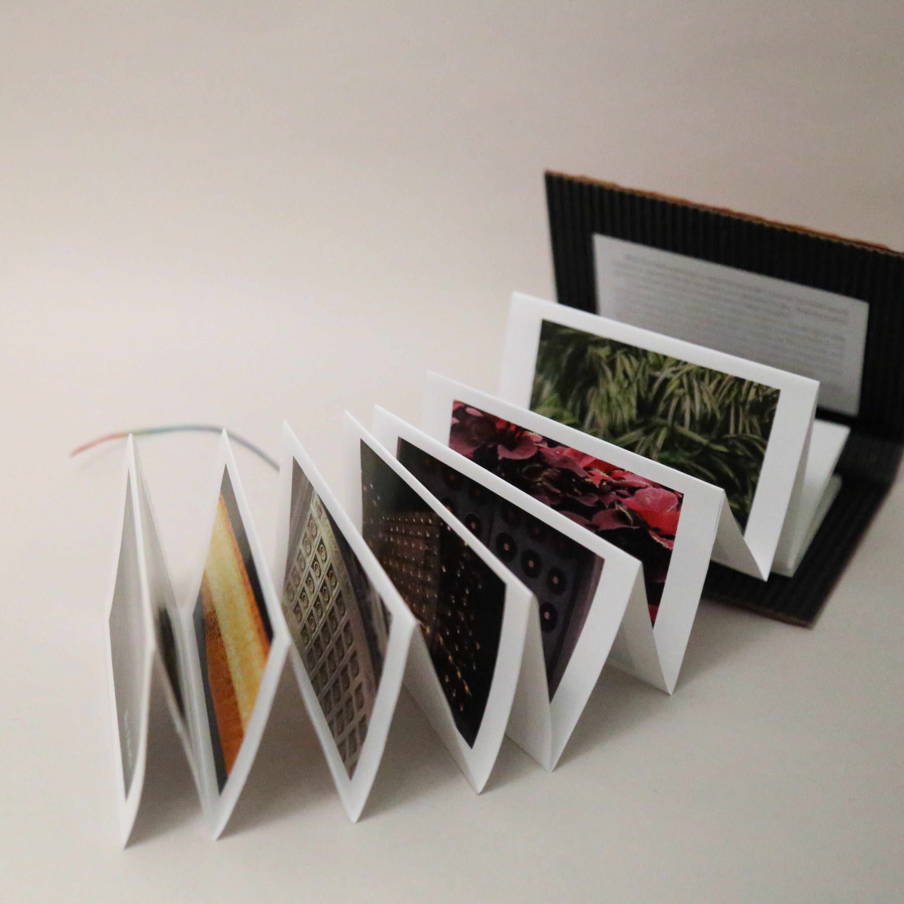
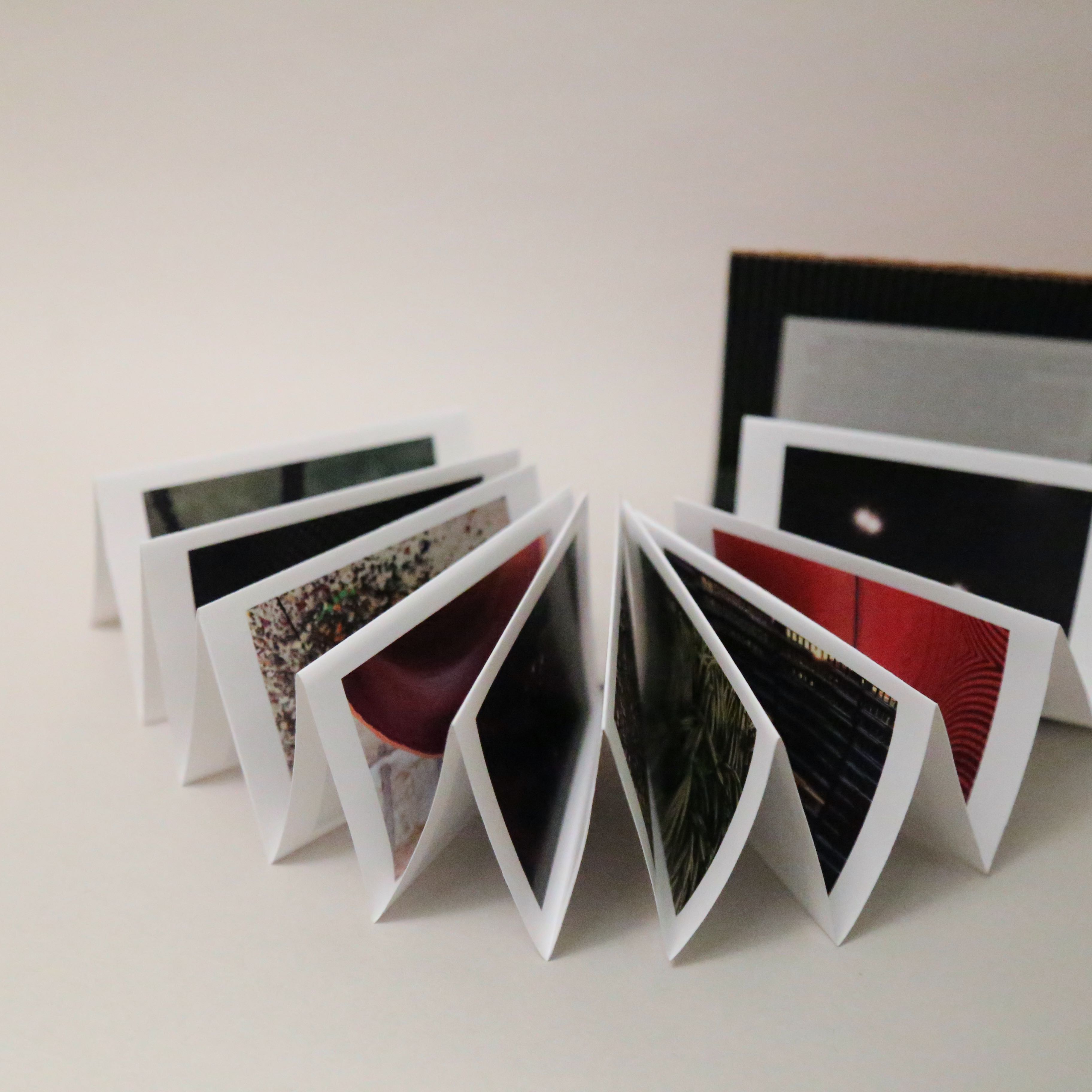
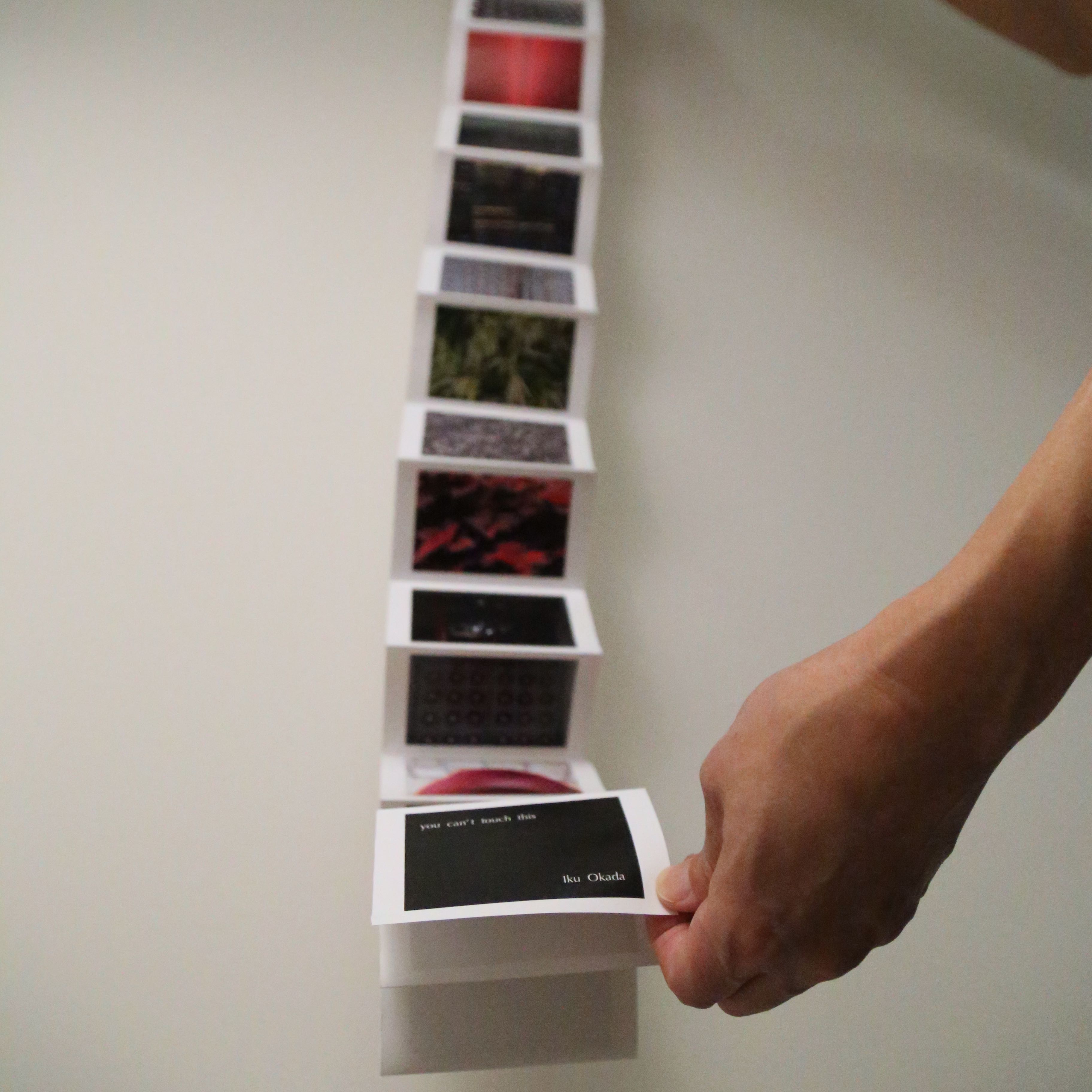
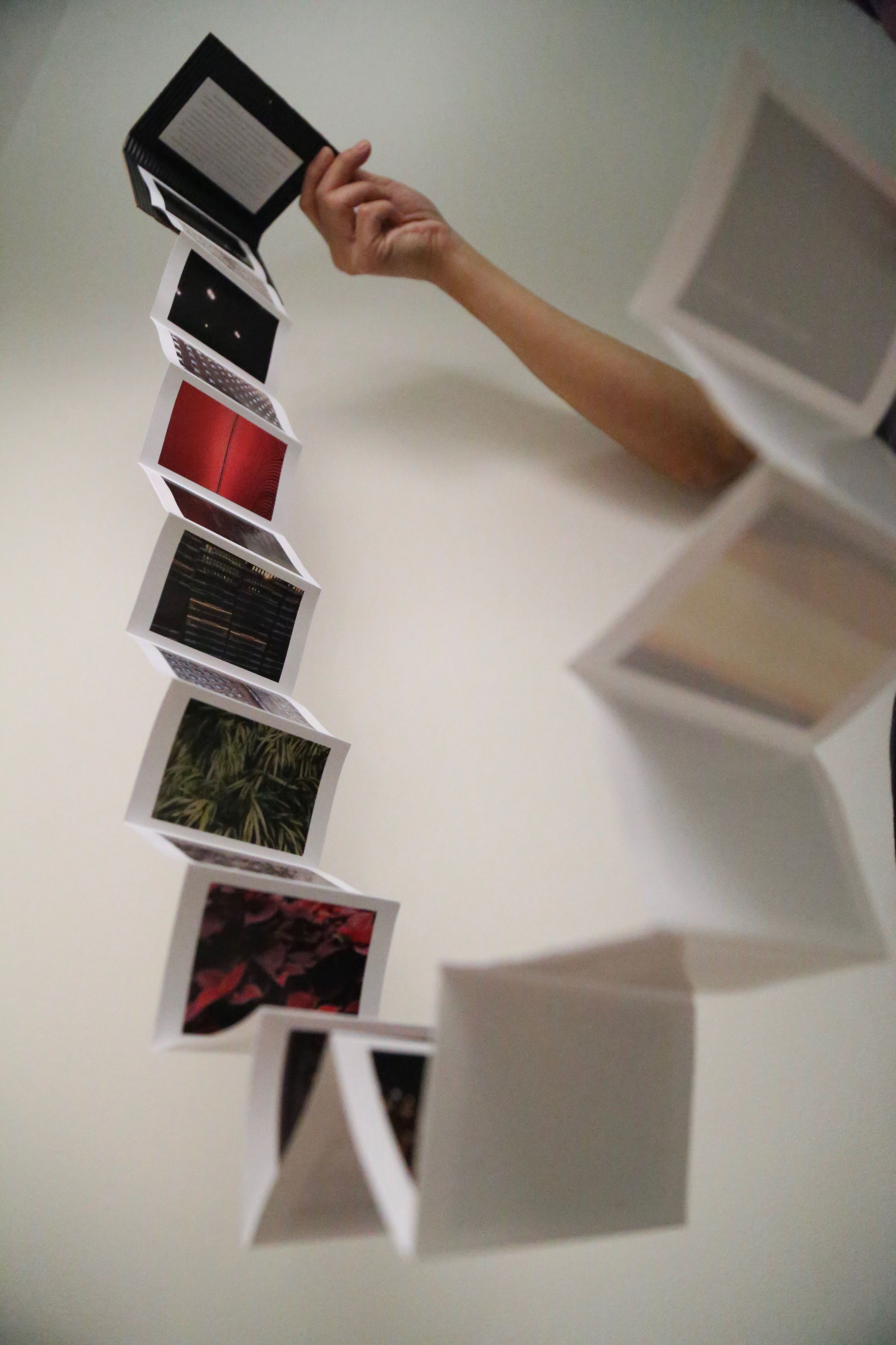
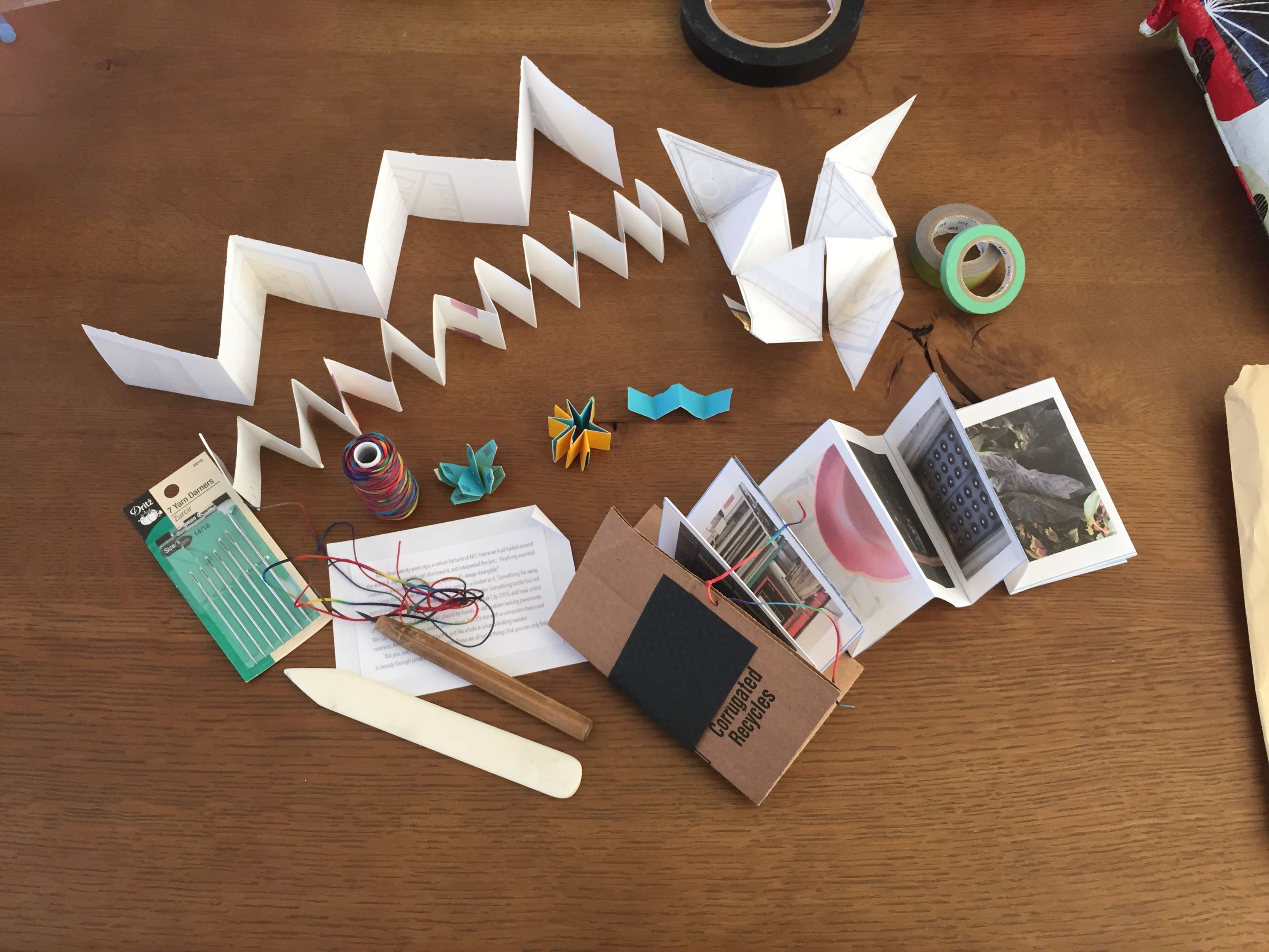
At the moment my pages are soaking in a bucket of 1-part water to 2-parts isopropyl alcohol in the hope that someday they won’t smell and feel like orange goo-gone. They soak while I blog and file down the finger stumps I am left with after picking off 18 stickers!

unnamedAs much as I was less than enthusiastic about starting over I did learn a lot about my process as a designer.  I suffer from a tendency to plow ahead without thinking fully about the final product.  Or rather, I know what the ideal final product would be in my head but occasionally fail to think through the steps to get there.  I believe that, having worked out in the ‘real world’ for a number of years before returning to school I have been trained to work to completion, if not perfection–and I am seeing this across all my classes.

Definitely a habit that is…almost broken by this class.

BUT, now that the Parsons AMT lab vinyl printer is back in business,  I am thrilled to refine the project!

Abbas: Children of Abraham

“My photography is a reflection, which comes to life in action and leads to meditation. Spontaneity – the suspended moment – intervenes during action, in the viewfinder.”

Abbas_
GB. ENGLAND. Yorkshire. Batley. At the Zakaria Muslim Girls High School, funded by the muslim community, girls in hijab (islamic dress) play touchball. 1989.

November 21, 2015 – March 20, 2016

“Children of Abraham presents 66 photographs of the monotheistic religions: Judaism, Islam, and Christianity, by renowned Magnum photographer Abbas. Since 1970 Abbas has documented through his camera lens the “political and social life of societies in conflict.” This exhibition is the culmination of over 13 years of research and travel by the artist to record religious practices and their manifestations in all parts of the world. This is Abbas’ first exhibition in America exclusively devoted to the theme of religion. Abbas will travel from Paris, France to present an artist talk, and a series of related programs and events are planned.” from the Arthur Ross Gallery at the University of Pennsylvania website – 11/19/2015

arg

For More Information: http://www.arthurrossgallery.org