My photo essay initial idea was to take photos of different perspectives that are different from our usual view. I wanted to play with bird’s eye view and also low angle perspectives, like what my dog would see. During my first few rounds of taking pictures, I brought my dog with my and included him in various shots.
Knowing that the photo essay would be later placed in a book; I decided to pay the Center for Book Arts a visit to get some inspiration on possible book layout and ideas. The visit was fun and I was able to see letterpress in action, but I still did not know what kind of binding I would use for my book. I was certain I wanted to bind and not fold an instant book though.
I kept exploring the internet to see what I could do and I came across a scrapbook idea that I really liked. By this point of reviewing and choosing pictures, the photo essay was shaping into a photo essay around Bentley, my bichon frise and poodle mix dog. It was becoming like “A day in the life of Bentley.” Although I love my dog to bits and pieces, reviewing my pictures again the week before it was due, I realized I wasn’t completely happy with what I had. I felt like I was beefing up the book with a lot of craft and that the story and pictures itself were not all that strong. I spoke to Carmile and showed her some of the shots that I really liked and she told me to take the week to go back to taking pictures.
This slideshow requires JavaScript.
At this point, I knew I had to work fast and work hard so I wouldn’t fall behind. I narrowed down 600+ pictures to 24 and sent contacts sheets to Carmile for feedback. Coincidentally, in my Typography class that week, we were starting our new project, a fun facts book so our professor actually brought in a bunch of samples of book mockups that she created and I saw the perfect layout for my subject! Remember how I said I really wanted to bind? Guess what, that changed. I opted for a folded instant book instead. I also created a sleeve for it and made the book reversible and can be folded both ways.
I’m actually quite happy with the final product, even though I didn’t get to bind. Production was painful though. It took approximately four 2-hour sessions at the AMT Lab plotter to be able to print the two documents the way I wanted it.
This one was a special one. The project required us to learn the basics of photography, choose a topic of our liking and get clicking. The problem with having your own choice, is that there are so many wonderful things to choose from, and like the last project I was pulled in various directions.
I wanted to capture colours, non-materialistic happiness, joy in the little things, the beach.
Decisions, decisions decisions!!
For the first topic, I combined ‘little joys’ and ‘by the waterside’. Here are some of the pictures I took at different times in the day.
The next step was to try my hand at book-binding. I never anticipated that I would ever create my own book from scratch, book cover maybe but not the entire thing. I was really excited about choosing the kind of paper I was using, what method I would use, and to see if my final outcome reflected the ones in the various book binding youtube videos I had researched.
This slideshow requires JavaScript.
These are two trial books that I made. For one I used the non-adhesive three style sewing method while for the other I used the concertina gluing method by Scott Mccarney.
Final Choice
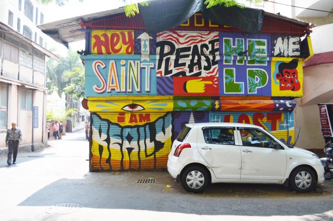
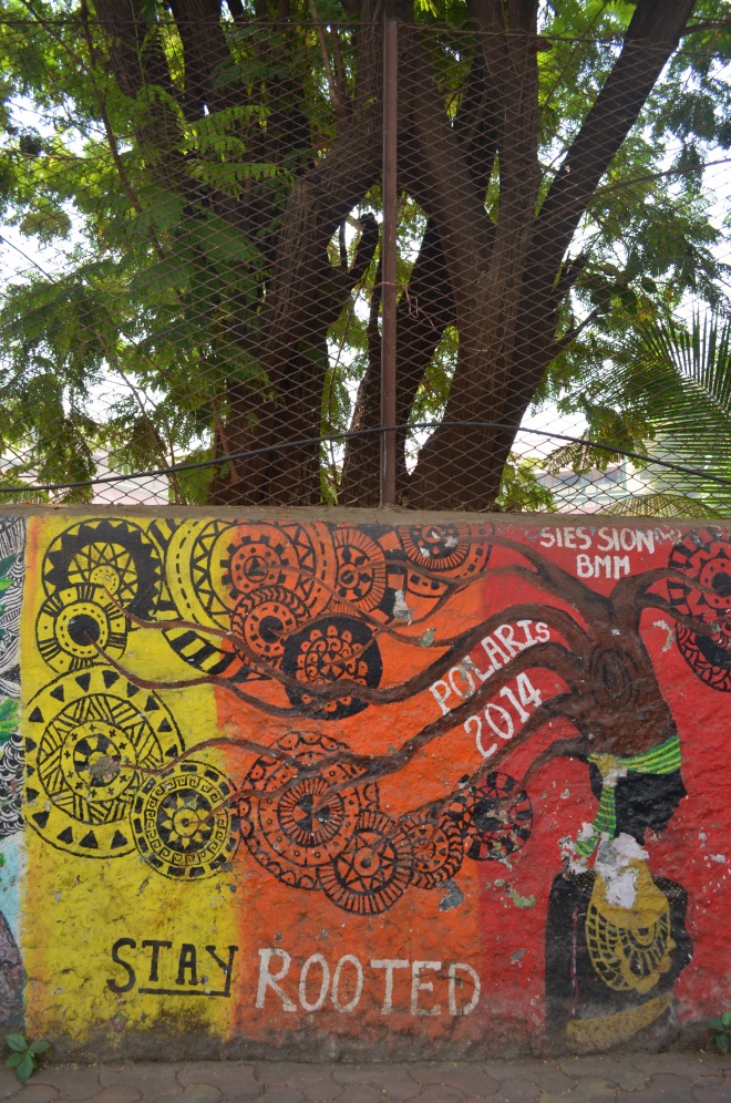
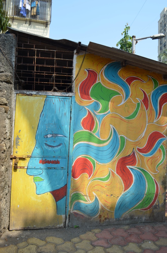
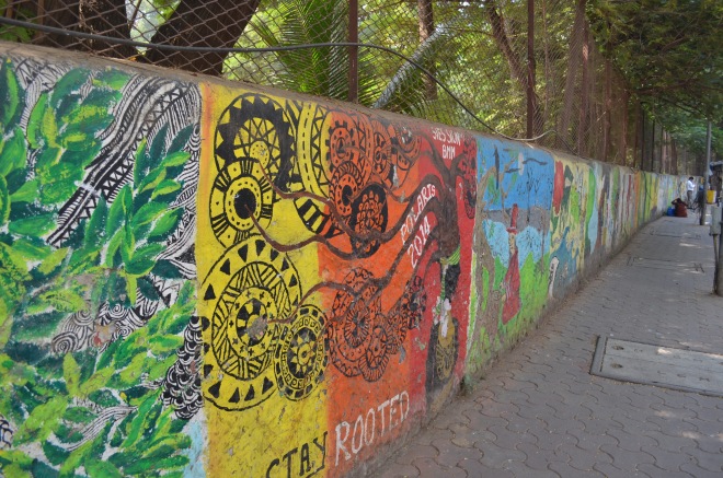
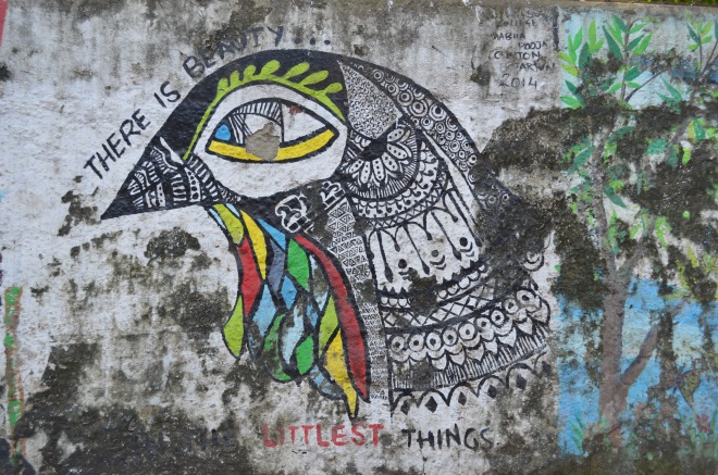
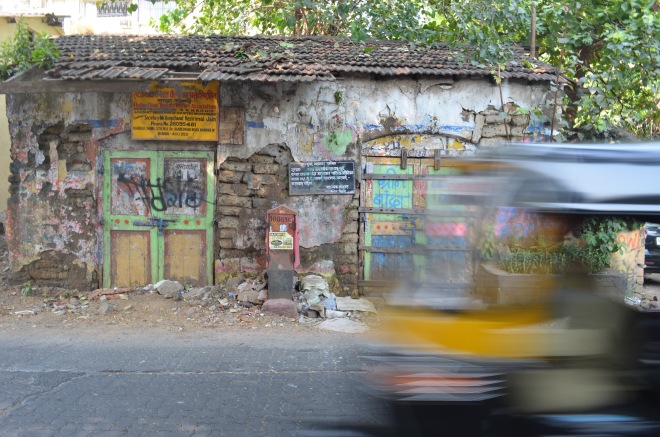
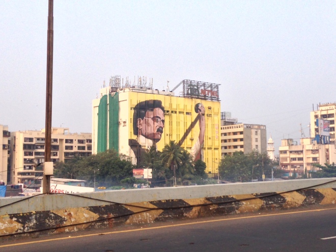
The topic that I chose to go with was one that I was extremely passionate about. After a hospital visit and eating pancakes for lunch, I decided to take a stroll in a Bombay afternoon (not weird at all). On doing so I was so inspired by the street art, and run-down locations. My e-classmates work was another reason I was so inspired to go ahead with this topic.
I clicked photographs of street art that can be considered vandalism or freedom of expression, I choose to believe in the latter. It reminded me of being in the present because most of the time there is so much going on in our mind, that we are seeing but not really looking.
I photographed dilapidated houses that spoke to me in a certain way. There was a sadness, but still so much beauty. It was old and forgotten but to me it just felt like so much more. I went into so many tiny lanes, and felt like a tourist in my own city.
Snippets of the book
Look through some of my favourite spreads below.
This slideshow requires JavaScript.
Book Cover
Below is the process of how I decided on the logo for my book.
I adopted the three style sewing method by Scott Mccarney for the final book. It was a really easy method and worked really well since I printed 4″ by 6″ pages. I wanted the cover to symbolise my entire experience and represent my photographs in a cohesive way. The white background was striking but looked very clean, and organised unlike the free rustic nature of my pictures. Hence I decided to choose a tan paper as my backdrop and I used rope as well in the corner.
Back pocket
I used a map to pin down the source of all my photographs. I used the back flap of my book as a pocket and inserted the map inside.
As you know by now about my blogging on the latest and the greatest… I love books. I took a stroll after Thanksgiving dinner and that stroll led me right to The Strand on Broadway & 12th St. NYC. BUT – I am on a book fasting diet (for now). I woke up this morning and found myself in front of my computer reading my New York Times alerts. One alert was about books. The topic, New York!
Many of your photo essays focused on New York as the subject from firehouses to the subway to the people. The book list is as varied as your essays.
Coffee table books about New York.
Credit Tony Cenicola | The New York Times
Here are a few of the title but take a look at the article,too. You may find a topic (or topics) you want to dive into a bit more.
• “Interior Landmarks: Treasures of New York” (The New York School of Interior Design, the Monacelli Press; $60), by Judith Gura and Kate Wood
• “Graffiti Murals: Exploring the Impacts of Street Art”(Schiffer Publishing; $29.99), Patrick Verel embraces the vibrant collaboration with building owners to ward off vandalism and vapidity.
• From Andy Warhol’s house to Keith Haring’s Pop Shop, “Unforgotten New York” redeems its subtitle: “Legendary Spaces of the 20th-Century Avant-Garde” (Presetel; $39.95).
• As sylvan escape or jostling playground, Central Park has inspired painters from Milton Avery to William Zorach. Robert F. Pasquier explores New York’s premier oasis through their prism in “Painting Central Park”(the Vendome Press; $60), an evocative visual festival.
The process of developing my photo essay over the course of two months was an interesting one. For worse or for better, very little of my original idea survived to the final stages of the process.
If this project taught me anything (in fact, it taught me many things), it is that sticking to your original vision of a final product can actually limit its development. As my Digital Layout professor KC Witherell says, “Don’t get married to an idea.” This project, like all others at Parsons, put me to the test: could I gracefully allow my ideas and my work to change from my original vision?
When we were first assigned the project, I had my heart set on photographing the performers who jump on the subways and dance on the poles; I saw them everywhere I went during my first month in New York, and I thought that the way the performers affected the body language of the subway riders was very interesting. People immediately cast their eyes to the floor, to the wall, anywhere but at the performers. By betraying even the slightest hint of amusement or attention, it was as if the subway riders were entering into a contract with the performers: you must tip us.
Alas, the very day I decided to photograph the contrast between the performers’ body language and the subway riders’ body language was the last day I saw the subway performers until–get this–3 days after the final photo essay was due. I spent the first weekend of the project riding around the city for hours until finally I decided to cast a wider net and photograph performers anywhere I found them, and any form I found them. I photographed violinists, break dancers, saxophonists, children’s entertainers, bands; everyone I could find. I tried to get close-ups of the performers’ faces and the spectators’ faces, looking for contrasts.
After the first critique with Michael Durham, former photojournalist at Life Magazine, it was decided that the close-ups weren’t really working, and in fact the most interesting photos were of the breakdancers. Photos from days of photographing were discarded.
At that point, too, I needed to come up with a concept for the text that would accompany my photos when they were bound into my final book. Luckily, with inspiration from Michael Durham, the idea to interview the breakdancers for my text came quickly, and the following week I went back to City Hall where I had initially seen the street performers to ask some questions. After weeks of observing street performers, I had grown very curious about the lives they lead.
When I got to City Hall, I saw that many of the performers I had originally photographed were there again in the same spot, nearly a month later. I watched a performance, took some photos, and then approached some of the men for an interview. I am naturally shy, so the thought of choosing people as my subjects in the first place had been a bit nerve-racking; the thought of interviewing my subjects was even more so. Ultimately, though, I’m so glad I chose to do these things for my work, because the results were so rewarding. This is the work that I’m most proud of (so far) at Parsons.
With my photos taken and text written, I set about the task of laying out my book and then binding it. This took some weeks of revision as well. Some photos of my mock-ups:
This slideshow requires JavaScript.
I decided to make my book into a circle accordion. That way, my book would fit neatly into a cover and could be pages through as an ordinary book, but could also be displayed in a circle to mimic a street performance: photographs of performers in the center; spectators circling around. I had to scale my book down slightly for practical reasons. Finding reasonably priced and manageable ways to print a document that’s 6.25 inches by 85 inches was unsurprisingly a bit of a mission!
Here are some photos of the (almost) final version (small refinements will be made before the end of the semester):
This slideshow requires JavaScript.
Though the process was long, this was a project that I enjoyed from start to finish, and learned many things along the way. I discovered that I love bookbinding, and that interviewing subjects isn’t half bad either. I’m looking forward to producing many more photo essays in the future!
You are missing another NYC gem for those of you that have not visited The Grolier Club on the upper Eastside especially if you are a lover of books, printing, collecting…and more. It is a treat to walk through an exhibit in this Club established in 1884.
Here is a quote from The Grolier Club Constitution that can describe this “to foster the study, collecting, and appreciation of books and works on paper, their art, history, production, and commerce. It shall pursue this mission through the maintenance of a library devoted to all aspects of the book and graphic arts and especially bibliography; through the occasional publication of books designed to illustrate, promote and encourage the book and graphic arts; through exhibitions and educational programs for its members and the general public; and through the maintenance of a Club building for the safekeeping of its property, and otherwise suitable for the purposes of the Club.”
Cover Design from Just So Stories by Rudyard Kipling
Here is a list of their exhibitions (now through 2016).
A few weeks ago we started working on a new project. We had to create the design of a book and think of a theme to research on.
Many of us came up with beautiful and creative ideas.
Here are some photos took in class of the different projects.
Juri’s very stylish and playful book – 5 sheets of paper with different styles and patterns to exchange the mannequin’s dress.Juri’s book – “Le petit closet”Sarah’s book – it has been extremely interesting to see her work in progress throughout the weeks. Her determination has over come all the struggles. This is the incredible result!Sarah’s book on the designer Iris Apfel
Photo Essay with Text: “Justicia” | By Stephanie Segura Brooklyn: La Chamba Press, 2015
Yes, more about books…today is my day to remind everyone about those little creative places in NYC that we often forget to put on our “to visit” list.
“Printed Matter is located in the heart of the busy Chelsea art district, surrounded by hundreds of galleries, arts organizations, and fellow arts non-profits. With with well over 100,000 visitors annually, the active street-level storefront offers a glimpse into the thriving state of contemporary artists’ publishing, featuring artists’ books, zines, posters, prints, multiples, audio works and a broad selection of out-of-print material. In addition to being packed full of unique publications, we host an array of programs and events on a regular basis. From rotating exhibitions and window installations to events such as book launches, talks and performances, there’s always something going on at Printed Matter. The shop also holds the non-profit offices where our small staff can be seen at work on various services in support of book artists and can always help you find what you’re looking for…”
Photo Essay with Text: México Lindo Y Querido By Stephanie Segura Brooklyn: La Chamba Press, 2015New Release: Brad Elterman | No Dogs on Beach | Book Signing October 21, 2015
This is my semester post about one of my favorite places, The Center for Book Arts.
The Center is dedicated to exploring and cultivating contemporary aesthetic interpretations of the book as an art object, while preserving the traditional practices of the art of the book.
I like to remind everyone about this small NYC gem that is tucked away at 28 West 27th St on the 3rd floor as we embark on developing our photo essay books. The Center is a wonderful place for research and information from their exhibits they mount to the printing workshops to bookbinding classes.
See whats going on at The Center. Hopefully it will be added to your own FAV list.
Last week our Process and Skills class was in a workshop format, where we all learned the actual process of creating a book. This Bookbinding workshop was run by the experimented Mary Ellen Buxton, who patiently and passionately shared her knowledge on the subject.
Before class, I went to go to Talas in Brooklyn, to get all of my supplies. However, I ended up going and it was closed However, I found another shop about a stones throw from the Graham stop, called “Artist & Craftsman Supply” (761 Metropolitan Ave), that had everything I needed.
The first part of class Ms. Buxton showed us the way to properly detect the direction of the grain in a piece of paper, by gently bending both sides of the paper just slightly enough to detect which side has a harder bounce. She then explained how it is very important to fold along the grain, otherwise the paper (most often when it’s a slightly thicker stock) will end up buckling, or ripping over some time. It is also important to correctly use the bone folder to achieve the cleanest fold possible. When looking for the grain, it is best write in pencil little arrows and numbers to help you remember and ease the process when you are finally ready to trim the paper.
She also emphasized the fact that when composing different books, she often makes cheat sheets, with her notes all over the test booklet, so she can make a bunch of mistakes and create several versions sometimes of a book before producing the perfect final product. This was reassuring to know that she doesn’t always get it right the first time! This is all in part of the process it takes to get the best end result.
For this first book, we chose to have the cover paper in a color and the inside in white. I started with various paper at 12×18 and trimmed 4 pieces down to 4”x 18”. I folded the outside sheet in half, along the grain, and the white interior sheets were folded in three parts. One piece of each was taken off and then folded again in half – this part was then used to create the mini pamphlet inside the larger part of the book, where the bigger white pieces were stitched into create a French fold.
When stitching, it was important to use the bulldog clips to hold the book together, so all the pieces stay perfectly in place while putting holes and string through the book. In order to stich, you needed to use an awl (not the one I bought, which was very flimsy, I don’t recommend you get it) to poke three holes, and mark up inside numbers for each hole so you don’t confuse yourself when stitching. Luckily my thread was already coated in wax so it was easy to set up the thread and needle.
We ended up doing a Japanese stiching on the outside of the cover. Unfortunately, at the very end I realized that I had stitched incorrectly, and accidentally left one flap outside the book. However, throughout the workshop I realized that the entire process is a planning, trying and testing game – if something ends up not working, or going as plan – you find a solution. So, we analyzed my book and found out how I could re-stich in order to make the book work. Success! I will be sure to think of this when creating my next book.
Another thing I thought was really interesting about the class was how we talked about how each book is created in a certain way to reflect its content. It was really great to see some of the complex bindings that Ms. Buxton brought in and hear and see how well they were thought through to reflect the authors message/the meaning and purpose of the book. To be honest, this was not always something that I considered whenever picking up a book, but it is now something that I am definitely going to think of when browsing the stocks and when creating my own books in the future.
Charlie Harbutt died on June 29th exactly one month shy of his 80s birthday.
Office of the Dean sent the following message:
Dear Colleagues, It is with great sorrow that we inform you that Charlie Harbutt, long-time faculty in the Photography program, died earlier this week. We will host a memorial service for Charlie in the fall, and will follow up with the details when available.
Having taught at Parsons for more than twenty years, Charlie was deeply respected and loved by his students and colleagues. His mentorship influenced generations of young photographers, and the faculty he worked with benefited from his decades of experience and open presence on campus. We feel this loss deeply, and are grateful that he leaves us with a lasting legacy through his contributions to his field and to his community. We wish strength and comfort to his wife, the photographer Joan Liftin, his family, and all those he inspired throughout his time at our school.
departures and arrivals, Publisher: Damiani (2012)
From the introduction to departures and arrivals:“Gradually my pictures became more about what I felt in my day-to-day wanderings and not so much about subject. They started to be about the shapes and forms I was seeing and drawn to, suggesting a content different from their subject matter. Such pictures were like gifts from a buried self, glimpses of who I was and what I felt. Photography for me, when I’m working well, is all point and shoot. I’ve tried a lot of things, some in the darkroom. But what I like best is that however the picture is made, it’s a surprise to me when I see the photo come up in the developer. My all-time favorite was taken on the Rue du Depart near Gare Montparnasse railroad station in Paris because it was so different from what I remember shooting. It was at once a departure and an arrival.”
Other books by Charlie Harbutt
America In Crisis (1969) (contributor and co-editor), Progreso, Navarin Editeur, Paris, 1986I Grandi Fotografi, Editoriale Fabbri, Milan, Italy: 1983, Travelog, MIT Press, Cambridge, 1974. Arles award: Best photographic book of 1974
Since this is a Process & Skills blog we took the liberty of adding Charlie’s syllabus:
PUPH 2545 A CRN 6585 Spring 2013
Course Description:
Most photographs, whether student, fine art or commercial are made by the traditional art school method: define concept, a pre-visualization, then execute that vision with taste and elegance in some medium. The goal is TOTAL control. For over a century now, artists in almost every medium have disputed this approach: John Cage in music, Martha Graham in dance, the Surrealists and Dadaists with automatic writing and chance juxtapositions, William Burroughs notebooks, Jackson Pollock’s dribbles.
In photography, the box camera originally had no viewfinder, which made such control impossible. Inspired by the weird, but inventive compositions that resulted, photographers using its successor camera, the 35mm, have explored this new approach and some of their discoveries were adapted by their view camera brethren. In their attempt to describe their approach, some photographers say the proper state of mind is to be as blank as the piece of film or as open to discovering images as the lens, which makes pictures all the time. The photographer chooses which ones to preserve on film. This method introduces chance, spontaneity and time into the visual media in a new way. And this has often led to metaphor, as in Steichen’s equivalents. This class will study such spontaneous photographers as they have worked in fine arts, documentary and commercial photography. But primarily it will aim at helping students to produce photographs by this method.
Course Outline:
We moderns trust the pragmatic, logical, “rational” mind more than the intuitive and poetic, even when making art. In schools, we are asked to do assignments, to take a problem and solve it, to execute a concept in some medium. As photographers, we go out “looking for pictures.” That often means looking for moments in the world around us that remind us of pictures we’ve seen in coffee table books or chic magazines. In a way we’re looking at the world with blinders.
Like our eyes, cameras can see and make pictures of everything. You can use the camera, as the poet William Burroughs did, to discover what’s on your mind, even your subconscious. In the process, you might discover ideas you’re more comfortable with or ways of making pictures.
instinct – 1. a. The innate, complex, and normally adaptive aspect of behavior.
b. A strong impulse or motivation
metaphor – A figure of speech in which a term is transferred from the object it ordinarily designates to an object it may designate only by implicit comparison or analogy, as in the phrase “evening of life”.
“More profoundly and at times negatively, the way art is experienced has changed. Conceptual Art has encouraged the assumption that every object, every picture, even every abstract painting tells a story – that it carries within it some kind of narrative, meaning or “subtext.” Equally ingrained is the more limiting expectation that all this meaning is primarily intellectual and easily reduced to language, that art as an entity is completely explainable. We owe to conceptualism years of one-lined artworks in all media – the “I get it” school of esthetic experience. This condition has caused a permanent confusion of content with subject matter, to the continuing detriment of both content and form. Too often, art that lacks an explicit subject is thought to without content and dismissed.”